New to Telerik UI for WPF? Start a free 30-day trial
Styling the RadSplitContainer
Updated on Sep 15, 2025
The RadSplitContainer allows you to use movable bars to divide the displayed area into resizable parts. This article will demonstrate how to style the control.
Targeting the RadSplitContainer Element
In order to style all RadSplitContainers in a RadDocking, you should create a style targeting RadSplitContainer.
Example 1: Creating an implicit style targetting RadSplitContainer
XAML
<Application.Resources>
<!-- If you are using the NoXaml binaries, you will have to base the style on the default one for the theme like so:
<Style TargetType="telerik:RadSplitContainer" BasedOn="{StaticResource RadSplitContainerStyle}">-->
<Style TargetType="telerik:RadSplitContainer">
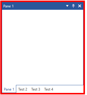
<Setter Property="BorderBrush" Value="Red" />
<Setter Property="BorderThickness" Value="5" />
</Style>
</Application.Resources>
<Grid>
<telerik:RadDocking x:Name="radDocking" >
<telerik:RadSplitContainer >
<telerik:RadPaneGroup >
<telerik:RadPane Header="Pane 1" />
<telerik:RadPane Header="Test 2"/>
<telerik:RadPane Header="Test 3" />
<telerik:RadPane Header="Test 4" />
</telerik:RadPaneGroup>
</telerik:RadSplitContainer>
</telerik:RadDocking>
</Grid>Figure 1: Styled RadSplitContainer in the Office2016 theme
In order to learn how to further modify the control by extracting its ControlTemplate, read the Editing Control Templates article.