New to Telerik UI for WPF? Start a free 30-day trial
Customizing Appearance
Updated on Sep 15, 2025
RadDataPager provides few properties that allows you to customize the appearance of its elements.
Customizing the Numeric Buttons
The numeric buttons of the DataPager components can be customized via the NumericButtonStyle property. The property expects a Style object with its TargetType set to RadRadioButton.
Setting NumericButtonStyle
XAML
	<telerik:RadDataPager DisplayMode="All">
		<telerik:RadDataPager.NumericButtonStyle>
			<Style TargetType="telerik:RadRadioButton">
				<Setter Property="Padding" Value="12 5" />
				<Setter Property="Margin" Value="1 2" />
				<Setter Property="Background" Value="#F56147" />
			</Style>
		</telerik:RadDataPager.NumericButtonStyle>
	</telerik:RadDataPager>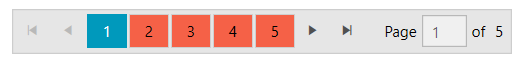
The data context passed to the button is an object of type PageViewModel. The IsCurrent property of the PageViewModel can be used to determine if button is selected (the current page button).
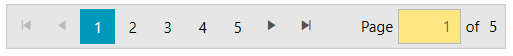
Customizing the TextBox
The text area that allows you to enter the page index can be customized via the TextBoxStyle property. The property expects a Style object with its TargetType set to TextBox.
Setting the TextBoxStyle
XAML
	<telerik:RadDataPager DisplayMode="All">
		<telerik:RadDataPager.TextBoxStyle>
			<Style TargetType="TextBox">
				<Setter Property="Width" Value="50" />
				<Setter Property="Background" Value="#FFE680" />
				<Setter Property="TextAlignment" Value="Right" />
			</Style>
		</telerik:RadDataPager.TextBoxStyle>
	</telerik:RadDataPager>