Template Structure
Like most WPF controls, the RadContextMenu also allows you to template it in order to change the control from the inside. Except for templating the whole control, you can template parts of it or even independent controls related to it.
For more information about templating and how to modify the default templates of the controls from the UI for WPF suite read Editing Control Templates article on this matter.
RadContextMenu Template Structure
This section explains the structure of the RadContextMenu's template. Here is a snapshot of the template generated in Expression Blend.
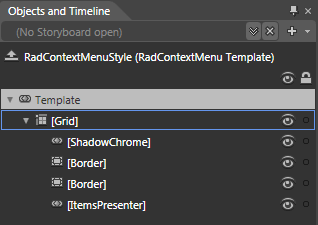
It contains the following parts:
-
[Grid] - the layout root for the template and is of type Border. Visualizes the background and the border of the RadMenu.
-
[ShadowChrome] - represents the shadow of the RadContextMenu and is of type ShadowChrome.
-
[Border] - represents the left column of the RadContextMenu and is of type Border.
-
[Border] - represents the background and the border of the main content and is of type Border.
-
[ItemsPresenter] - represents the host control for the RadMenu's items and is of type ItemsPresenter.
-