New to Telerik UI for WPF? Start a free 30-day trial
TextBoxStyle
Updated on Sep 15, 2025
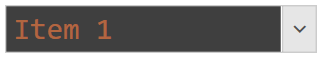
The TextBoxStyle property allows you to customize the input area of RadComboBox.
The input area is shown only when the control is in edit mode. This happens when its IsEditable property is set to True.
Example 1: Setting TextBoxStyle
XAML
	<telerik:RadComboBox IsEditable="True" SelectedIndex="0">
		<telerik:RadComboBox.Items>
			<telerik:RadComboBoxItem Content="Item 1" />
			<telerik:RadComboBoxItem Content="Item 2" />
			<telerik:RadComboBoxItem Content="Item 3" />
		</telerik:RadComboBox.Items>
		<telerik:RadComboBox.TextBoxStyle>
			<!-- If you use NoXaml dlls and implicit styles, set the following property on the Style element - BasedOn="{StaticResource ComboBoxTextBoxStyle}" -->
			<Style TargetType="TextBox">
				<Setter Property="Background" Value="#3F3F3F" />
				<Setter Property="Foreground" Value="#FF8041" />
				<Setter Property="FontSize" Value="24" />
				<Setter Property="FontFamily" Value="Consolas" />
			</Style>
		</telerik:RadComboBox.TextBoxStyle>
	</telerik:RadComboBox>
Figure 1: Input area with changed colors and font