New to Telerik UI for WPF? Start a free 30-day trial
Drop-Down Button Icon
Updated on Sep 15, 2025
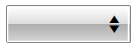
The DropDownButtonIconContent and the DropDownButtonIconContentTemplate properties allow you to customize the drop-down button icon of the RadComboBox control.
-
DropDownButtonIconContent: Gets or sets the content of the show dialog button.
-
DropDownButtonIconContentTemplate: Gets or sets the content template of the show dialog button.
Using RadGlyphs
The DropDownButtonIconContent and DropDownButtonIconContentTemplate properties are fully compatible with our RadGlyph control. The following example shows how to set a RadGlyph as a drop-down button icon.
Example 1: Setting a RadGlyph as Drop-Down Button Icon
XAML
<telerik:RadComboBox DropDownButtonIconContent="">
<telerik:RadComboBox.DropDownButtonIconTemplate>
<DataTemplate>
<telerik:RadGlyph Glyph="{Binding}" />
</DataTemplate>
</telerik:RadComboBox.DropDownButtonIconTemplate>
<telerik:RadComboBoxItem Content="Item 1" />
<telerik:RadComboBoxItem Content="Item 2" />
</telerik:RadComboBox>Figure 1: RadComboBox with customized dropdown icon