Additional Content
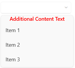
The RadComboBox control provides the ability to define additional content that can be positioned relative to the clear selection button and the drop-down items.
Setting Additional Content
To utilize this functionality, you can set the AdditionalContent property of RadComboBox, which is of the type of object and you can assign a value of any type. To further customize it, you can use the AdditionalContentTemplate property and specify a DataTemplate for it.
[XAML] Setting the AdditionalContent and AdditionalContentTemplate
<telerik:RadComboBox AdditionalContent="Additional Content Text">
    <telerik:RadComboBox.Items>
        <telerik:RadComboBoxItem Content="Item 1"/>
        <telerik:RadComboBoxItem Content="Item 2"/>
        <telerik:RadComboBoxItem Content="Item 3"/>
    </telerik:RadComboBox.Items>
    <telerik:RadComboBox.AdditionalContentTemplate>
        <DataTemplate>
            <TextBlock Text="{Binding}"
            FontWeight="SemiBold"
            Foreground="Red"
            HorizontalAlignment="Center"/>
        </DataTemplate>
    </telerik:RadComboBox.AdditionalContentTemplate>
</telerik:RadComboBox>
RadComboBox with additional content
Setting the Position of the Additional Content
You can position the additional content area relevant to the clear selection button and the drop-down items. To do so, you can utilize the AdditionalContentPosition property. It is an enumeration of the type of AdditionalContentPosition and provides the following options:
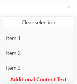
AboveClearButton—The additional content is displayed above the clear button of the drop-down menu of RadComboBox.BelowClearButton—The additional content is displayed below the clear button of the drop-down menu of RadComboBox. This is the default value.BelowDropDownItems—The additional content is displayed below the drop-down items of the RadComboBox.
[XAML] Setting the AdditionalContentPosition
<telerik:RadComboBox AdditionalContent="Additional Content Text"
                     AdditionalContentPosition="BelowDropDownItems"
                     ClearSelectionButtonContent="Clear selection"
                     ClearSelectionButtonVisibility="Visible">
    <telerik:RadComboBox.Items>
        <telerik:RadComboBoxItem Content="Item 1"/>
        <telerik:RadComboBoxItem Content="Item 2"/>
        <telerik:RadComboBoxItem Content="Item 3"/>
    </telerik:RadComboBox.Items>
    <telerik:RadComboBox.AdditionalContentTemplate>
        <DataTemplate>
            <TextBlock Text="{Binding}"
                       FontWeight="SemiBold"
                       Foreground="Red"
                       HorizontalAlignment="Center"/>
        </DataTemplate>
    </telerik:RadComboBox.AdditionalContentTemplate>
</telerik:RadComboBox>
RadComboBox with additional content positioned below the drop-down items