Customizing Groups
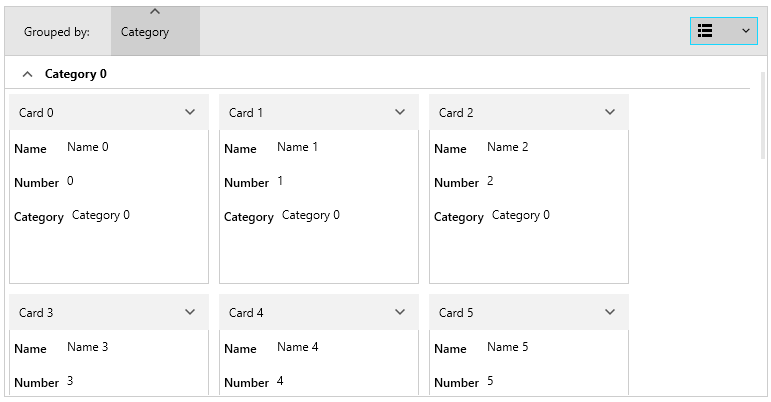
A RadCardView group can be customized in order to match the expected design or functionality.
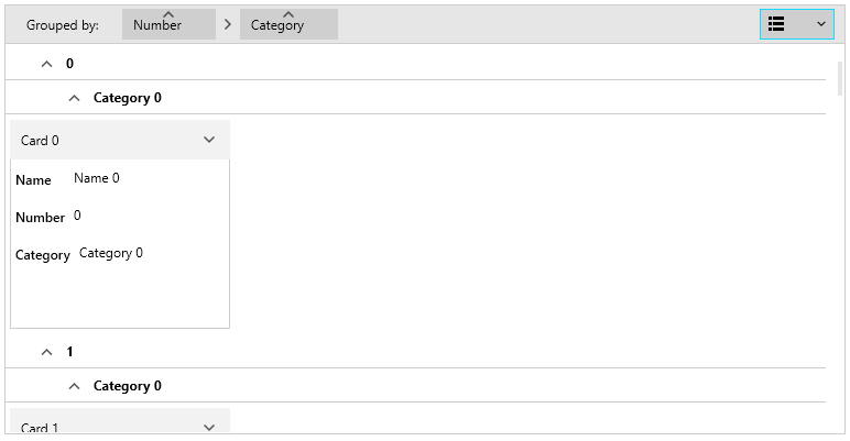
Read the Grouping article to see how to setup the grouping.
Group Panel
To change the visibility of the group panel's text and items, set the ShowGroupPanel property of RadCardView.
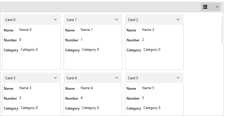
Example 1: Hiding group panel
<telerik:RadCardView ShowGroupPanel="False"/>Figure 1: Hidden group panel
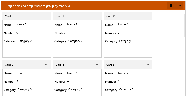
To change the background color of the group panel, set the GroupPanelBackground property of RadCardView.
To change the text color of the group panel, set the GroupPanelForeground property of RadCardView.
To disable the sorting of groups with the group member button, set the CanUserSortGroups property of RadCardView.
Example 2: Customizing group panel colors
    <telerik:RadCardView GroupPanelBackground="#CA5100"
						 GroupPanelForeground="White"
                         CanUserSortGroups="False"/>
Figure 2: Changed group panel background
Additionally, the element that represents the group panel can be customized using the GroupPanelStyle property.
Example 3: Customizing group panel style
	<telerik:RadCardView.GroupPanelStyle>
		<Style TargetType="cardView:CardViewGroupPanel">
			<Setter Property="Height" Value="50" />
			<Setter Property="Opacity" Value="0.5" />
		</Style>
	</telerik:RadCardView.GroupPanelStyle>
The "cardView:" namespace points to xmlns:cardView="clr-namespace:Telerik.Windows.Controls.Data.CardView;assembly=Telerik.Windows.Controls.Data"
Figure 3: Customized group panel style
To customize the group member button elements in the group panel, set the GroupPanelItemStyle property.
Example 4: Customizing group panel items
	<telerik:RadCardView.GroupPanelItemStyle>
		<Style TargetType="cardView:CardViewGroupPanelItem">
			<Setter Property="Height" Value="50" />
		</Style>
	</telerik:RadCardView.GroupPanelItemStyle>
Figure 4: Customized group panel items
Group Item Indentation
To set the group items horizontal offset (indentation), set the GroupItemIndentation property.
Example 5: Changing group items indentation
<telerik:RadCardView GroupItemIndentation="25" />Figure 5: Customized group panel items