How to Customize the Calendar Buttons
Customizing the buttons in RadCalendar could easily be achieved by creating a custom StyleSelector and setting it to the DayButtonStyleSelector property of the control.
This tutorial will go through on how to:
-
Create a custom DayButtonStyleSelector
-
Customize the CalendarButton Style
-
Set the DayButtonStyleSelector of RadCalendar
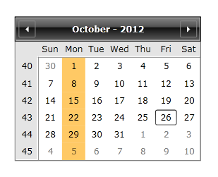
The next example shows how to create a custom DayButtonStyleSelector in order to change the Background color of every Monday in the calendar.
-
First you will need to create a DayButtonStyleSelector that inherits StyleSelector class:
C#public class DayButtonStyleSelector : StyleSelector { } -
Create a property of type Style:
C#public class DayButtonStyleSelector : StyleSelector { public Style SpecialStyleMonday { get; set; } } -
Override the SelectStyle() method:
C#public class DayButtonStyleSelector : StyleSelector { public Style SpecialStyleMonday { get; set; } public override Style SelectStyle(object item, DependencyObject container) { CalendarButtonContent content = item as CalendarButtonContent; if (content != null) { if (content.Date.DayOfWeek == DayOfWeek.Monday && content.ButtonType == CalendarButtonType.Date) { return SpecialStyleMonday; } } return base.SelectStyle(item, container); } } -
Add the following namespaces in the xaml:
XAML<UserControl xmlns:local="clr-namespace:WpfApplication1" xmlns:calendar="clr-namespace:Telerik.Windows.Controls.Calendar;assembly=Telerik.Windows.Controls.Input"> </UserControl> -
Create a StaticResource for the DayButtonStyleSelector and the SpecialStyleMonday Style:
XAML<local:DayButtonStyleSelector x:Key="CustomStyleSelector"> <local:DayButtonStyleSelector.SpecialStyleMonday> <Style TargetType="calendar:CalendarButton"> <Setter Property="Background"> <Setter.Value> <SolidColorBrush Color="Orange" Opacity="0.6"/> </Setter.Value> </Setter> </Style> </local:DayButtonStyleSelector.SpecialStyleMonday> </local:DayButtonStyleSelector> -
Set the DayButtonStyleSelector property of the control:
XAML<telerik:RadCalendar DayButtonStyleSelector="{StaticResource CustomStyleSelector}"/> -
The last step is to set the DayButtonStyle to null in order for the custom DayButtonStyleSelector to be used:
XAML<telerik:RadCalendar DayButtonStyleSelector="{StaticResource CustomStyleSelector}" DayButtonStyle="{x:Null}"/>
The next screenshot shows the final result: