Properties
| Property | Description |
|---|---|
| ListElement | Gets the auto-complete list element. |
| UseSystemPasswordChar | Gets or sets a value indicating whether the text in view should appear as the default password character. |
| PasswordChar | Gets or sets the character used to mask characters of a password in a single-line |
| HideSelection | Gets or sets a value indicating whether the selected text in the text box control remains highlighted when the element loses focus. |
| CaretIndex | Gets or sets the caret position. |
| SelectionLength | Gets or sets the number of characters selected in the text box. |
| TextLength | The length of the text. |
| MaxLength | Gets or sets the maximum number of characters the user can type or paste into the text box element. |
| Text | Gets or sets the current text in the text box element. |
| NullText | Gets or sets the prompt text that is displayed when the text box contains no text. |
| NullTextColor | Gets or sets the color of the null text. |
| TextAlign | Gets or sets how the text is horizontally aligned in the element. |
| Lines | Gives access to the lines collection |
| SelectedText | Gets or sets a value indicating the currently selected text in the text box. |
| AcceptsTab | Gets or sets a value indicating whether pressing the TAB key in a multiline text box element types a TAB character in the element instead of moving the focus to the next element in the tab order. |
| AcceptsReturn | Gets or sets a value indicating whether pressing ENTER in a multiline TextBox control creates a new line of text in the control or activates the default button for the form. |
| Multiline | Gets or sets a value indicating whether this is a multiline text box. |
| WordWrap | Indicates whether a multiline text box control automatically wraps words to the beginning of the next line when necessary. |
| SelectionColor | Gets or sets the color of the selection. |
| SelectionOpacity | Gets or sets the selection opacity. |
| IsReadOnly | Gets or sets a value indicating whether text in the text box is read-only. |
| IsReadOnlyCaretVisible | Gets or sets a value indicating whether the caret is visible in read only mode. |
| ShowClearButton | Gets or sets a value indicating whether the clear button is shown. |
| ShowNullText | Gets or sets a value indicating whether the null text will be shown when the control is focused and the text is empty. |
| ShowEmbeddedLabel | Gets or sets a value indicating whether the embedded label is shown. It is recommended to set AutoSize to true, when using the embedded label. |
| EmbeddedLabelText | Gets or sets the text of the embedded label. |
ShowClearButton
Since R1 2017 RadTextBoxControl can show a clear button when there is some text in the editor. This is controlled by the ShowClearButton property.
NullText
RadTextBoxControl has a NullText property that is not shared by the standard Windows Forms text box. This property specifies what text to be displayed when the control has no Text value. By default, when the control receives focus, this text is automatically removed. This behavior can be controlled by the ShowNullText property. If it is set to true the NullText will be shown even when the text box is focused until you enter some text in the editor.
Embedded Labels
Since R2 2021 RadTextBoxControl supports embedded labels. The embedded label shows a text in the text box field usually to indicate what text should the user enter in the text box. When RadTextBoxControl gets focus the embedded label will go up, so the user can type in the text box field. The ShowEmbeddedLabel property controls whether the embedded label is shown. You can set the desired text by using the EmbeddedLabelText property.
Example 1: Setting the embedded label
this.radTextBoxControl1.ShowEmbeddedLabel = true;
this.radTextBoxControl1.AutoSize = true;
this.radTextBoxControl1.EmbeddedLabelText = "First Name";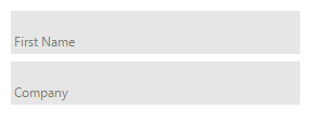
In order the embedded label to be shown correctly it is neccessary to autosize the RadTextBoxControl by setting AutoSize=true or set an appropriate height.
RadTextBoxControlElement exposes the following useful properties related to embedded labels. You can access them through the TextBoxElement property:
- EmbeddedLabel - Gets an instance of the corresponding embedded label.
- RepositionEmbeddedLabel - Gets or set a value to indicate whether to reposition the embedded label, when text box is empty.
- EmbeddedLabelAnimationSpeed - Gets or set the animation speed of the embedded label.
The speed is an integer between 1 and 10 (slowest) with default value 8.
As of R2 2021 the default Height for RadTextBoxControl is changed to 22px.
Events
| Event | Description |
|---|---|
| SelectionChanging | Occurs when text selection is changing. |
| SelectionChanged | Occurs when text selection is changed. |
| TextChanging | Occurs when the text is changing. |
| TextBlockFormatting | Use this event to change the styles of the words. |
| CreateTextBlock | Occurs when an instance of ITextBlock instance is created. |
| ContextMenuOpening | Occurs before the default context menu is opened. |