
Telerik and Kendo UI Kits for Figma
Get Developers and Designers in Perfect Sync
Smooth designer-developer collaboration is within your reach with the Telerik & Kendo UI Kits for Figma. Each Figma UI kit is the perfect design equivalent of our web UI components, helping you avoid unnecessary iterations.
Design Assets and UI Components that Match Perfectly
With the Telerik & Kendo UI web component libraries and matching Figma UI kits, you speed up UI development cycles and avoid unnecessary back-and-forth.


Customizable web UI components for both designers and developers
Easy start of your Design System or integration with existing one
Fully accessible (compliant with WCAG 2.2, Section 508, WAI-ARIA)
It's Time for Developers and Designers to Start Speaking the Same Language
No matter if you work with in-house designers or an agency—your collaboration is off to a running start with the Telerik and Kendo UI Figma UI kits.
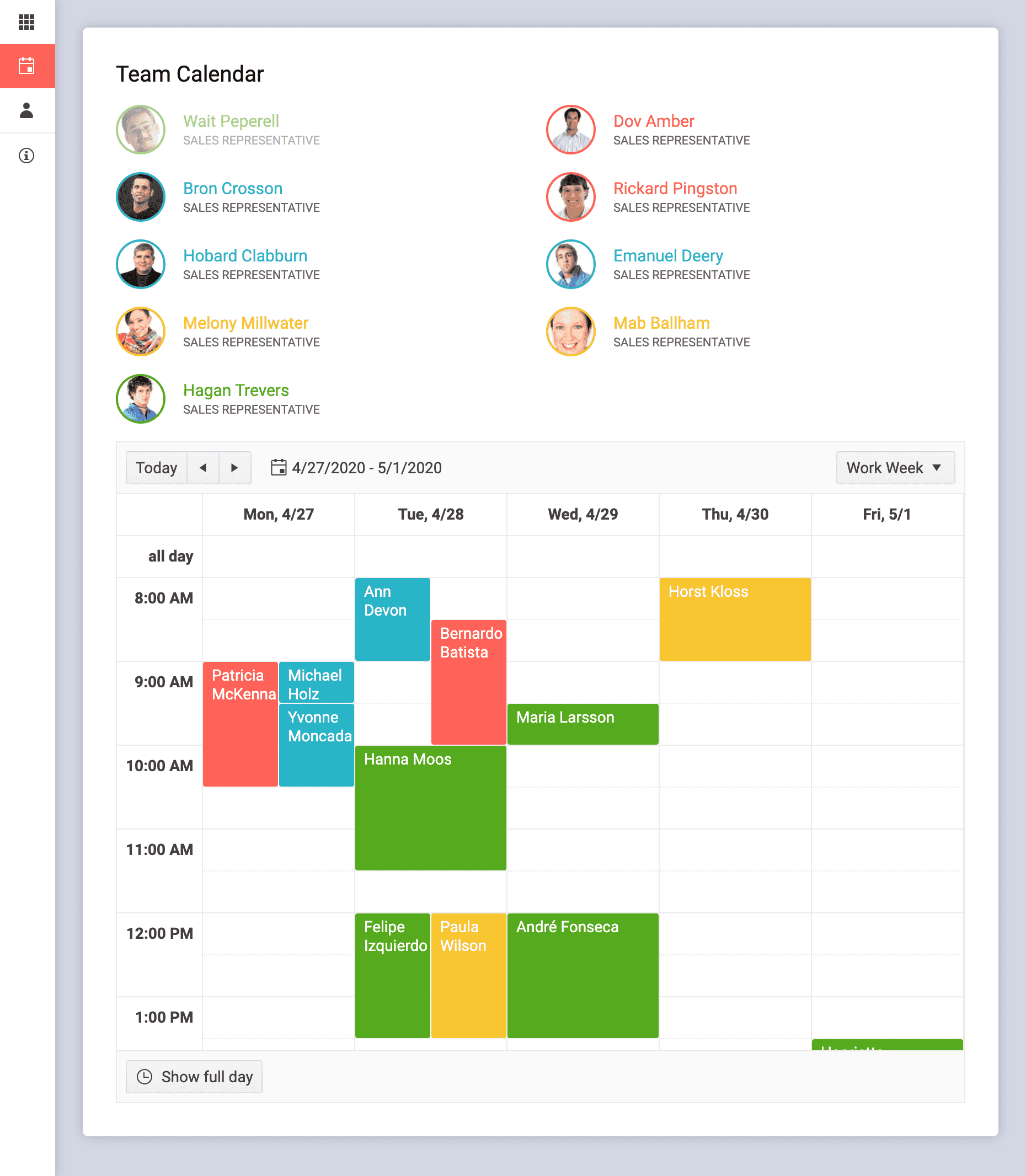
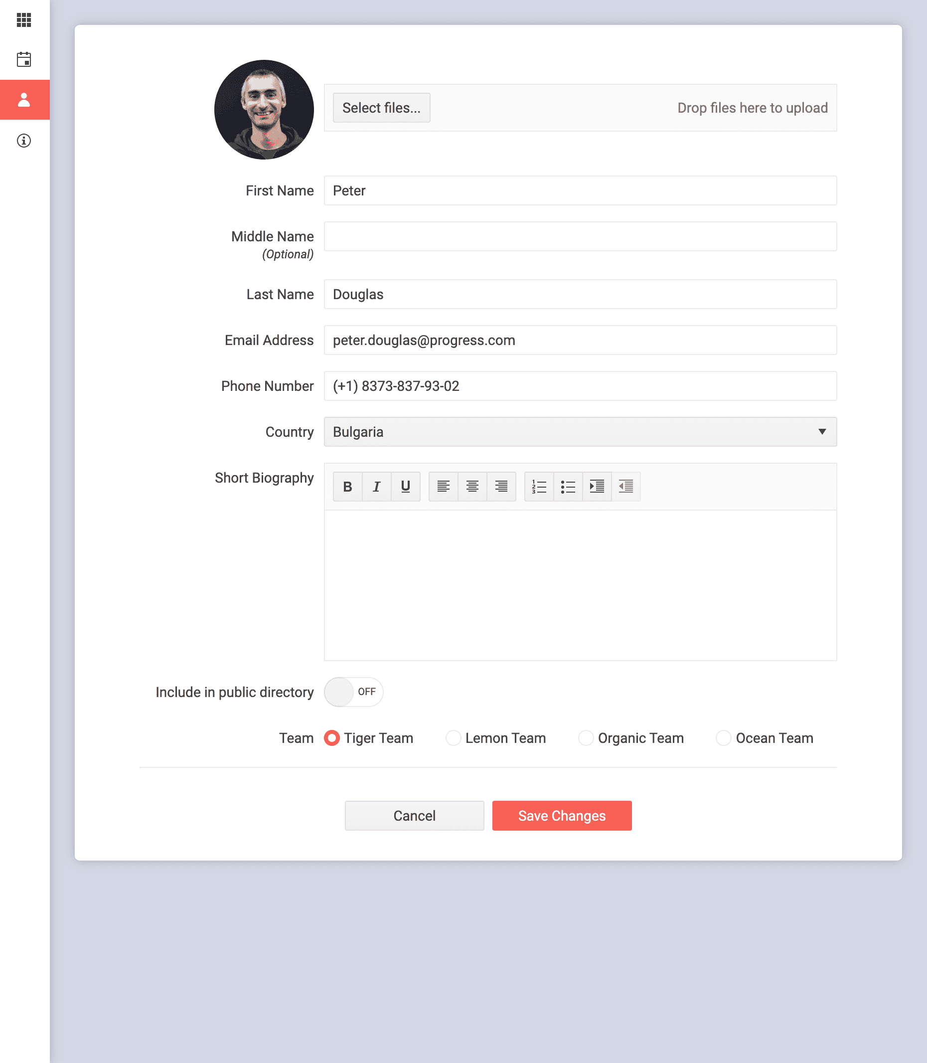
Speed Up UI Development Cycles with Matching Components
Enjoy the ready-to-use web Figma UI kits that match the Material, Bootstrap, Fluent and Default themes you get out of the box with the Telerik and Kendo UI web component libraries.
Ensure Smooth Implementation and Friendly Collaboration
Optimize iterations with a single source of truth. Thanks to the Figma UI kits, the designer knows exactly what components you will be using for your UI.
Start Crafting Your Own Design System
Nothing can stand in your way when you have a powerful UI component library and customizable Figma design kits.

Top Features


Built Following Design Best Practices
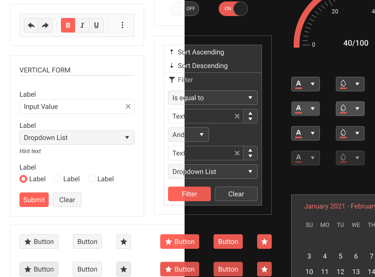
Each Figma UI kit is built with the Atomic design principle in mind, so the complex components reuse the basic ones. All variables and usage descriptions are exposed and the components are fully customizable to meet your creative needs.
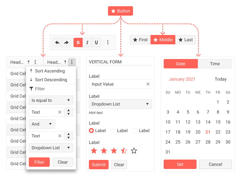
Auto-Layout
Create designs that dynamically adjust to their contents. Easily add layers, accommodate longer text strings or maintain alignment as your designs evolve.
Component Variants
Variations of the same component are grouped and organized into one. This makes components easier to maintain and more intuitive to use. You can extend with even more variants yourself!
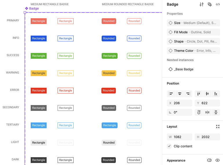
Variables
Using variables makes your design flexible, consistent and maintainable. They help you construct and maintain a design system by storing values for colors, typography, spacing, and border radius.
Light and Dark Modes
With the Figma UI kits’ built-in support for light and dark modes through Figma variables, creating light and dark swatches for your app becomes straightforward.
Part of the Telerik and Kendo UI Component Libraries
If you own a license for one of our web UI libraries (for React, Angular, Vue, jQuery, Blazor, ASP.NET Core or ASP.NET MVC), the corresponding Figma design kits are a bonus, available for free as part of each library.

Simplify UI Styling with the
Powerful ThemeBuilder
- Enjoy an intuitive visual interface for styling web UI
- Export your design files and convert Figma variables into
SASS/CSS variables - Collaborate and share projects with colleagues and customers

Learning as You Go? We Can Help.
Get started with expert content on the intersection of design and development or dive straight into the Figma UI kits documentation.
Blogs

Why Designers Should Care About Telerik and Kendo UI Component Libraries
Documentation for everyone, tools that meet you where you prefer to work, and software that makes editing, previewing, sharing and implementing design changes easier than ever before! What’s not to love?

Case Study: How Progress Uses Figma to Manage the Design Process
Ever wondered how the magic happens when it comes to designing and developing our Telerik and Kendo UI component libraries? Let’s take a look at how the component creation process works for our KendoReact team.

Figma for Developers
If you thought Figma was only for designers, think again! Figma is a powerful tool, with tons of great features for developers to take advantage of as well—plus, teams work better together when everyone has a high-level understanding of each other’s tools and priorities.
Web Figma UI Kits Documentation
.NET web
JavaScript
Tools to Help You Apply UI Customizations
We combine our UI components with front-end documentation and tools into a Design System Kit to help you satisfy your styling requirements and produce consistent UI without hassle. You and/or designers can leverage these resources:


Get in Perfect Sync with Your Designer
Smooth designer-developer collaboration is within your reach with the Figma UI Kits. Start using them today!
