Group Templates
When grouping is applied, the group rows of the Grid organize data rows into a tree structure.
For runnable examples, refer to:
- Demo on using the row template of the Grid
- Demo on using the detail-row template of the Grid
- Demo on using the toolbar template of the Grid
Group rows display group summary values and contain expanding and collapsing group icons which enable users to expand (show the child rows) and collapse (hide the child rows) a group row. The Grid provides the following templates which you can use to customize the appearance of the group rows:
GroupHeaderTemplate—Renders a template for the entire group row. Usually, the main aim is to display information about the entire group. By default, if you do not define a template, the name of the field and the current group value is displayed.- (Available as of the R3 2018 release)
GroupHeaderColumnTemplate—Renders a template in the group row aligned to the column itself. Usually, it displays an aggregate value for a specific column in the context of the current group. The template content is visually displayed as aligned to the column itself. GroupFooterTemplate—Renders a template in the group footer row that is aligned to the column. Works in a similar way to thegroupHeaderColumnTemplatefor the group footer row.
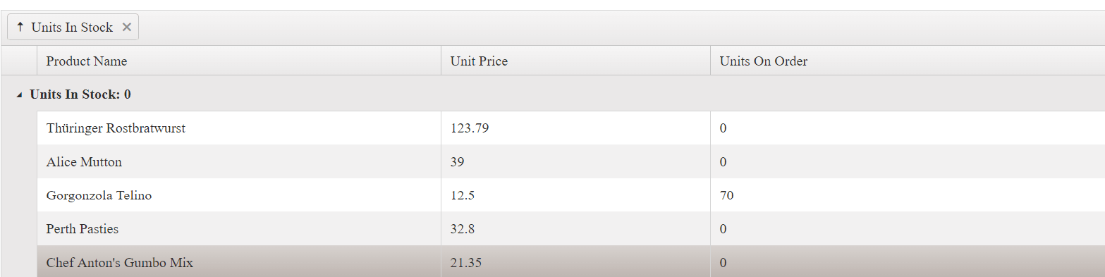
If you do not define a template, the name of the field and the current group are displayed in the following way.
Figure 1: A Grid with no group templates
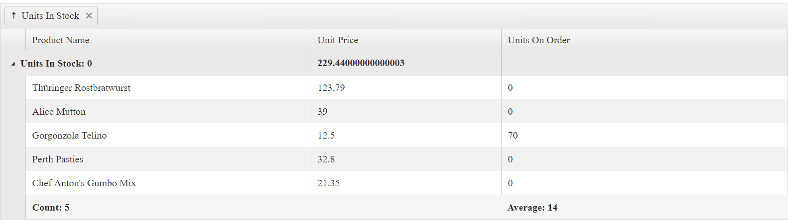
The only difference in the use of GroupHeaderTemplate is that the template content is compiled and displayed instead of the field and current group value. Both GroupHeaderColumnTemplate and GroupFooterTemplate work in a similar way. GroupHeaderColumnTemplate displays the content as aligned to the column in the group row. GroupFooterTemplate displays the content as aligned to the column in the group footer row. Their content is displayed as aligned to the column as shown in the following way.
Figure 2: A Grid with defined group header and group footer templates
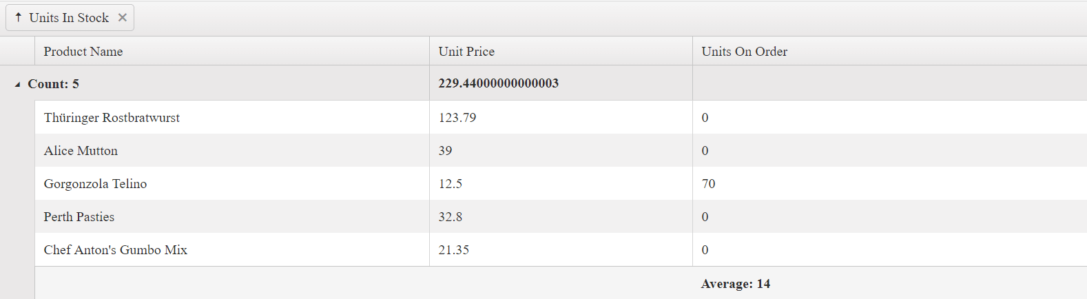
Because GroupHeaderTemplate is displayed next to the expanding icon of the group row, it takes precedence over the GroupHeaderColumnTemplate of the first visible column. To show the GroupHeaderColumnTemplate content for the first column of the Grid, do not set the GroupHeaderTemplate for the group column. The following Grid configuration demonstrates that commenting the GroupHeaderTemplate for the Units In Stock column shows the GroupHeaderColumnTemplate for the Product Name column.
    <div id="grid"></div>
    <script>
        $("#grid").kendoGrid({
            dataSource: {
                transport: {
                    read: "https://demos.telerik.com/service/v2/core/Products"
                },

                pageSize: 7,
                group: {
                            field: "UnitsInStock", aggregates: [
                            { field: "ProductName", aggregate: "count" },
                            { field: "UnitsInStock", aggregate: "min" }
                            ]
                        },

                aggregate: [ { field: "ProductName", aggregate: "count" },
                                { field: "UnitsInStock", aggregate: "min" }]
            },

            columns: [
                { field: "ProductName", title: "Product Name",
                    aggregates: ["count"],
                    groupHeaderColumnTemplate: "Count: #=count#", width: 300
                },
                { field: "UnitPrice", title: "Unit Price" },
                { field: "UnitsOnOrder", title: "Units On Order" },
                { field: "UnitsInStock", title: "Units In Stock", aggregates: ["min"],
                    //groupHeaderTemplate: "Min: #= min #", width: 500
                }
            ]
        });
    </script>
Figure 3: A Grid with a group header template applied to the first column and no group header template defined
KB Articles on Templates
- Editing Records in Child Grids
- Refreshing the Grid in the Detail Template
- Creating a Custom Editor in the Detail Template
- Find Out More in the Knowledge Base