Selection
By default, selection in the Grid is disabled.
For a runnable example, refer to the demo on selection in the Grid.
To boost the performance of the Grid when it is rendering a huge number of items and selection is enabled, use paging and a reasonable page size.
Getting Started
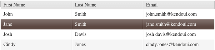
To enable the selection functionality of the Grid, set the selectable option to true. As a result, the default single-row selection functionality will be applied.
    $("#grid").kendoGrid({
        selectable: true,
        // Other configuration.
     });
Figure 1: A Grid with enabled row selection
Select Modes
The Grid supports the following select modes:
- Checkbox-column selection
- Single-row selection
- Multi-row selection
- Single-cell selection
- Multi-cell selection
- The Grid does not support the simultaneous usage of the built-in checkbox-column selection and the selection which is enabled through the
selectableoption.- To persists the selection of rows in a Grid which is re-bound, that is, when paging, filtering, sorting, editing, or virtual scrolling occur, enable the
persistSelectionproperty. To persist the row selection and avoid the usage of thepersistSelectionproperty, refer to the knowledge base article on persisting row selection during data operations.- The Grid will not scroll down as you try to select more elements that are outside of the visible view.
Checkbox-Column Selection
As of the R2 2017 SP1 release, the Grid provides an option for setting multiple selection through rendering a checkbox column. To enable the checkbox column selection, configure the columns.selectable property. Enabling the selectable property for a column will also render a checkbox in the header and will allow the selection and deselection of all rows on the current page.
$("#grid").kendoGrid({
  columns: [
    { selectable: true },
    { field: "name" }
  ],
  dataSource: [ { name: "Jane Doe" }, { name: "John Doe" } ]
});
Single-Row Selection
The single-row selection is enabled through the default configuration of the selectable option to row. selectable: "row" functions in the same way as the selectable: true one.
$("#grid").kendoGrid({
    selectable: "row",
    // Other configuration.
});
Multi-Row Selection
To enable the selection of multiple Grid rows, set selectable to multiple row. When the multiple row selection is enabled, the user can select multiple rows by dragging them.
$("#grid").kendoGrid({
  selectable: "multiple row",
  // Other configuration.
  });
Single-Cell Selection
To enable the selection of individual Grid cells, set selectable to cell.
$("#grid").kendoGrid({
    selectable: "cell",
    // Other configuration.
});
Multi-Cell Selection
To enable the selection of multiple Grid cells, set selectable to multiple cell. When the multiple cell selection is enabled, the user can select multiple cells by dragging them.
$("#grid").kendoGrid({
    selectable: "multiple cell",
    // Other configuration.
});
Ignored Elements
By default, the Grid excludes some elements from the target list so that a click on any of these elements will not result in a row selection.
The following code snippet contains all of the ignored selectors:
input,a,textarea,.k-multiselect-wrap,select,button,.k-button>span,.k-button>img,span.k-icon.k-i-arrow-60-down,span.k-icon.k-i-arrow-60-up,label.k-checkbox-label.k-no-text,.k-icon.k-i-collapse,.k-icon.k-i-expand,span.k-numeric-wrap,.k-focusableSelection on Mobile Devices
As of Kendo UI version R3 2023, the Selection functionality on mobile devices receives the following improvements:
- Multiple selection with
taptoggles the selected row or cell. - Multiple selection with the marquee tool requires
hold&slideto activate. It indicatesholdwhen selecting the row or cell.
KB Articles on Selection
- Selecting or Deselecting All Rows with a Select All Header Checkbox
- Making the Selection with a Checkbox Column
- Selecting Multiple Rows with Checkboxes
- Binding the Selection to the Model Field with a Checkbox Column
- Find Out More in the Knowledge Base