Kendo UI for jQuery DateRangePicker Overview
Updated on Dec 10, 2025
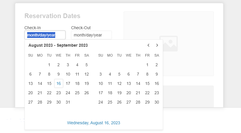
The DateRangePicker is a container for holding start and end date inputs.
It allows the user to select a date range from a calendar or through a direct input. The widget also supports custom templates for its month view, configuration options for minimum and maximum dates, a start view, and a depth for navigation. The first day of the week in the Calendar view depends on the applied culture.

Functionality and Features
- Disabled Dates—In the DateRangePicker, you can disable specific days, such as weekends and national holidays, so that they cannot be selected by the end user.
- Selected Dates—The DateRangePicker allows you to render pre-selected dates and define date ranges.
- Start View and Navigation Depth—The component allows you to change the default view.
- Calendar Types—You can use a specific calendar type out of the supported DateTimePicker ones.
- Reverse Selection—The component allows you to pick an end date which is before the start date.
- Buttons—Learn more about the buttons supported by the component.
- Automatic Correction—You can configure whether the component will autocorrect the user's input when the
minandmaxdates are set.
Next Steps
- Getting Started with the Kendo UI DateRangePicker for jQuery
- Overview of the DateRangePicker (Demo)
- Using the API of the DateRangePicker (Demo)