Kendo UI for jQuery DatePicker Overview
Updated on Dec 10, 2025
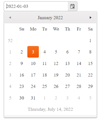
The DatePicker enables the user to select a date from a calendar or through a direct input.
 Start Free Trial
It provides options for using custom templates for its Month view, setting minimum and maximum dates, a start view, and a depth for navigation.
Functionality and Features
| Feature | Definition |
|---|---|
| Disabled dates | In the DatePicker, you can disable specific days, such as weekends and national holidays, so that they cannot be selected by the end user. |
| Selected dates | The DatePicker allows you to render pre-selected dates and define date ranges. |
| Start View and Navigation Depth | You can set the initial DatePicker view and define the view depth to which the user can navigate. |
| Input value validation | While, by design, the DatePicker keeps its input value unchanged, it still provides options for you to utilize a client-validation framework and render prompt error messages. |
| Calendar types | Even though the DatePicker supports only the Gregorian calendar by default, you can still simulate other calendar types such as Lunar. |
| Week number column | The DatePicker enables you to display a column with the number of weeks within the current Month view. |
| DateInput integration | You can smoothly integrate the DatePicker with the Kendo UI for jQuery DateInput control for its displayed input element. |
| Templates | The DatePicker supports the implementation of templates which enable you to customize its elements such as cells, footer, and week column. |
| Automatic Correction | You can configure whether the component will autocorrect the user's input when the min and max dates are set. |
| Globalization | The DatePicker supports globalization to ensure that it can fit well in any application, no matter what languages and locales need to be supported. Additionally, the DatePicker supports rendering in a right-to-left (RTL) direction. |
| Accessibility | The DatePicker is accessible for screen readers, supports WAI-ARIA attributes, and delivers keyboard shortcuts for faster navigation. |
Next Steps
- Getting Started with the Kendo UI DatePicker for jQuery
- Basic Usage of the DatePicker (Demo)
- Basic Events in the DatePicker (Demo)