
Hi All:
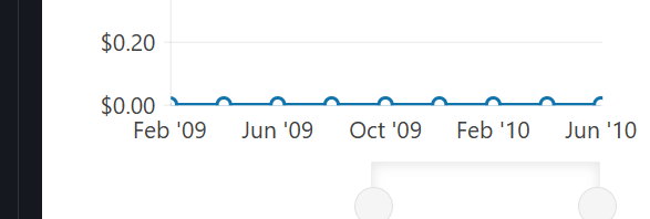
When using the Kendo UI Chart, data points with a value of 0 are getting obscured by the X-axis (category axis). Although I tried setting the
I am facing an issue where data points with a value of 0 are being obscured by the X-axis category labels in Kendo React Charts. I tried setting custom min and max values for the ChartCategoryAxisItem, but this causes the data to be displayed in a flattened manner. Is there a recommended solution to prevent this overlap or display the data points clearly without affecting the overall chart appearance? Thanks in advance!!

Oqvxwbhd (forked) - StackBlitz
When using the Kendo UI Chart, data points with a value of 0 are getting obscured by the X-axis (category axis). Although I tried setting the
min property on ChartCategoryAxisItem to adjust the axis' minimum value (e.g., starting from a negative number), the axis labels do not appear correctly at the specified min value. Instead, they still start from the actual minimum value of the data. As a result, data points with a value of 0 are obscured, which affects the readability and presentation of the chart.I am facing an issue where data points with a value of 0 are being obscured by the X-axis category labels in Kendo React Charts. I tried setting custom min and max values for the ChartCategoryAxisItem, but this causes the data to be displayed in a flattened manner. Is there a recommended solution to prevent this overlap or display the data points clearly without affecting the overall chart appearance? Thanks in advance!!
Oqvxwbhd (forked) - StackBlitz
