I need to know which classes apply to the panelbar. The Theme builder is not clear about what CSS effect what controls
I have a menu that looks fine when I select a menu item Appointment Scheduling Summary
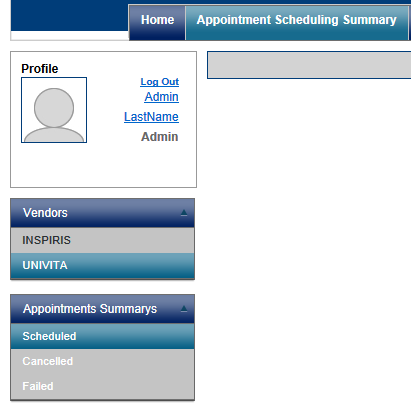
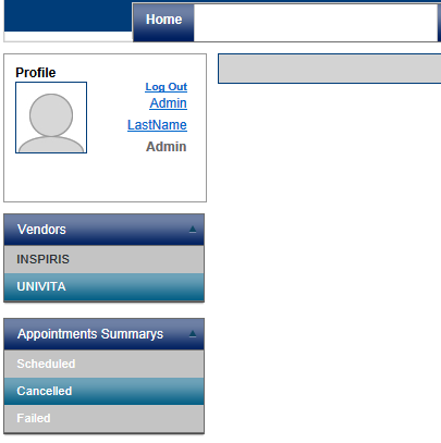
But when I select Cancelled the page refreshes and the menu does this:
What CSS property sets the menu background to transparent or white? I cannot find it and the Theme Builder is confusing at best.
Where is the documentation for each control in the Kendo UI Suite for the web so I can quickly find what classes effect what controls?
I have a menu that looks fine when I select a menu item Appointment Scheduling Summary
But when I select Cancelled the page refreshes and the menu does this:
What CSS property sets the menu background to transparent or white? I cannot find it and the Theme Builder is confusing at best.
Where is the documentation for each control in the Kendo UI Suite for the web so I can quickly find what classes effect what controls?
7 Answers, 1 is accepted
0
Accepted


Hello Eric,
The Kendo UI widgets share a lot of CSS classes and behave consistently in several ways. The following article provides some more information about this:
http://docs.kendoui.com/getting-started/web/appearance-styling
The base PanelBar HTML output is the following:
The <li> items receive a k-state-active class when expanded.
The <li>'s child element (which can be a <span> or an <a>) receives a k-state-hover class when hovered.
The HTML output and CSS classes of the Menu is almost identical to the PanelBar. The notable differences are:
1. The k-state-hovered class is applied to the item's <li> element.
Depending on the specific combination of default / active / hovered / selected text and background color styles, it is possible to observe same-color text and background. The order of the CSS rules also makes a difference in some cases.
When unexpected behavior occurs, it is advisable to inspect the problematic elements with Firebug or a similar tool and make the required fine tuning by overriding the offending CSS styles with ones of higher specificity.
All the best,
Dimo
the Telerik team
The Kendo UI widgets share a lot of CSS classes and behave consistently in several ways. The following article provides some more information about this:
http://docs.kendoui.com/getting-started/web/appearance-styling
The base PanelBar HTML output is the following:
<ul class="k-widget k-reset k-header k-panelbar"> <li class="k-item k-state-default"> <span class="k-link k-header"> Root Item <span class="k-icon k-i-arrow-s k-panelbar-expand"></span> </span> <ul class="k-group k-panel"> <li class="k-item k-state-default"><span class="k-link">sub item</span></li> </ul> </li></ul>The <li> items receive a k-state-active class when expanded.
The <li>'s child element (which can be a <span> or an <a>) receives a k-state-hover class when hovered.
The HTML output and CSS classes of the Menu is almost identical to the PanelBar. The notable differences are:
1. The k-state-hovered class is applied to the item's <li> element.
2. When the Menu highlights the current page, it uses a k-state-selected class for the corresponding <li> element.
Depending on the specific combination of default / active / hovered / selected text and background color styles, it is possible to observe same-color text and background. The order of the CSS rules also makes a difference in some cases.
When unexpected behavior occurs, it is advisable to inspect the problematic elements with Firebug or a similar tool and make the required fine tuning by overriding the offending CSS styles with ones of higher specificity.
All the best,
Dimo
the Telerik team
Join us on our journey to create the world's most complete HTML 5 UI Framework - download Kendo UI now!
0

Eric
Top achievements
 Rank 1
Rank 1
answered on 16 Jan 2013, 06:56 PM
I couldn't find it because it uses
.t-state-active
not
.k-state-active 0
Accepted
Hi Eric,
This is the Kendo UI forum, so my instructions were relevant to the Kendo UI widgets.
Greetings,
Dimo
the Telerik team
This is the Kendo UI forum, so my instructions were relevant to the Kendo UI widgets.
Greetings,
Dimo
the Telerik team
Join us on our journey to create the world's most complete HTML 5 UI Framework - download Kendo UI now!
0
Eric
Top achievements
Rank 1
Rank 1
answered on 17 Jan 2013, 01:29 PM
That's why I was confused. The Kendo PanelBar is using .t-state-active
See attached file
See attached file
0
Hi Eric,
This class cannot be set by the widget, it is probably added manually.
Regards,
Dimo
the Telerik team
This class cannot be set by the widget, it is probably added manually.
Regards,
Dimo
the Telerik team
Join us on our journey to create the world's most complete HTML 5 UI Framework - download Kendo UI now!
0
Eric
Top achievements
Rank 1
Rank 1
answered on 17 Jan 2013, 02:14 PM
Nope.
I'm the only developer working on this and I don't manually add anything regarding CSS for Telerik controls.
The widget is doing this. The class gets added when you click the widget.
Our _layout page does have references to the telerik.common.css and telerik.webblue.css because we use both types of controls. Kendo and Telerik MVC.
But that doesn't explain why the Kendo widget would pull in a MVC CSS class.
0
Hi Eric,
I suggest you to run a full text search in yoru application and find all occurrences of t-state-active. Theoretically, it is possible that this class been used by mistake in the past, but now this is surely not the case.
Greetings,
Dimo
the Telerik team
I suggest you to run a full text search in yoru application and find all occurrences of t-state-active. Theoretically, it is possible that this class been used by mistake in the past, but now this is surely not the case.
Greetings,
Dimo
the Telerik team
Join us on our journey to create the world's most complete HTML 5 UI Framework - download Kendo UI now!