
 Rank 2
14 Answers, 1 is accepted


You could try setting the ControlTemplate property to the TabViewHeaderItem. This will help you customize the header items. Here is a sample ControlTemplate from our QSF examples:
<telerikPrimitives:TabViewHeaderItem Text="{Binding Name}" ControlTemplate="{StaticResource iconControlTemplate}" /><ControlTemplate x:Key="iconControlTemplate"> <Grid BackgroundColor="Transparent" RowSpacing="0"> <Grid.RowDefinitions> <RowDefinition Height="Auto" /> <RowDefinition Height="Auto" /> </Grid.RowDefinitions> <Image Source="{Binding Icon, Converter={StaticResource uwpImageSourceConverter}}" HorizontalOptions="Center" VerticalOptions="Center" WidthRequest="16" HeightRequest="16" Margin="0, 4, 0, 6" /> <Label Grid.Row="1" Text="{TemplateBinding Text}" TextColor="{TemplateBinding IsSelected, Converter={StaticResource booleanAccentConverter}}" FontSize="10" HorizontalTextAlignment="Center" Margin="0, 0, 0, 6" /> </Grid> </ControlTemplate>You could download the QSF applications in the Android and iOS stores. It is called "Progress Telerik UI for Xamarin Examples".
Regards,
Nikolay Demirev
Telerik by Progress
Rank 2
I have that app installed on my Droid device and it has some nice examples, but I didn't notice this.
Also, I am mainly working from the sample Visual Studio Solution that gets installed with the product and I find going through that code to be most helpful. However, the examples in that code do not show this at all.
Furthermore, this is not documented anywhere.
I realize this is a new control, but I have used Telerik since its early days and have continued to use it for the document and support. So hopefully the documentation for Xamarin will be up-to-date soon?
I am still deciding whether to upgrade to your Ultimate subscription based solely on the Xamarin controls. I like what I see, but am really struggling with the lack of documentation and examples. Meaning that the time the controls typically save me is being eaten away as I browse properties, code in JustDecompile, etc.
Thank you for your feedback. It is greatly appreciated. We will consider it while making improvements on our help articles. We are constantly working on improving our products and their documentation.
The example I suggested is not the best, as it has that indicator bar removed. Excuse me for misleading you. I wanted to show you that the entire content of the headers can be customized. If you want you could place a BoxView in the ControlTemplate, which you could show and hide in order to achieve that indicator effect.
In the same example, you could find the ControlTemplate for the items on the top of the TabView, which have that type of indicator. Here is the ControlTemplate code:
<ControlTemplate x:Key="orangeControlTemplate"> <Grid BackgroundColor="Transparent"> <BoxView IsVisible="{TemplateBinding IsSelected}" BackgroundColor="{StaticResource orange}" VerticalOptions="End" HeightRequest="2" /> <Label Text="{TemplateBinding Text}" TextColor="{TemplateBinding IsSelected, Converter={StaticResource booleanOrangeConverter}}" HorizontalTextAlignment="Center" Margin="0, 0, 0, 8" /> </Grid></ControlTemplate>Regards,
Nikolay Demirev
Telerik by Progress

 Rank 1

You can learn how to make a ControlTemplate in C# here in the Xamarin.Forms documentation, as this is not a Telerik specific-implementation (it's a general Xamarin.Forms topic).
Once you have a ControlTemplate class in your project, you can then add the children in the constructor. Here's the C# code for Nikolay's XAML in the CTOR of an example ControlTemplate class
public class OrangeTemplate : Grid { public OrangeTemplate() { // 1- Create the elements (note "this' is the root Grid) this.BackgroundColor = Color.Transparent; // the BoxView var bv = new BoxView { BackgroundColor = (Color) Application.Current.Resources["orange"], HeightRequest = 2, VerticalOptions = LayoutOptions.End }; bv.SetBinding(IsVisibleProperty, new TemplateBinding("IsSelected")); // the Label var label = new Label { HorizontalTextAlignment = TextAlignment.Center, Margin = new Thickness(0, 0, 0, 8) }; label.SetBinding(Label.TextProperty, new TemplateBinding("Text")); label.SetBinding(Label.TextColorProperty, new TemplateBinding("IsSelected", BindingMode.Default, (IValueConverter)Application.Current.Resources["orangeBooleanConverter"])); // 2 - Add the children this.Children.Add(bv); this.Children.Add(label); } }An important note: The code above expects two StaticResources to be avaiable ("orange" and "orangeBooleanConverter"), which you would need to have or you'll get an exception.
Otherwise, set the colors and converter instance in C#:
// converter instance instead of resourcelabel.SetBinding(Label.TextColorProperty, new TemplateBinding("IsSelected", BindingMode.Default, new OrangeBooleanConverter()));// using a color instead of resourceBackgroundColor = Color.Orange,Telerik specific implementation
With your ControlTemplate defined, you just do the following to use it:
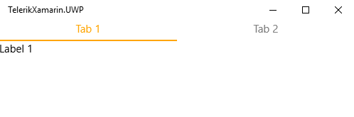
var tb = new TabViewHeaderItem();tb.ControlTemplate = new ControlTemplate(typeof(OrangeTemplate));Here's a complete implementation using those headers:
MyTabView.Items.Add(new TabViewItem{ Content = new Label { Text = "Label 1" }, Header = new TabViewHeaderItem { ControlTemplate = new ControlTemplate(typeof(OrangeTemplate)), Text = "Tab 1" }});MyTabView.Items.Add(new TabViewItem{ Content = new Label { Text = "Label 2" }, Header = new TabViewHeaderItem { ControlTemplate = new ControlTemplate(typeof(OrangeTemplate)), Text = "Tab 2" }});Here's the result at runtime:
Regards,
Lance | Tech Support Engineer, Sr.
Progress Telerik
Rank 1
Thank you Lance, i'm trying to implement your code but i'm missing this part:
new OrangeBooleanConverter()
Can you guide me what should go in that class ?
That converter belongs to Brian's project (the OP of this thread), it's just an IValueConverterthat returns one color if it's true or another color if it's false. You'll need to implement your own that meets your needs.
If you're not familiar with creating an implementation of IValueConverter, its just a class that takes one object value and returns a different one. Value converters are common across all XAML frameworks (WPF, UWP, Xamarin, Silverlight, etc).
Here's the basic structure of a value converter, to demonstrate how it works I'm converting a bool to a string message:
public class SomeBoolToStringConverter : IValueConverter{ public object Convert(object value, Type targetType, object parameter, CultureInfo culture) { // Step 1 - 'value' is the incoming type, so you'll want to cast it. In this example, it's a bool var originalBoolValue = (bool)value; // Step 2 - do some work to create the object you want to return, in this example, it's a string string returnableObject = ""; if (originalBoolValue) returnableObject = "incoming value was true"; else returnableObject = "incoming value was false"; // Step 3 - Return the new "converted" object, in this example, it's just a string return returnableObject; } public object ConvertBack(object value, Type targetType, object parameter, CultureInfo culture) { // do the opposite here. cast to a string and return a bool throw new NotImplementedException(); }}In the case of setting the header color using the IsSelected value, you want to create a converter that 'converts' a bool object to a Color object.
A primary goal of writing code is to be efficient as much as possible. With this in mind, you can write a single BoolToColorConverter that can use any color instead of a OrangeBooleanConverter that only returns orange.
To do this, just add a couple properties to the converter class that allows you to set the color for true and the color for false.
public class BoolToColorConverter : IValueConverter{ // Expose a couple color properties and set some default values public Color SelectedColor { get; set; } = Color.Red; public Color UnselectedColor { get; set; } = Color.Black; public object Convert(object value, Type targetType, object parameter, CultureInfo culture) { // Then return the SelectedColorif the incoming bool value is true return (bool)value ? SelectedColor : UnselectedColor; } public object ConvertBack(object value, Type targetType, object parameter, CultureInfo culture) { throw new NotImplementedException(); }}Now you can use it like this this in place of OrangeBooleanConverter:
label.SetBinding(Label.TextColorProperty, new TemplateBinding("IsSelected", BindingMode.Default, new BoolToColorConverter { SelectedColor = Color.Green, UnselectedColor = Color.Black }));Notice how I was able to set the color green when instantiating the converter instead of being stuck with a hard coded color in a converter class itself.
Regards,
Lance | Tech Support Engineer, Sr.
Progress Telerik
Rank 1
Rank 1
Hi,
Thank you again for the previous explanation, i'm looking for a upgrade to that solution. is it possible to also customize the background colors of the tabheader as happens with the textcolor?
Yes, you can since you have full control over the UI element itself. Let's revisit the actual custom template itself.
There's a class named OrangeTabItemHeaderTemplate and it inherits from Grid.
public class OrangeTabItemHeaderTemplate : Grid { public OrangeTabItemHeaderTemplate() { // 1- Create the elements (note "this' is the root Grid) this.BackgroundColor = Color.Transparent; // the BoxView var bv = new BoxView { HeightRequest = 2, VerticalOptions = LayoutOptions.End }; bv.SetBinding(IsVisibleProperty, new TemplateBinding("IsSelected")); bv.SetBinding( BackgroundColorProperty, new TemplateBinding( "IsSelected", BindingMode.Default, new BoolToColorConverter { SelectedColor = Color.Green, UnselectedColor = Color.Black })); // the Label var label = new Label { HorizontalTextAlignment = TextAlignment.Center, Margin = new Thickness(0, 0, 0, 8) }; label.SetBinding( Label.TextColorProperty, new TemplateBinding( "IsSelected", BindingMode.Default, new BoolToColorConverter { SelectedColor = Color.Green, UnselectedColor = Color.Black })); label.SetBinding(Label.TextProperty, new TemplateBinding("Text")); // 2 - Add the children this.Children.Add(bv); this.Children.Add(label); }}If yo notice, it is hard coding it's background to Transparent! You can take the same approach you did for the BoxView's background.
To demonstrate, let's replace the hard coded BackgroundColor with a Binding:
// NOTE - "this" is the root Grid of the custom header// Commenting this out so we can set a binding for BackgroundColor instead// this.BackgroundColor = Color.Transparent;// NEW - We're now binding BackgroundColor to IsSelectedthis.SetBinding(BackgroundColorProperty, new TemplateBinding("IsSelected", BindingMode.Default, new BoolToColorConverter { SelectedColor = Color.Transparent, UnselectedColor = Color.Green }));Now, you'll see that when a tab is selected, the background color wil be Transparent and the Text will be Gree, and when it's not selected the background color is Green
Regards,
Lance | Tech Support Engineer, Sr.
Progress Telerik
Rank 1
Hi Lance,
I Implemented that solution but the tabs are now disabled, the selection action is missing.
I tested it on my end, it works as expected. However, I can see why a user would think selection is disabled.
Essentially the color makes it appear like the selected item is not the selected it. Thus when attempting to select the tab, it doesn't do anything because it is already selected.
To explain this better, I've recorded this 30 second video for you.
If this isn't the case, I'll need to reproduce your problem on my end. Please reply back with the code I need:
- The classes involved (converter, custom template)
- The view (the TabView and the added items)
With this I'll attempt to reproduce and see what the issue might be.
Regards,
Lance | Tech Support Engineer, Sr.
Progress Telerik
Rank 1
Hi Lance,
I expected that works exactly like in your video but isn't. This is exactly how i'm making it.
using System;
using System.Collections.Generic;
using System.Globalization;
using System.Linq;
using System.Text;
using Telerik.XamarinForms.Primitives;
using Xamarin.Forms;
namespace TelerikXamarin.Portable
{
public class TabPage : ContentPage
{
public TabPage()
{
RadTabView MyTabView = new RadTabView();
MyTabView.Items.Add(new TabViewItem
{
Content = new Label { Text = "Label 1" },
Header = new TabViewHeaderItem
{
ControlTemplate = new ControlTemplate(typeof(OrangeTemplate)),
Text = "Tab 1"
}
});
MyTabView.Items.Add(new TabViewItem
{
Content = new Label { Text = "Label 2" },
Header = new TabViewHeaderItem
{
ControlTemplate = new ControlTemplate(typeof(OrangeTemplate)),
Text = "Tab 2"
}
});
Content = MyTabView;
//Content = new StackLayout
//{
// Children = {
// new Label { Text = "Welcome to Xamarin Forms!" }
// }
//};
}
}
public class OrangeTemplate : Grid
{
public OrangeTemplate()
{
// 1- Create the elements (note "this' is the root Grid)
//this.BackgroundColor = Color.Transparent;
this.SetBinding(BackgroundColorProperty,
new TemplateBinding("IsSelected", BindingMode.Default,
new BoolToColorConverter
{
SelectedColor = Color.Transparent,
UnselectedColor = Color.Green
}));
// the BoxView
var bv = new BoxView
{
BackgroundColor = Color.Orange,
HeightRequest = 2,
VerticalOptions = LayoutOptions.End
};
bv.SetBinding(IsVisibleProperty, new TemplateBinding("IsSelected"));
// the Label
var label = new Label
{
HorizontalTextAlignment = TextAlignment.Center,
Margin = new Thickness(0, 0, 0, 8)
};
label.SetBinding(Label.TextProperty, new TemplateBinding("Text"));
label.SetBinding(Label.TextColorProperty, new TemplateBinding("IsSelected", BindingMode.Default, new BoolToColorConverter { SelectedColor = Color.Green, UnselectedColor = Color.Black }));
// 2 - Add the children
this.Children.Add(bv);
this.Children.Add(label);
}
public class BoolToColorConverter : IValueConverter
{
// Expose a couple color properties and set some default values
public Color SelectedColor { get; set; } = Color.Red;
public Color UnselectedColor { get; set; } = Color.Black;
public object Convert(object value, Type targetType, object parameter, CultureInfo culture)
{
// Then return the SelectedColorif the incoming bool value is true
return (bool)value ? SelectedColor : UnselectedColor;
}
public object ConvertBack(object value, Type targetType, object parameter, CultureInfo culture)
{
throw new NotImplementedException();
}
}
}
}
I was not able to replicate the problem using your code. I've attached the investigative application, in which I only used your code. The only difference is I renamed the class to be more appropriate (CustomTabViewHeader.cs).
Your issue must be related to another element on the page or maybe you're not running the latest version which has the latest improvements and fixes (although I don't see any bug fixed for tab header not working in the release history).
Is this on a particular device or across all platforms? Can you update the demo so that it replicates the issue and send me back the demo so I can investigate further.
Lastly, I recommend creating a new ticket or forum thread for this as the original thread created by Brian is no longer relevant to your issue.
Regards,
Lance | Tech Support Engineer, Sr.
Progress Telerik