9 Answers, 1 is accepted

 Rank 1
Hello,
I was able to render the Date editor editor as image attached using the below layout and custom renderer :
<?xml version="1.0" encoding="utf-8"?>
<RelativeLayout xmlns:android="http://schemas.android.com/apk/res/android"
android:layout_width="match_parent"
android:layout_height="wrap_content">
<FrameLayout
android:id="@+id/data_form_header_container"
android:layout_gravity="center_vertical"
android:layout_width="match_parent"
android:layout_marginLeft="12dp"
android:textColor ="#000000"
android:layout_height="20dp"
/>
<RelativeLayout
android:layout_width="match_parent"
android:layout_height="wrap_content"
android:id="@+id/rl_date"
android:layout_margin="16dp"
android:background="#242D3C"
android:layout_below="@id/data_form_header_container"
>
<FrameLayout
android:id="@+id/data_form_editor_container"
android:layout_width="match_parent"
android:layout_marginLeft="12dp"
android:textColor ="#ffffff"
android:layout_height="44dp" />
<View
android:id="@+id/divider"
android:layout_width="5dp"
android:layout_height="match_parent"
android:background="#FF0000"
android:layout_toLeftOf ="@id/data_form_editor_image"/>
<ImageView
android:id="@+id/data_form_editor_image"
android:visibility="gone"
android:layout_width="20dp"
android:layout_height="20dp"
android:layout_centerVertical="true"
android:layout_alignParentRight="true" />
<ImageView
android:id="@+id/data_form_validation_icon"
android:visibility="gone"
android:layout_width="0dp"
android:layout_height="0dp" />
</RelativeLayout>
<FrameLayout
android:id="@+id/data_form_validation_container"
android:layout_width="match_parent"
android:layout_height="wrap_content"
android:layout_below="@id/rl_date"
/>
</RelativeLayout>
How ever still i would like to make the editor heading "Bold" and change the colour of text in editor. Please help how can i achieve that. PFA.
Rank 1
Again I am able to change the colour of text in editors using below code :
But again how can i make the editor headers BOLD
protected override void UpdateEditor(EntityPropertyEditor editor, Telerik.XamarinForms.Input.DataForm.IEntityProperty property) { base.UpdateEditor(editor, property); if (editor.Property().Name() == "ReservationDate") { var autoComplete = editor.EditorView as Android.Widget.TextView; autoComplete.Background = null; autoComplete.SetTextColor(Android.Graphics.Color.White); } }


The only properties we currently support for styling are seen here via the Editors Styling properties we expose through the Xamarin Forms API.
The other elements can only be styled using customer renderers on the native platform. Customer renderer and custom native platform styling falls outside the scope of support as it is not an exposed feature of the control. I have submitted a feedback request on your behalf for the native control to expose more features for styling.
In the meantime, if this is an immediate must-have for you, we have professional services partners who specialize in custom design and custom feature development. If you'd like to be introduced to one to discuss contracting them, fill out the form here and I'll make sure someone reaches out to you as soon as possible.
Regards,
Lance | Tech Support Engineer, Sr.
Progress Telerik
Rank 1
We do understand the limitations the currently available APIs present. More styling options for the RadDataForm is one of the highest requested feedback items for the RadDataForm and rest assured the dev team has it on high priority for future releases. At this time, those are all the options available to style the editors from XamarinForms.
In particular, we have this feature request in the Feedback Portal that would allow you to use your own editor in a template using a Xamarin.Forms template instead of the native control. This would give you full control over the appearance of the editor from the PCL.
Alternatively, you can always style the low-level controls and UI elements, but that's outside the scope of the suite of controls and is up to you to implement.
If there is anything else you'd like to see the development team implement, please add it to the Feedback Portal, the team uses it to prioritize what is worked on next and gets implemented ahead of other feature requests.
Regards,
Lance | Tech Support Engineer, Sr.
Progress Telerik
Rank 1
We do have documentation here that shows you how to set the elements of the native control's (e.g. reused header via the HeaderView property). I do understand what you're asking, but there just isn't just isn't an option to edit the header from Xamarin.Forms via a style class yet. Therefore it's up to you to design and layout the Android Layout.
You'll find all of the currently available documentation for the native controls under the "Native Controls Wrappers" node there. If there's something else missing you'd like to see (in addition to the header styling topic), please don't hesitate to add it to the UI for Xamarin Feedback Portal.
Regards,
Lance | Tech Support Engineer, Sr.
Progress Telerik
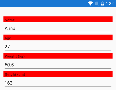
Although it is out of scope, I've gone ahead and written an approach using the Xamairn.Android TextView API on the HeaderView to point you in the right direction.
Here's the code I used in my custom renderer's UpdateEditor method:
protected override void UpdateEditor(EntityPropertyEditor editor, IEntityProperty property){ base.UpdateEditor(editor, property); if (editor.HeaderView is TextView textView) { textView.SetBackgroundColor(Color.ParseColor("#FFFF0000")); textView.SetTypeface(Typeface.Serif, TypefaceStyle.Bold); }}This is using the normal Xamarin.Android API's TextView.SetTypeFace method and not a styling feature of RadDataForm. You're directly editing the native TextView used by the native RadDataForm.
Here is the result at runtime:
I hope this helps you get closer to your goals.
Regards,
Lance | Tech Support Engineer, Sr.
Progress Telerik
Rank 1