9 Answers, 1 is accepted
0


Hello Bill,
You can accomplish this by using the CellDecorationStyleSelector property of the DataGrid Column(s).
Demo
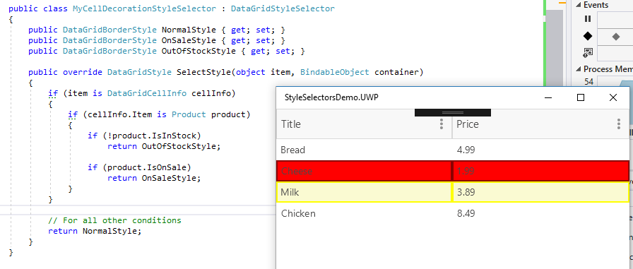
Here's is the result of the approach at runtime, the yellow style is when the item is on sale and the red style is when it's out of stock:
Code
View:
Data model:
View model
and finally the selector class:
Wrapping Up
You can see more in the DataGrid "Customization Example" demo. You can browse the code on GitHub here or if you've installed UI for Xamarin to the default location, you'll find the demo at the following location:
C:\Program Files (x86)\Progress\Telerik UI for Xamarin R1 2018\QSF\QSF\Examples\DataGridControl\CustomizationExample
I hope I was able answer your question, if I have be sure to mark the post as such so that other visitors looking for the same thing can easily find it.
Let me know if you have any additional questions.
Regards,
Lance | Tech Support Engineer, Sr.
Progress Telerik
You can accomplish this by using the CellDecorationStyleSelector property of the DataGrid Column(s).
Demo
Here's is the result of the approach at runtime, the yellow style is when the item is on sale and the red style is when it's out of stock:
Code
View:
<?xml version="1.0" encoding="utf-8" ?><ContentPage ...> <ContentPage.BindingContext> <local:ViewModel /> </ContentPage.BindingContext> <ContentPage.Resources> <ResourceDictionary> <local:MyCellDecorationStyleSelector x:Key="MyStyleSelector"> <local:MyCellDecorationStyleSelector.NormalStyle> <dataGrid:DataGridBorderStyle BackgroundColor="White" BorderColor="Transparent" BorderThickness="0" /> </local:MyCellDecorationStyleSelector.NormalStyle> <local:MyCellDecorationStyleSelector.OnSaleStyle> <dataGrid:DataGridBorderStyle BackgroundColor="LightGoldenrodYellow" BorderColor="Yellow" BorderThickness="2" /> </local:MyCellDecorationStyleSelector.OnSaleStyle> <local:MyCellDecorationStyleSelector.OutOfStockStyle> <dataGrid:DataGridBorderStyle BackgroundColor="Red" BorderColor="DarkRed" BorderThickness="2" /> </local:MyCellDecorationStyleSelector.OutOfStockStyle> </local:MyCellDecorationStyleSelector> </ResourceDictionary> </ContentPage.Resources> <dataGrid:RadDataGrid x:Name="DataGrid" ItemsSource="{Binding Products}" AutoGenerateColumns="False"> <dataGrid:RadDataGrid.Columns> <dataGrid:DataGridTextColumn PropertyName="Title" CellDecorationStyleSelector="{StaticResource MyStyleSelector}" /> <dataGrid:DataGridNumericalColumn PropertyName="Price" CellDecorationStyleSelector="{StaticResource MyStyleSelector}" /> </dataGrid:RadDataGrid.Columns> </dataGrid:RadDataGrid></ContentPage>Data model:
public class Product{ public string Title { get; set; } public double Price { get; set; } public bool IsInStock { get; set; } public bool IsOnSale { get; set; }}View model
public class ViewModel : NotifyPropertyChangedBase{ public ViewModel() { Products.Add(new Product { Title = "Bread", Price = 4.99, IsInStock = true, IsOnSale = false}); Products.Add(new Product { Title = "Cheese", Price = 1.99, IsInStock = false, IsOnSale = false}); Products.Add(new Product { Title = "Milk", Price = 3.89, IsInStock = true, IsOnSale = true}); Products.Add(new Product { Title = "Chicken", Price = 8.49, IsInStock = true, IsOnSale = false}); } public ObservableItemCollection<Product> Products { get; set; } = new ObservableItemCollection<Product>();}and finally the selector class:
public class MyCellDecorationStyleSelector : DataGridStyleSelector{ public DataGridBorderStyle NormalStyle { get; set; } public DataGridBorderStyle OnSaleStyle { get; set; } public DataGridBorderStyle OutOfStockStyle { get; set; } public override DataGridStyle SelectStyle(object item, BindableObject container) { if (item is DataGridCellInfo cellInfo) { if (cellInfo.Item is Product product) { if (!product.IsInStock) return OutOfStockStyle; if (product.IsOnSale) return OnSaleStyle; } } // For all other conditions return NormalStyle; }}Wrapping Up
You can see more in the DataGrid "Customization Example" demo. You can browse the code on GitHub here or if you've installed UI for Xamarin to the default location, you'll find the demo at the following location:
C:\Program Files (x86)\Progress\Telerik UI for Xamarin R1 2018\QSF\QSF\Examples\DataGridControl\CustomizationExample
I hope I was able answer your question, if I have be sure to mark the post as such so that other visitors looking for the same thing can easily find it.
Let me know if you have any additional questions.
Regards,
Lance | Tech Support Engineer, Sr.
Progress Telerik
Do you want to have your say when we set our development plans?
Do you want to know when a feature you care about is added or when a bug fixed?
Explore the
Telerik Feedback Portal
and vote to affect the priority of the items
0

Bill
Top achievements
 Rank 1
Rank 1
answered on 07 Feb 2018, 04:51 PM
Thanks, that info is useful for changing background colours. However, I couldn't work out how to hide all the column headers. Is that possible?
0
Hello Bill,
My apologies, I missed that. Your first question asks if you can hide the column itself, yes you can set the column's IsVisible="False".
As far as the headers go, you can hide the text of the header by setting the HeaderText to an empty string or having an empty HeaderContentTemplate, but you can't completely remove the header.
If you want to disable the column's user Sorting, Grouping and Filtering options, you can do so as well with the CanUserSort, CanUserFilter and CanUserGroup properties
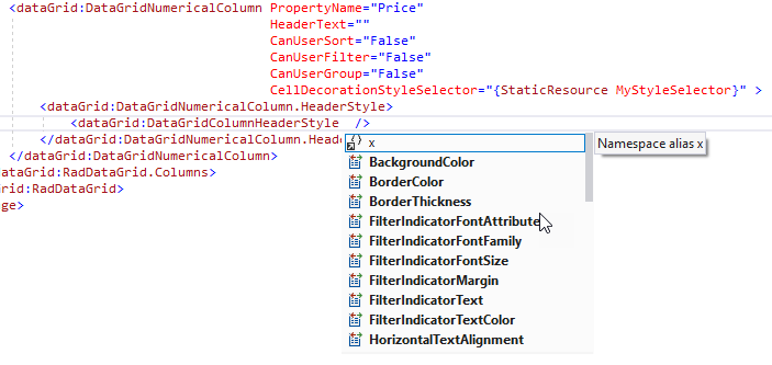
You also have additional control over the header's, and its elements', appearance using the HeaderStyle:
Regards,
Lance | Tech Support Engineer, Sr.
Progress Telerik
My apologies, I missed that. Your first question asks if you can hide the column itself, yes you can set the column's IsVisible="False".
As far as the headers go, you can hide the text of the header by setting the HeaderText to an empty string or having an empty HeaderContentTemplate, but you can't completely remove the header.
If you want to disable the column's user Sorting, Grouping and Filtering options, you can do so as well with the CanUserSort, CanUserFilter and CanUserGroup properties
You also have additional control over the header's, and its elements', appearance using the HeaderStyle:
Regards,
Lance | Tech Support Engineer, Sr.
Progress Telerik
Do you want to have your say when we set our development plans?
Do you want to know when a feature you care about is added or when a bug fixed?
Explore the
Telerik Feedback Portal
and vote to affect the priority of the items
0
Bill
Top achievements
Rank 1
Rank 1
answered on 08 Feb 2018, 10:34 AM
I tried the following, however, I get the error "Can not set the content of telerikDataGrid:DataGridTextColumn as it doesn't have a ContentPropertyAttribute":
<telerikDataGrid:RadDataGrid x:Name="DataGridResults" SelectionMode="None"> <telerikDataGrid:RadDataGrid.Columns> <telerikDataGrid:DataGridTextColumn PropertyName=" " CellDecorationStyleSelector="{StaticResource MyStyleSelector}"> <telerikDataGrid:DataGridColumnHeaderStyle BorderThickness="0" BorderColor="White" /> </telerikDataGrid:DataGridTextColumn> </telerikDataGrid:RadDataGrid.Columns></telerikDataGrid:RadDataGrid>
0
Bill
Top achievements
Rank 1
Rank 1
answered on 08 Feb 2018, 10:40 AM
Also, forgot to mention, but this is for xamarin.forms for Android.
0
Hello Bill,
You forgot to set the PropertyName, this is the reason for the error. You currently have it set to a blank string.
This has to be the name of the property on the model. For example, PropertyName="Name" is what you'd use for the Name column for a Student object:
I'm guessing you meant to set the HeaderText to an empty string instead.
Regards,
Lance | Tech Support Engineer, Sr.
Progress Telerik
You forgot to set the PropertyName, this is the reason for the error. You currently have it set to a blank string.
<telerikDataGrid:RadDataGrid x:Name="DataGridResults" SelectionMode="None"> <telerikDataGrid:RadDataGrid.Columns> <telerikDataGrid:DataGridTextColumn PropertyName=" " CellDecorationStyleSelector="{StaticResource MyStyleSelector}"> <telerikDataGrid:DataGridColumnHeaderStyle BorderThickness="0" BorderColor="White" /> </telerikDataGrid:DataGridTextColumn> </telerikDataGrid:RadDataGrid.Columns></telerikDataGrid:RadDataGrid>This has to be the name of the property on the model. For example, PropertyName="Name" is what you'd use for the Name column for a Student object:
public class Student{ public string Name {get; set;}}I'm guessing you meant to set the HeaderText to an empty string instead.
<telerikDataGrid:RadDataGrid x:Name="DataGridResults" SelectionMode="None"> <telerikDataGrid:RadDataGrid.Columns> <telerikDataGrid:DataGridTextColumn PropertyName="MyProperty" HeaderText="" CellDecorationStyleSelector="{StaticResource MyStyleSelector}"> <telerikDataGrid:DataGridColumnHeaderStyle BorderThickness="0" BorderColor="White" /> </telerikDataGrid:DataGridTextColumn> </telerikDataGrid:RadDataGrid.Columns></telerikDataGrid:RadDataGrid>Regards,
Lance | Tech Support Engineer, Sr.
Progress Telerik
Do you want to have your say when we set our development plans?
Do you want to know when a feature you care about is added or when a bug fixed?
Explore the
Telerik Feedback Portal
and vote to affect the priority of the items
0

Alain
Top achievements
Rank 1
Rank 1
answered on 02 Apr 2018, 07:11 PM
Hi @Lance
Is it possible to apply those styles dynamic?
Let's say we have 3 columns
Title | Qty in stock | Qty required
If user enters a "Qty required" greater than "Qty in stock", make Qty required cell Red.
P.S. I saw in the SDK examples that a ValueConverter is used to change the styles of the grid lines
0
Hello Bill,
You can do this for a row if you go with a DataGridTemplateColumn and create a converter for the cell background color because you have access to that row's data object.
Using your example, here's the model:
Here's the converter:
In your XAML resources, you'd have the converter defined:
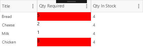
Finally, in the the Template column's CellContentTemplate, we have a Grid behind the Label. The Grid's background is colored by the returned value of the converter.
At runtime, the cell backgrounds are colored accoreingly:
Regards,
Lance | Tech Support Engineer, Sr.
Progress Telerik
You can do this for a row if you go with a DataGridTemplateColumn and create a converter for the cell background color because you have access to that row's data object.
Using your example, here's the model:
public class Product : INotifyPropertyChanged{ private string title; private int qtyInStock; private int qtyRequired; public string Title { get => title; set {title = value; OnPropertyChanged();} } public int QtyInStock { get => qtyInStock; set {qtyInStock = value; OnPropertyChanged();} } public int QtyRequired { get => qtyRequired; set {qtyRequired = value; OnPropertyChanged();} } public event PropertyChangedEventHandler PropertyChanged; protected virtual void OnPropertyChanged([CallerMemberName] string propertyName = null) { PropertyChanged?.Invoke(this, new PropertyChangedEventArgs(propertyName)); }}Here's the converter:
internal class QtyRequiredColorConverter : IValueConverter{ public object Convert(object value, Type targetType, object parameter, CultureInfo culture) { var product = value as Product; if (product?.QtyRequired > product?.QtyInStock) { return Color.Red; } return Color.Transparent; } public object ConvertBack(object value, Type targetType, object parameter, CultureInfo culture) { throw new NotImplementedException(); }}In your XAML resources, you'd have the converter defined:
<local:QtyRequiredColorConverter x:Key="QtyRequiredColorConverter"/>Finally, in the the Template column's CellContentTemplate, we have a Grid behind the Label. The Grid's background is colored by the returned value of the converter.
<dataGrid:DataGridTemplateColumn HeaderText="Qty Required"> <dataGrid:DataGridTemplateColumn.CellContentTemplate> <DataTemplate> <Grid BackgroundColor="{Binding Converter={StaticResource QtyRequiredColorConverter}}"> <Label Text="{Binding QtyRequired}"/> </Grid> </DataTemplate> </dataGrid:DataGridTemplateColumn.CellContentTemplate></dataGrid:DataGridTemplateColumn>At runtime, the cell backgrounds are colored accoreingly:
Regards,
Lance | Tech Support Engineer, Sr.
Progress Telerik
Do you want to have your say when we set our development plans?
Do you want to know when a feature you care about is added or when a bug fixed?
Explore the
Telerik Feedback Portal
and vote to affect the priority of the items
0
Alain
Top achievements
Rank 1
Rank 1
answered on 03 Apr 2018, 12:51 PM
This worked perfectly! I was missing the DataGridTemplateColumn
Thanks Lance