Getting Started with the OTPInput
This tutorial explains how to set up a basic Telerik UI for ASP.NET MVC OTPInput component and highlights the major steps in the configuration of the component.
You will initialize an OTPInput component with a set of items. Which will be either grouped together or rendered as standalone OTPInputs. This gives you control over the component's input composition.
Then, you will use the events of the UI component.
Prerequisites
To successfully complete the tutorial, you need a project that is already configured to use the Telerik UI for ASP.NET MVC components:
-
To create a new pre-configured project for the Telerik UI for ASP.NET MVC components, you can use a project template.
-
To manually configure an existing project by using NuGet, see the Adding Telerik UI through NuGet.
1. Prepare the CSHTML File
The first step is to add the required directives at the top of the .cshtml document:
-
To use the Telerik UI for ASP.NET MVC HtmlHelpers:
cshtml@using Kendo.Mvc.UI
Optionally, you can structure the document by adding the desired HTML elements like headings, divs, paragraphs, and others.
    @using Kendo.Mvc.UI

    <h4>OTPInput with Predefined Items</h4>
    <br/>
    <div>

    </div>
2. Initialize the OTPInput
Use the OTPInput HtmlHelper to add the component to a page:
- The
Name()configuration method is mandatory as its value is used for theidand thenameattributes of the OTPInput element. - The
Items()collection contains the list of items representing the different input groups. - The
Space()configuration controls the spacing behavior between each of the input groups.
@using Kendo.Mvc.UI
<h4>OTPInput with Predefined Items</h4>
<br/>
<div>
@(Html.Kendo().OTPInput()
.Name("otp")
.Items(items => {
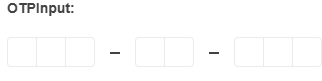
items.Add().GroupLength(3);
items.Add().GroupLength(2);
items.Add().GroupLength(3);
})
.Space(false)
)
</div>3. Configure the Separator
The OTPInput components allows you to add a separator between each of the established input groups. In this tutorial, you will use the available SeparatorHandler() option to render an SVG Icon.
    @using Kendo.Mvc.UI

    <h4>OTPInput with Predefined Items</h4>
    <br/>
    <div>
        @(Html.Kendo().OTPInput()
                .Name("otp")
                .Items(items => {
                    items.Add().GroupLength(3);
                    items.Add().GroupLength(2);
                    items.Add().GroupLength(3);
                })
                .Space(false)
                .SeparatorHandler("separatorHandler")
        )
</div>4. Handle an OTPInput Event
The OTPInput component provides a convenient event for implementing your desired logic. In this tutorial, you will use the exposed Change() event to log a new entry in the browser's console.
    @using Kendo.Mvc.UI

    <h4>OTPInput with Predefined Items</h4>
    <br/>
    <div>
       @(Html.Kendo().OTPInput()
           .Name("otp")
           .Items(items => {
               items.Add().GroupLength(3);
               items.Add().GroupLength(2);
               items.Add().GroupLength(3);
           })
           .Space(false)
           .SeparatorHandler("separatorHandler")
           .Events(events => events.Change("onChange"))
       )
</div>5. (Optional) Reference Existing OTPInput Instances
You can reference the OTPInput instances that you have created and build on top of their existing configuration:
-
Use the
idattribute of the component instance to establish a reference.JS<script> var otpinputReference = $("#otpinput").getKendoOTPInput(); // otpinputReference is a reference to the existing OTPInput instance of the helper. </script> -
Use the OTPInput client-side API to control the behavior of the widget. In this example, you will use the
enablemethod to disable the OTPInput.JS<script> var otpinputReference = $("#otpinput").getKendoOTPInput(); // otpinputReference is a reference to the existing OTPInput instance of the helper. otpinputReference.enable(false); </script>