New to Telerik UI for WinUI? Start a free 30-day trial
Explicit Styling
Updated on Mar 26, 2026
This article will demonstrate how to style the RadNumericBox control conponents explicitly.
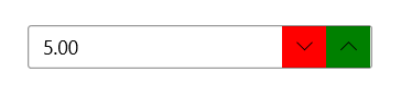
Styling the Increase/DecreaseButton
In order to style the Increase/Decrease button explicitly, you can use the IncreaseButtonStyle and DecreaseButtonStyle properties as demonstrated in Examples 1 and 2.
Example 1: Creating the custom styles
XAML
<Application.Resources>
	<ResourceDictionary xmlns:primitivesCommon="using:Telerik.UI.Xaml.Controls.Primitives.Common">
		<ResourceDictionary.MergedDictionaries>
			<XamlControlsResources xmlns="using:Microsoft.UI.Xaml.Controls" />
			<ResourceDictionary Source="ms-appx:///Telerik.WinUI.Controls/Themes/Generic.xaml"/>
		</ResourceDictionary.MergedDictionaries>

		<Style x:Key="CustomNumericButtonIncreaseStyle" TargetType="primitivesCommon:InlineButton" BasedOn="{StaticResource NumericButtonIncreaseStyle}">
			 <Setter Property="Background" Value="Green"/>
		</Style>

		<Style x:Key="CustomNumericButtonDecreaseStyle" TargetType="primitivesCommon:InlineButton" BasedOn="{StaticResource NumericButtonDecreaseStyle}">
			<Setter Property="Background" Value="Red"/>
		</Style>
	</ResourceDictionary>
</Application.Resources>
Example 2: Setting the IncreaseButtonStyle and DecreaseButtonStyle
XAML
<Grid xmlns:input="using:Telerik.UI.Xaml.Controls.Input">
	<input:RadNumericBox    Value="5"  Width="250" VerticalAlignment="Center"  IncreaseButtonStyle="{StaticResource CustomNumericButtonIncreaseStyle}" DecreaseButtonStyle="{StaticResource CustomNumericButtonDecreaseStyle}"/>
</Grid>
Figure 1: Result from Example 2
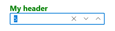
Styling the Header
To style the header of RadNumericBox you can set the HeaderStyle property as demonstrated in Example 1.
Example 3: Setting the HeaderStyle
XAML
<Grid xmlns:input="using:Telerik.UI.Xaml.Controls.Input">
	<Grid.Resources>
		<Style TargetType="ContentControl" x:Key="CustomHeaderStyle">
			<Setter Property="Foreground" Value="Green"/>
			<Setter Property="FontSize" Value="20"/>
			<Setter Property="FontWeight" Value="Bold"/>
		</Style>
	</Grid.Resources>
	<input:RadNumericBox Header="My header" Value="5"  Width="250" VerticalAlignment="Center" HeaderStyle="{StaticResource CustomHeaderStyle}" />
</Grid>
Figure 2: Result from Example 3