Getting Started with WinUI Buttons
This guide provides the information you need to start using the Telerik UI for WinUI Buttons by adding the available button components to your project.
At the end, you will see the following buttons.

Prerequisites
Before adding the Buttons, you need to:
-
Create your Telerik UI for WinUI application and install the Telerik UI for WinUI components depending on the required installation approach:
Add the Assembly References
To use the DataForm component, add references to Telerik.WinUI.Controls.dll and Telerik.Licensing.Runtime.dll.
Define the Components
To start using the Buttons, you need to initialize the needed element and assign its Content, Click event handler, Command or any other settings you need. The following example shows how to use the available buttons and subscribe to their Click events.
To access the button elements in XAML, add a namespace that points to Telerik.UI.Xaml.Controls - xmlns:telerikControls="using:Telerik.UI.Xaml.Controls" .
Adding a reference to the Telerik namespace
<UserControl x:Class="TelerikWinUIApp.ButtonsExample"
			 xmlns="http://schemas.microsoft.com/winfx/2006/xaml/presentation"
			 xmlns:x="http://schemas.microsoft.com/winfx/2006/xaml"
			 xmlns:telerikControls="using:Telerik.UI.Xaml.Controls" />
Defining RadButton
<telerikControls:RadButton Content="RadButton" Click="Button_Click"/>Button Click event handler
private void Button_Click(object sender, RoutedEventArgs e)
{
}
The next several examples show the other type of buttons. The Click event handler's example is ommitted on purpose because it matches the one shown in the previous example (for RadButton).
Defining RadToggleButton
<telerikControls:RadToggleButton Content="RadToggleButton" Click="Button_Click"/>
Defining RadRadioButton
<StackPanel>
	<telerikControls:RadRadioButton Content="RadRadioButton Option 1" Click="Button_Click"/>
	<telerikControls:RadRadioButton Content="RadRadioButton Option 2" Margin="0 10 0 0" Click="Button_Click"/>
	<telerikControls:RadRadioButton Content="RadRadioButton Option 3" Margin="0 10 0 0" Click="Button_Click"/>
</StackPanel>
You can group a set of
RadRadioButtonin aStackPanel. This way when you check one of the buttons, the others will get automatically unchecked.
Defining RadDropDownButton
<telerikControls:RadDropDownButton Content="RadDropDownButton" Click="Button_Click" DropDownHeight="120">
	<telerikControls:RadDropDownButton.DropDownContent>
		<TextBlock Text="This is drop down content!" Margin="8" VerticalAlignment="Center" />
	</telerikControls:RadDropDownButton.DropDownContent>
</telerikControls:RadDropDownButton>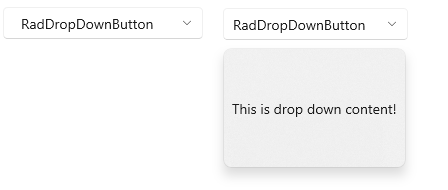
Defining RadSplitButton
<telerikControls:RadSplitButton  Content="RadSplitButton" Click="Button_Click" DropDownHeight="120">
	<telerikControls:RadSplitButton.DropDownContent>
		<TextBlock Text="This is drop down content!" Margin="8" VerticalAlignment="Center" />
	</telerikControls:RadSplitButton.DropDownContent>
</telerikControls:RadSplitButton>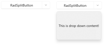
Telerik UI for WinUI Learning Resources
- Telerik UI for WinUI Buttons Component
- Getting Started with Telerik UI for WinUI Components
- Telerik UI for WinUI Installation
- Telerik UI for WinUI Examples
- Telerik UI for WinUI Accessibility
- Telerik UI for WinUI License Agreement