
ThemeBuilder
What's New
What's New 2026 Q2
New Meridian Theme Support in Progress ThemeBuilder
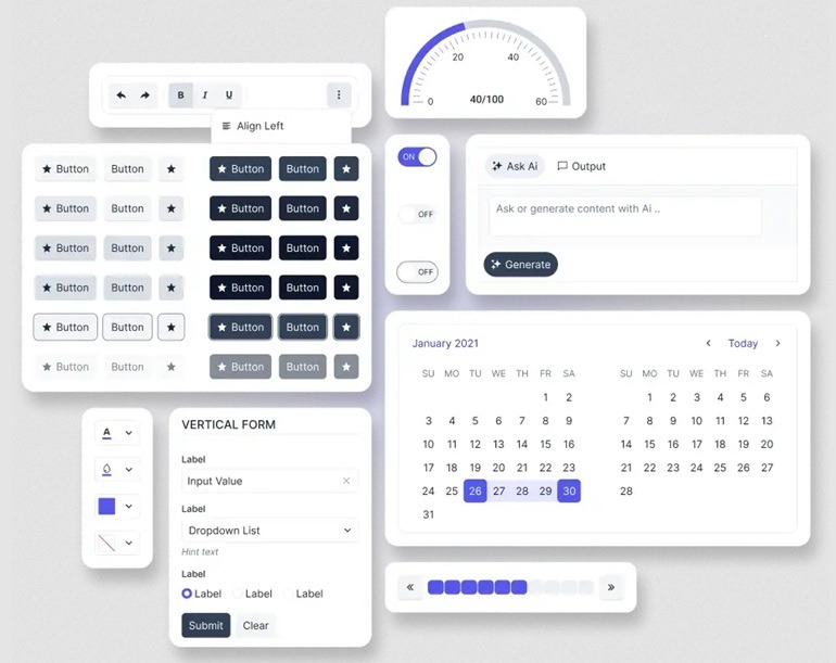
ThemeBuilder now supports the new Meridian theme, enabling you to design and customize modern, polished UI experiences with ease. You can explore and apply the Meridian theme updated styles, components, and design tokens directly within ThemeBuilder, ensuring seamless alignment with the latest Kendo UI design system.
Automatic Variable Values in Progress ThemeBuilder
Streamline theme customization with automatic variable values supported in Progress ThemeBuilder. By leveraging built-in variable relationships and smart defaults, changes to core design tokens such as colors or spacing, automatically propagate across related styles and components.
What's New 2026 Q1
ThemeBuilder: Performance Improvements and Optimized Theme Processing
ThemeBuilder introduces performance enhancements that improve theme editing responsiveness and project load times. Optimized CSS processing logic and compressed asset delivery reduce theme payload size and improve preview update speed when adjusting variables.
Key improvements include:
- Faster variable updates through intelligent compilation handling
- Reduced unnecessary CSS recompilation during design iterations
- Real-time preview updates without full page refresh
- Optimized theme asset delivery for improved loading performance
These updates provide a smoother and more efficient design workflow, particularly for large and complex themes.
ThemeBuilder: Expanded and Unified Component Preview Coverage
The component preview system is now fully aligned with the official Kendo UI HTML specifications. This ensures consistent visual parity between ThemeBuilder previews and production components.
Enhancements include:
- Expanded component coverage (PDF Viewer, PropertyGrid, SpeechToTextButton, Spreadsheet, TaskBoard, ContextMenu, Timeline, and others)
- Complete variant support based on official specifications
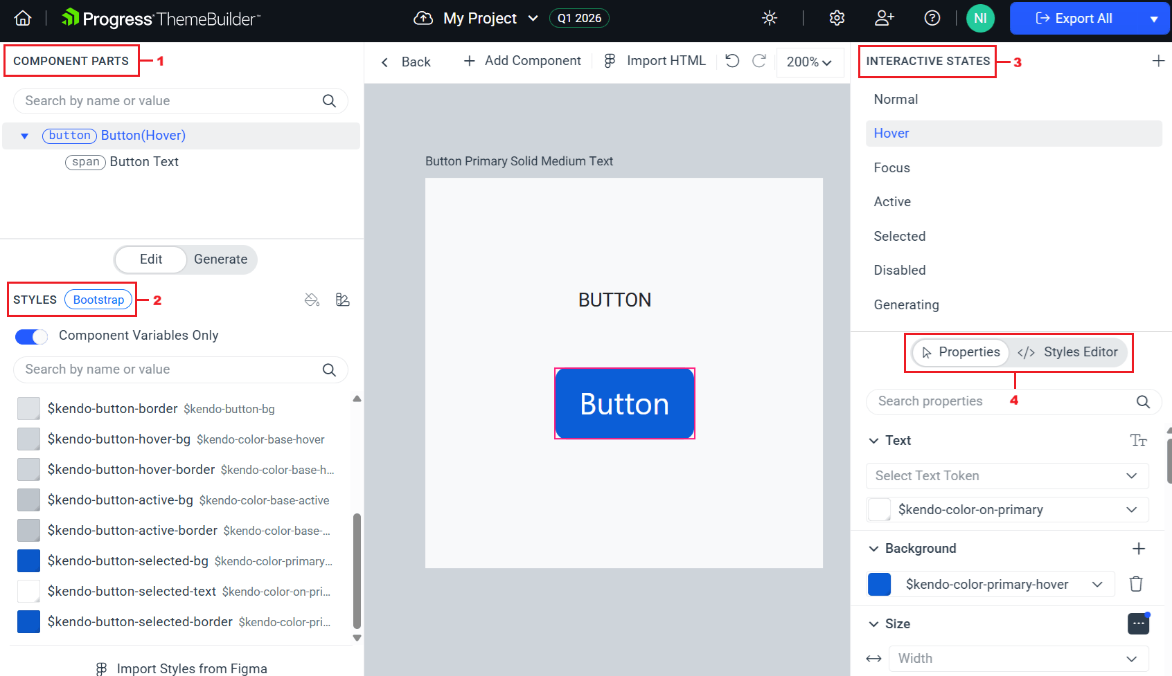
- Interactive state preview for default, hover, focus, active, disabled, selected and invalid states
- Automatic synchronization with upstream component updates
This alignment ensures consistent behavior and accurate theme customization across all supported components.

Next Steps
Check out the offers. Purchase an individual license for ThemeBuilder, or treat yourself to one of our bundles.
Try ThemeBuilder with dedicated technical support.