Unite UX 0.8.0
March 26, 2020
Beta 6 is now out with multiple onboarding resources to get you started, more flexible layout container options for defining responsiveness and simplified charts on the design side. See the highlights below, as well as the full list in the Release Documentation.
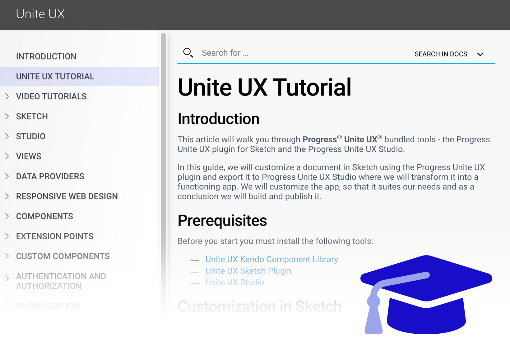
Step-by-Step Tutorial
Get started with a step-by-step guide on how to transform a design to a responsive web application. Start with a ready dashboard in Sketch and follow the guide to export it with the Unite UX plug-in, import it in Unite UX Studio and explore the various capabilities of the tool to create a fully functional application frontend with a framework of your choice.
Find the tutorial in the Documentation.
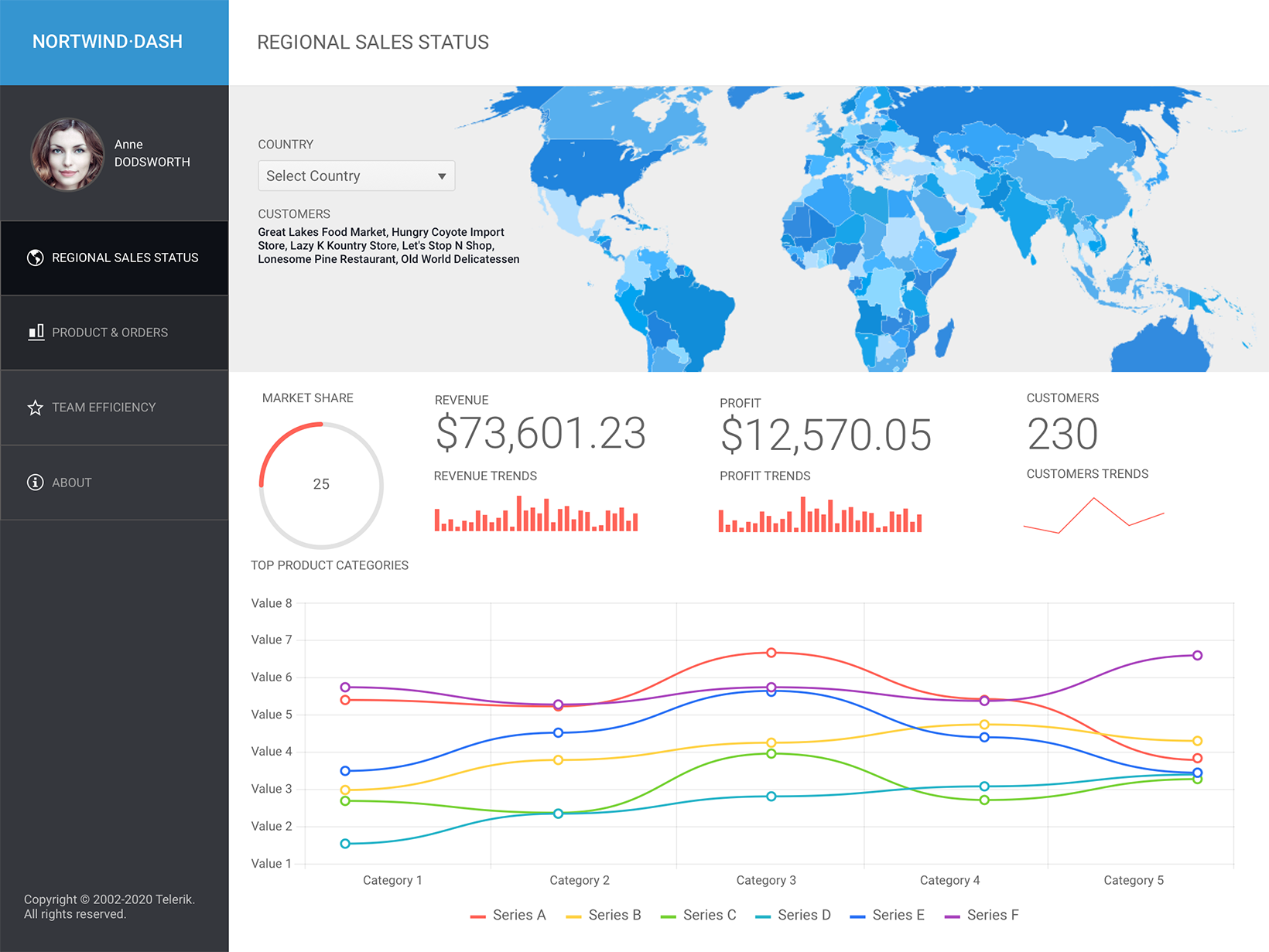
Sample App
Want to check a more advanced application example? You can now save a sample Angular dashboard application locally from Unite UX Studio. Explore one approach of how to define application layout, make responsive views in various breakpoints and get custom components inside the Studio.
The Sample App will be there for you as you open the latest version of the Studio. Just save it locally and check it out.
Find more about it in the Documentation.
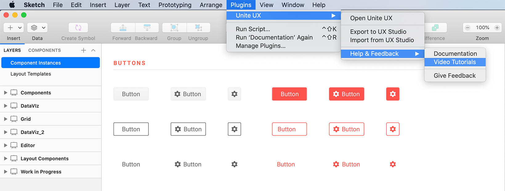
Designer Video Tutorials from the Unite UX Plug-in
Hey Designers, did you check our video tutorials especially for you? Get a quick access to this guided tour series directly from Sketch > Plug-in > Unite UX > Help & Feedback > Videos and get yourself ready for the journey.
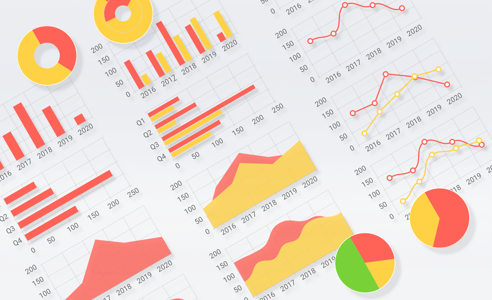
Simplified Charts in Sketch Library
Designers, we get you equipped with a series of simplified charts to give you more flexibility to fit and resize them as your design requires. Go to Insert > Kendo UI Library > Charts > Simplified or simply pick one from the library.
New Layout Container
More flexibility is here for developers to precisely align elements. In addition to Bootstrap, rows and columns, we are now introducing a new layout container that allows you to put multiple components and control how they are placed inside, in the following ways:
- Display (Default, Block, Inline, Flex, Inline-Flex): the property sets whether an element is treated as a block or an inline element and the layout used for its children, such as flex.
-
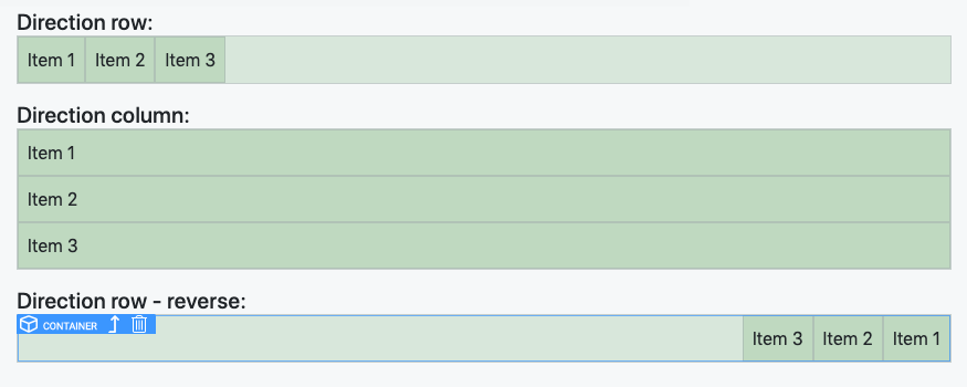
Direction (Column/reverse, Row/reverse): set the direction of the items in a container with direction utilities. It controls how flex items are placed in the container defining the main axis and the direction (normal or reversed).
-
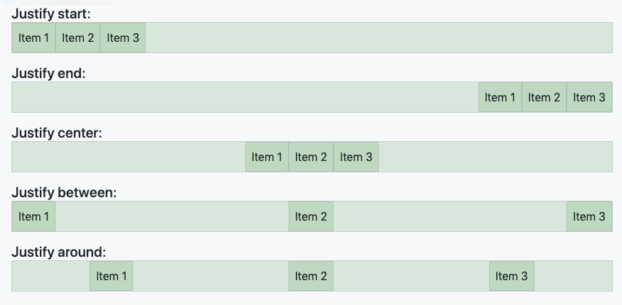
Justify content (start, end, center, between, around): the property defines how the space is distributed between and around the content items.
-
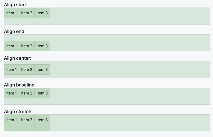
Align items (start, end, center, baseline, stretch): the align-items property sets the align-self value on all direct children as a group, it controls the alignment of items on the Cross Axis.
- Align self (start, end, center, baseline, stretch): this property overrides the parent’s align-items value.
Find more about it in the Documentation.
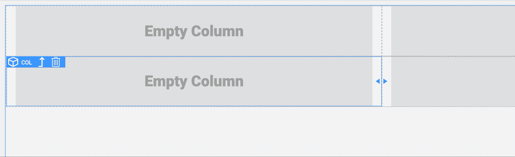
Container Resize on the Canvas
Resize the Bootstrap width directly on the canvas of the Responsive tab by simply dragging it to the desired size. Neat.
Web
- Kendo UI for jQuery
- Kendo UI for Angular
- KendoReact
- Kendo UI for Vue
- Progress Telerik UI for ASP.NET AJAX
- Progress Telerik UI for ASP.NET Core
- Progress Telerik UI for ASP.NET MVC