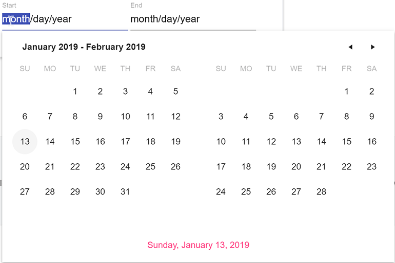
Date Range selection is a popular request. New in R1 2019, the DateRangePicker component provides the ability to pick a start and end date all within a single drop down menu.
New Component: MultiViewCalendar
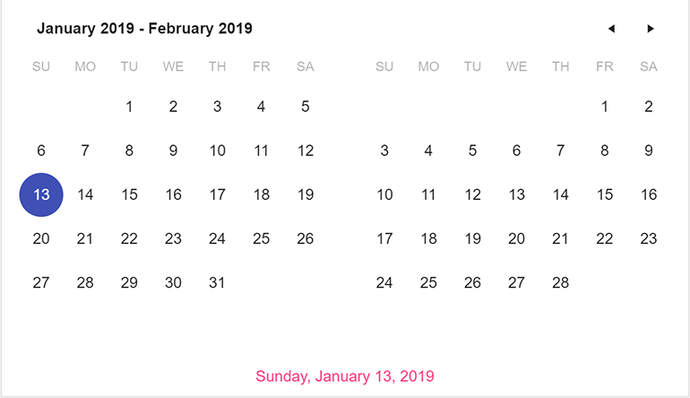
Calendaring options are among the more popular funcationality we enable. Because of this, we’ve added the new MultiViewCalendar component, which enables developers to easily display two calendars side by side.
New Component: ScrollView
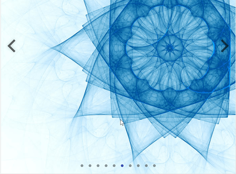
The ScrollView UI component provides an easy way to present images in a predefined area. Multiple images can be scrolled through by using the navigation elements, or automatically scroll through them on a set time interval.
TreeView Performance Boost
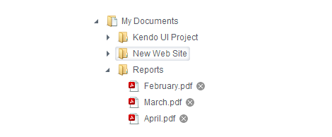
With R1 2019 we have taken significant steps to improve rendering and interaction time with the TreeView which is most noticeable in data intensive scenarios. No need to work with any new configuration, everything has been improved under the hood!
New Component: Switch
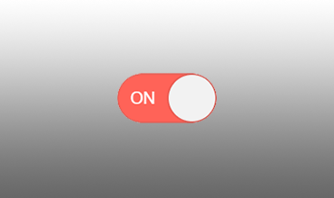
The Switch component, which lets the user toggle between checked and unchecked states,
is extremely popular in mobile and desktop applications alike. While previously available in the hybrid UI suite, the Switch component is now a part of the standard Kendo UI library.
.
New Component: Ripple
The ripple animation stems from the Material Design guidelines provided by Google. Often times this is used with button interactions, or when selecting check boxes or radio buttons. Traditionally this is something a developer has to implement themselves, but with the Ripple component this can be applied to any generic HTML element.
Continued Stability Enhancements
Progress is dedicated to continuously enhancing and improving all of our toolsets. To this end, with the R1 2019 release, we actively tackled and closed more bugs than were reported and reduced the overall number of issues for the suite.