ToolBarTray
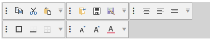
The toolbars suite provides you with the RadToolBarTray control that allows you to host several RadToolBar elements in the same tray. The tray handles the position, size, and order of toolbars inside of it. It is divided by bands (rows) and each band can contain multiple toolbars.
Figure 1: RadToolBarTray Overview
Defining ToolBarTray
The following example shows a very basic definition of the RadToolBarTray control with two RadToolBars.
Example 1: Define the tray in XAML
	<telerik:RadToolBarTray VerticalAlignment="Center" Width="460">
		<telerik:RadToolBar>
			<telerik:RadButton Content="Button 1" />
			<telerik:RadButton Content="Button 2 " />
			<telerik:RadButton Content="Button 3" />
		</telerik:RadToolBar>
		<telerik:RadToolBar>
			<telerik:RadButton Content="Button 1" />
			<telerik:RadButton Content="Button 2 " />
		</telerik:RadToolBar>
	</telerik:RadToolBarTray>
Figure 2: RadToolBarTray populated with RadToolBars

Setting Band and BandIndex
The RadToolBar control exposes a Band property that can be used to define the row of the toolbar in the tray. The position (the order) in the current band is controlled via the BandIndex property of the toolbar.
The following picture shows how the band and band index affect the positions of the toolbars in the tray.
Figure 3: RadToolBarTray Band and BandIndex
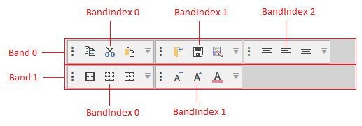
By default all
RadToolBarelements hosted in the tray are positioned in the first band (Band=0). The default band index is the based on the collection index of the toolbar plus the current band position.
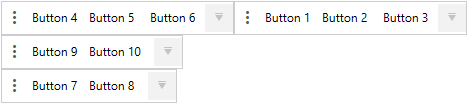
Example 2: Setting Band and BandIndex manually
	<telerik:RadToolBarTray>
		<telerik:RadToolBar BandIndex="1">
			<telerik:RadButton Content="Button 1" />
			<telerik:RadButton Content="Button 2 " />
			<telerik:RadButton Content="Button 3" />
		</telerik:RadToolBar>
		<telerik:RadToolBar BandIndex="0">
			<telerik:RadButton Content="Button 4" />
			<telerik:RadButton Content="Button 5 " />
			<telerik:RadButton Content="Button 6" />
		</telerik:RadToolBar>
		<telerik:RadToolBar Band="2">
			<telerik:RadButton Content="Button 7" />
			<telerik:RadButton Content="Button 8 " />
		</telerik:RadToolBar>
		<telerik:RadToolBar Band="1">
			<telerik:RadButton Content="Button 9" />
			<telerik:RadButton Content="Button 10 " />
		</telerik:RadToolBar>
	</telerik:RadToolBarTray>
Figure 4: RadToolBars with Band and BandIndex set
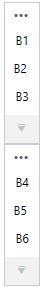
Setting Orientation
By default, the RadToolBarTray will order the toolbars horizontally. Also, the RadToolBar controls will order its items horizontally. To switch the orientation of the tray and the toolbars set the Orientation property of RadToolBarTray to Vertical.
Example 3: Setting Orientation
	<telerik:RadToolBarTray Orientation="Vertical" VerticalAlignment="Center" Width="460">
		<telerik:RadToolBar>
			<telerik:RadButton Content="B1" />
			<telerik:RadButton Content="B2 " />
			<telerik:RadButton Content="B3" />
		</telerik:RadToolBar>
		<telerik:RadToolBar>
			<telerik:RadButton Content="B4" />
			<telerik:RadButton Content="B5 " />
			<telerik:RadButton Content="B6" />
		</telerik:RadToolBar>
	</telerik:RadToolBarTray>
Figure 4: RadToolBarTray with Vertical Orientation
Use the RadToolBarTray in an MVVM scenario
Since the R1 2020 SP1 release, the RadToolBarTray supports generating RadToolBars when its ItemsSource property is set. Examples 4 and 5 demonstrate how to achieve the same result shown in Example 2 in an MVVM manner.
Example 4: Sаmple models and viewmodels
	public class ToolBarButtonViewModel
    {
        public string Content { get; set; }
    }

	public class ToolBarModel
    {
        public ToolBarModel()
        {
            this.ItemModels = new ObservableCollection<ToolBarButtonViewModel>();
        }

        public ObservableCollection<ToolBarButtonViewModel> ItemModels { get; set; }

        public int Band { get; set; }

        public int BandIndex { get; set; }
    }

	public class MainViewModel
    {
        private ObservableCollection<ToolBarModel> toolBarModels;

        public ObservableCollection<ToolBarModel> ToolBarModels
        {
            get
            {
                if (this.toolBarModels == null)
                {
                    this.toolBarModels = this.CreateToolBarModels();
                }

                return toolBarModels;
            }
        }

        private ObservableCollection<ToolBarModel> CreateToolBarModels()
        {
            return new ObservableCollection<ToolBarModel>()
                                        {
                                            new ToolBarModel()
                                            {
                                                BandIndex = 1,
                                                ItemModels = new ObservableCollection<ToolBarButtonViewModel>()
                                                {
                                                    new ToolBarButtonViewModel() {Content = "Button 1"},
                                                    new ToolBarButtonViewModel() {Content = "Button 2"},
                                                    new ToolBarButtonViewModel() {Content = "Button 2"},
                                                },
                                            },

                                            new ToolBarModel()
                                            {
                                                BandIndex = 0,
                                                ItemModels = new ObservableCollection<ToolBarButtonViewModel>()
                                                {
                                                    new ToolBarButtonViewModel() {Content = "Button 4"},
                                                    new ToolBarButtonViewModel() {Content = "Button 5"},
                                                    new ToolBarButtonViewModel() {Content = "Button 6"},
                                                },
                                            },

                                            new ToolBarModel()
                                            {
                                                Band = 2,
                                                ItemModels = new ObservableCollection<ToolBarButtonViewModel>()
                                                {
                                                    new ToolBarButtonViewModel() {Content = "Button 7"},
                                                    new ToolBarButtonViewModel() {Content = "Button 8"},
                                                },
                                            },
                                            new ToolBarModel()
                                            {
                                                Band = 1,
                                                ItemModels = new ObservableCollection<ToolBarButtonViewModel>()
                                                {
                                                    new ToolBarButtonViewModel() {Content = "Button 9"},
                                                    new ToolBarButtonViewModel() {Content = "Button 10"},
                                                },
                                            },
                                        };
        }
}Example 5: Defining the RadToolBarTray in xaml
	<Grid>
        <Grid.Resources>
            <DataTemplate DataType="{x:Type local:ToolBarButtonViewModel}">
                <telerik:RadButton Content="{Binding Content}" />
            </DataTemplate>

            <!-- If you are using the NoXaml dlls, you should base you style on the default one like so-->
            <!--<Style x:Key="ToolBarStyle" TargetType="telerik:RadToolBar" BasedOn="{StaticResource RadToolBarStyle}">-->
            <Style x:Key="ToolBarStyle" TargetType="telerik:RadToolBar" >
                <Setter Property="ItemsSource" Value="{Binding ItemModels}" />
                <Setter Property="Band" Value="{Binding Band}" />
                <Setter Property="BandIndex" Value="{Binding BandIndex}" />
            </Style>
        </Grid.Resources>
        <Grid.DataContext>
            <local:MainViewModel />
        </Grid.DataContext>

        <telerik:RadToolBarTray ItemsSource="{Binding ToolBarModels}" ItemContainerStyle="{StaticResource ToolBarStyle}" />
    </Grid>