GroupFooterCellStyleSelector
The GroupFooterCellStyleSelector property of RadGridView can be used to style group footer rows differently based on a specific condition.
Bear in mind that the GroupFooterCellStyle takes precedence over the GroupFooterCellStyleSelector and will overwrite it if both are defined simultaneously.
To do so, first create a new class that inherits the StyleSelector class and override its SelectStyle method:
Example 1: The GroupFooterCellStyleSelector class
public class GroupFooterCellStyleSelector : StyleSelector
{
    public override Style SelectStyle(object item, DependencyObject container)
    {
        var cell = container as GridViewGroupFooterCell;
        var footerRow = cell.ParentRow as GridViewGroupFooterRow;
        var group = footerRow.Group as QueryableCollectionViewGroup;

        if (group.ItemCount > 1)
        {
            return BigGroupStyle;
        }
        else
        {
            return SmallGroupStyle;
        }
    }

    public Style BigGroupStyle { get; set; }
    public Style SmallGroupStyle { get; set; }
}Public Class GroupFooterCellStyleSelector
Inherits StyleSelector
Public Overrides Function SelectStyle(ByVal item As Object, ByVal container As DependencyObject) As Style
Dim cell = TryCast(container, GridViewGroupFooterCell)
Dim footerRow = TryCast(cell.ParentRow, GridViewGroupFooterRow)
Dim group = TryCast(footerRow.Group, QueryableCollectionViewGroup)
If group.ItemCount > 1 Then
Return BigGroupStyle
Else
Return SmallGroupStyle
End If
End Function
Public Property BigGroupStyle() As Style
Public Property SmallGroupStyle() As Style
End ClassIn the XAML file, define the style selector as a resource and set the properties of the BigGroupStyle and SmallGroupStyle:
Example 2: Setting the BigGroupStyle and SmallGroupStyle
<Grid.Resources>
       <my:GroupFooterCellStyleSelector x:Key="GroupFooterCellStyleSelector">
           <my:GroupFooterCellStyleSelector.BigGroupStyle>
               <Style TargetType="telerik:GridViewGroupFooterCell">
                   <Setter Property="Background" Value="Red"/>
               </Style>
           </my:GroupFooterCellStyleSelector.BigGroupStyle>
           <my:GroupFooterCellStyleSelector.SmallGroupStyle>
               <Style TargetType="telerik:GridViewGroupFooterCell">
                   <Setter Property="Background" Value="Yellow" />
               </Style>
           </my:GroupFooterCellStyleSelector.SmallGroupStyle>
       </my:GroupFooterCellStyleSelector>
</Grid.Resources>
The "my:" prefix before GroupFooterCellStyleSelector specifies the mapping for the namespace of the project: xmlns:my="..."
Finally, set the GroupFooterCellStyleSelector property of the chosen column:
Example 3: Setting the GroupFooterCellStyleSelector property
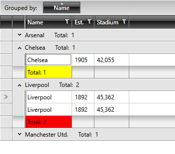
<telerik:GridViewDataColumn DataMemberBinding="{Binding Name}" GroupFooterCellStyleSelector="{StaticResource GroupFooterCellStyleSelector}" />Figure 1 shows the final result:
Figure 1: The group footer cells styled using the GroupFooterCellStyleSelector property