Set Custom Fill For PointMarks Depending On Condition
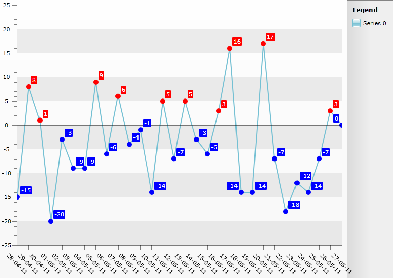
It is common scenario that you would like to customize the appearance of the PointMarks in a Line Series. However since Line Series are Self-Drawing Series changing a property affects all PointMarks. This help article will demonstrate how to set custom Fill for PointMarks in a single Line Serie where it is set according to their YValue - *Blue *SolidColorBrush for those that are negative and *Red *for the positive ones. Additionally the Series Items Labels are set with Color according to their corresponding PointMark.
- Create a new class named Data, which implements the INotifyPropertyChanged interface. It will be used as an ItemsSource for the chart control. The class has three properties:
-
Date - will be displayed on the X axis.
-
YValue - will be displayed on the Y axis.
-
PointMarkFill - will be applied to the PointMark Style to set the Fill for the PointMark.
	public class Data : INotifyPropertyChanged
	{
	    private DateTime _date;
	    private SolidColorBrush _pointMarkFill;
	    private int _yvalue;
	    public Data(DateTime date, int yvalue)
	    {
	        this._date = date;
	        this._yvalue = yvalue;
	        this.UpdatePointMarkVisibility();
	    }
	    public event PropertyChangedEventHandler PropertyChanged;
	    public DateTime Date
	    {
	        get
	        {
	            return _date;
	        }
	        set
	        {
	            if (this._date == value)
	                return;
	            this._date = value;
	            this.OnPropertyChanged("Date");
	        }
	    }
	    public int YValue
	    {
	        get
	        {
	            return _yvalue;
	        }
	        set
	        {
	            if (this._yvalue == value)
	                return;
	            this._yvalue = value;
	            this.OnPropertyChanged("YValue");
	        }
	    }
	    public SolidColorBrush PointMarkFill
	    {
	        get
	        {
	            return _pointMarkFill;
	        }
	        private set
	        {
	            if (object.Equals(this._pointMarkFill, value))
	                return;
	            this._pointMarkFill = value;
	            this.OnPropertyChanged("PointMarkVisibility");
	        }
	    }
	    protected virtual void OnPropertyChanged(string propertyName)
	    {
	        if (this.PropertyChanged != null)
	            this.PropertyChanged(this, new PropertyChangedEventArgs(propertyName));
	    }
	    private void UpdatePointMarkVisibility()
	    {
	        if (this.YValue > 0)
	            this.PointMarkFill = new SolidColorBrush(Colors.Red);
	        else
	            this.PointMarkFill = new SolidColorBrush(Colors.Blue);
	    }
}Note that the check for setting the PointMarkFill's value is added in the end of the code snippet above.Add the RadChart declaration:
<telerik:RadChart Name="chart"/>Retemplate the default PointMark Style - Add *Fill *Property databound to DataItem.PointMarkFill property of the class. Add the Style between the starting and ending tags of the UserControl:
	<Style x:Key="MyPointMark_Style" TargetType="telerik:PointMark">
	    <Setter Property="Template">
	        <Setter.Value>
	            <ControlTemplate TargetType="telerik:PointMark">
	                <Canvas>
	                    <Path x:Name="PART_PointMarkPath"
	                    Canvas.Left="{TemplateBinding PointMarkCanvasLeft}"
	                    Canvas.Top="{TemplateBinding PointMarkCanvasTop}"
	                    Style="{TemplateBinding ShapeStyle}"
	                    Width="{TemplateBinding Size}"
	                    Height="{TemplateBinding Size}"
	                    Fill="{Binding DataItem.PointMarkFill}"
	                    Stroke="{Binding DataItem.PointMarkFill}"
	                    Stretch="Fill">
	                        <Path.Data>
	                            <PathGeometry x:Name="PART_PointMarkPathGeometry" />
	                        </Path.Data>
	                    </Path>
	                </Canvas>
	            </ControlTemplate>
	        </Setter.Value>
	    </Setter>
	</Style>
Retemplate the default *SeriesItemLabel *Style so that the appropriate color will be set for each Label too:
	<Style x:Key="MySeriesItemLabel_Style" TargetType="telerik:SeriesItemLabel">
	    <Setter Property="Padding" Value="2,0" />
	    <Setter Property="IsHitTestVisible" Value="False"/>
	    <Setter Property="ContentTemplate">
	        <Setter.Value>
	            <DataTemplate>
	                <TextBlock Text="{Binding RelativeSource={RelativeSource TemplatedParent}, Path=Content }" TextAlignment="Center" />
	            </DataTemplate>
	        </Setter.Value>
	    </Setter>
	    <Setter Property="Template" >
	        <Setter.Value>
	            <ControlTemplate TargetType="telerik:SeriesItemLabel">
	                <Canvas x:Name="PART_MainContainer">
	                    <Path
	                Visibility="{TemplateBinding ConnectorVisibility}"
	                Style="{TemplateBinding ConnectorStyle}"
	                Stroke="{TemplateBinding Stroke}"
	                StrokeThickness="{TemplateBinding StrokeThickness}">
	                        <Path.Data>
	                            <PathGeometry >
	                                <PathGeometry.Figures>
	                                    <PathFigure x:Name="PART_Connector">
	                                        <PathFigure.Segments>
	                                            <PolyLineSegment />
	                                        </PathFigure.Segments>
	                                    </PathFigure>
	                                </PathGeometry.Figures>
	                            </PathGeometry>
	                        </Path.Data>
	                    </Path>
	                    <Border x:Name="PART_TextContainer"
	                Style="{TemplateBinding LabelStyle}"
	                BorderBrush="{TemplateBinding Stroke}"
	                Background="{Binding DataItem.PointMarkFill}"
	                Width="{TemplateBinding Width}"
	                Height="{TemplateBinding Height}">
	                        <ContentPresenter Margin="{TemplateBinding Padding}" />
	                    </Border>
	                </Canvas>
	            </ControlTemplate>
	        </Setter.Value>
	    </Setter>
	</Style>
The chart is populated with data in code-behind using Manual Series Mappings. The last line in the code snippet demonstrates how the Style for the PointMarks can be set.
	List<Data> exportData = new List<Data>();
	DateTime baseDate = DateTime.Today;
	Random r = new Random();
	for (int i = 0; i < 30; i++)
	{
	    exportData.Add(new Data(baseDate.AddDays(i), r.Next(-20, 20)));
	}
	SeriesMapping mapping = new SeriesMapping();
	mapping.ItemMappings.Add(new ItemMapping("YValue", DataPointMember.YValue));
	mapping.ItemMappings.Add(new ItemMapping("Date", DataPointMember.XCategory));
	chart.ItemsSource = exportData;
	chart.SeriesMappings.Add(mapping);
	chart.DefaultView.ChartArea.AxisX.IsDateTime = true;
	chart.DefaultView.ChartArea.AxisX.LabelRotationAngle = 45;
	chart.DefaultView.ChartArea.AxisX.DefaultLabelFormat = "dd-MM-yy";
	LineSeriesDefinition line = new LineSeriesDefinition();
	chart.DefaultSeriesDefinition = line;
	line.ShowPointMarks = true;
	line.ShowItemLabels = true;
	chart.DefaultSeriesDefinition.PointMarkItemStyle = this.Resources["MyPointMark_Style"] as Style;
chart.DefaultSeriesDefinition.SeriesItemLabelStyle = this.Resources["MySeriesItemLabel_Style"] as Style;The result can be seen on the image below: