Integration with RadContextMenu
The purpose of this tutorial is to show you how to integrate RadChart and RadContextMenu so they can nicely work together.
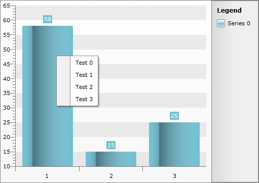
The final result should look like the snapshot below.
Basically, the approach that will be demonstrated here combines the MVVM support of RadChart with RadChart data-binding, and the data-binding functionality supported by the RadMenu (RadContextMenu) control.
You will need several helper classes that will be used for the RadChart and RadContextMenu population.
- Create a new class named MenuItem. This class represents a single item in the RadContextMenu. Note that the class has absolutely the same properties as the RadMenuItem used in the context menu. The idea here is to bind the different properties of the MenuItem business object to the corresponding properties of the RadMenuItem using style binding.
	public class MenuItem : INotifyPropertyChanged
	{
	    private bool isChecked;
	    private bool isEnabled = true;
	    private string text;
	    private string groupName;
	    private bool isCheckable;
	    private bool isSeparator;
	    private string imageUrl;
	    private bool staysOpenOnClick;
	    private MenuItemsCollection items;
	    private MenuItem parent;
	    public MenuItem()
	    {
	        this.items = new MenuItemsCollection( this );
	    }
	    public event PropertyChangedEventHandler PropertyChanged;
	    public string Text
	    {
	        get
	        {
	            return this.text;
	        }
	        set
	        {
	            this.text = value;
	        }
	    }
	    public string GroupName
	    {
	        get
	        {
	            return this.groupName;
	        }
	        set
	        {
	            this.groupName = value;
	        }
	    }
	    public bool IsCheckable
	    {
	        get
	        {
	            return this.isCheckable;
	        }
	        set
	        {
	            this.isCheckable = value;
	        }
	    }
	    public bool IsSeparator
	    {
	        get
	        {
	            return this.isSeparator;
	        }
	        set
	        {
	            this.isSeparator = value;
	        }
	    }
	    public string ImageUrl
	    {
	        get
	        {
	            return this.imageUrl;
	        }
	        set
	        {
	            this.imageUrl = value;
	        }
	    }
	    public bool StaysOpenOnClick
	    {
	        get
	        {
	            return this.staysOpenOnClick;
	        }
	        set
	        {
	            this.staysOpenOnClick = value;
	        }
	    }
	    public MenuItemsCollection Items
	    {
	        get
	        {
	            return this.items;
	        }
	    }
	    public MenuItem Parent
	    {
	        get
	        {
	            return this.parent;
	        }
	        set
	        {
	            this.parent = value;
	        }
	    }
	    public bool IsEnabled
	    {
	        get
	        {
	            return this.isEnabled;
	        }
	        set
	        {
	            if ( value != this.isEnabled )
	            {
	                this.isEnabled = value;
	                this.OnPropertyChanged( "IsEnabled" );
	            }
	        }
	    }
	    public bool IsChecked
	    {
	        get
	        {
	            return this.isChecked;
	        }
	        set
	        {
	            if ( value != this.isChecked )
	            {
	                this.isChecked = value;
	                this.OnPropertyChanged( "IsChecked" );
	                if ( !string.IsNullOrEmpty( this.GroupName ) )
	                {
	                    if ( this.IsChecked )
	                    {
	                        this.UncheckOtherItemsInGroup();
	                    }
	                    else
	                    {
	                        this.IsChecked = true;
	                    }
	                }
	            }
	        }
	    }
	    public Image Image
	    {
	        get
	        {
	            if ( string.IsNullOrEmpty( this.ImageUrl ) )
	                return null;
	            return new Image()
	            {
	                Source = new BitmapImage( new Uri( this.ImageUrl, UriKind.RelativeOrAbsolute ) )
	            };
	        }
	    }
	    private void UncheckOtherItemsInGroup()
	    {
	        IEnumerable<MenuItem> groupItems = this.Parent.Items.Where( ( MenuItem item ) => item.GroupName == this.GroupName );
	        foreach ( MenuItem item in groupItems )
	        {
	            if ( item != this )
	            {
	                item.isChecked = false;
	                item.OnPropertyChanged( "IsChecked" );
	            }
	        }
	    }
	    private void OnPropertyChanged( string propertyName )
	    {
	        if ( null != this.PropertyChanged )
	        {
	            this.PropertyChanged( this, new PropertyChangedEventArgs( propertyName ) );
	        }
	    }
}- Create a new class named MenuItemCollection. This class is pretty simple and self-explanatory.
	public class MenuItemsCollection : ObservableCollection<MenuItem>
	{
	    private MenuItem parent;
	    public MenuItemsCollection()
	        : this( null )
	    {
	    }
	    public MenuItemsCollection( MenuItem parent )
	    {
	        this.parent = parent;
	    }
	    public MenuItem Parent
	    {
	        get
	        {
	            return this.parent;
	        }
	        set
	        {
	            this.parent = value;
	        }
	    }
	    protected override void InsertItem( int index, MenuItem item )
	    {
	        item.Parent = this.Parent;
	        base.InsertItem( index, item );
	    }
}- Create a new class named ChartDataItem. The ChartDataItem is used to populate the RadChart with sample data.
	public class ChartDataItem : INotifyPropertyChanged
	{
	    private double yValue;
	    private MenuItemsCollection menuItems;
	    public event PropertyChangedEventHandler PropertyChanged;
	    public double YValue
	    {
	        get
	        {
	            return this.yValue;
	        }
	        set
	        {
	            if ( this.yValue != value )
	            {
	                this.yValue = value;
	                this.OnPropertyChanged( "YValue" );
	            }
	        }
	    }
	    public MenuItemsCollection MenuItems
	    {
	        get
	        {
	            if ( this.menuItems == null )
	            {
	                this.menuItems = new MenuItemsCollection();
	            }
	            return this.menuItems;
	        }
	    }
	    private void OnPropertyChanged( string propertyName )
	    {
	        if ( null != this.PropertyChanged )
	        {
	            this.PropertyChanged( this, new PropertyChangedEventArgs( propertyName ) );
	        }
	    }
}- Create a new class named ChartDataCollection - this is an observable collection of ChartDataItem objects.
	public class ChartDataCollection : ObservableCollection<ChartDataItem>
	{
}- And the final prerequisite is the ChartViewModel - the data source for your RadChart.
	public class ChartViewModel
	{
	    private Random rand = new Random( DateTime.Now.Millisecond );
	    private ChartDataCollection data;
	    public ChartDataCollection Data
	    {
	        get
	        {
	            if ( data == null )
	            {
	                data = new ChartDataCollection();
	                data.Add( CreateChartDataItem( "Test {0}" ) );
	                data.Add( CreateChartDataItem( "Foo {0}" ) );
	                data.Add( CreateChartDataItem( "Bar {0}" ) );
	            }
	            return data;
	        }
	    }
	    private ChartDataItem CreateChartDataItem( string menuItemTextFormat )
	    {
	        ChartDataItem item = new ChartDataItem();
	        item.YValue = rand.Next( 10, 100 );
	        for ( int i = 0; i < rand.Next( 2, 5 ); i++ )
	        {
	            item.MenuItems.Add( new MenuItem()
	            {
	                Text = string.Format( menuItemTextFormat, i )
	            } );
	        }
	        return item;
	    }
}- Now you need to re-template the desired chart series type in order to place a RadContextMenu instance as attached property in its template.
	<Style x:Key="CustomStyle"
	       TargetType="telerik:Bar">
	    <Setter Property="Template">
	        <Setter.Value>
	                    <ControlTemplate TargetType="telerik:Bar">
	                <Canvas Opacity="0"
	                        x:Name="PART_MainContainer">
	                            <telerik:RadContextMenu.ContextMenu>
	                                <telerik:RadContextMenu ItemsSource="{Binding DataItem.MenuItems}"
	                                                          ItemTemplate="{StaticResource MenuItemTemplate}"
	                                                          ItemClick="OnContextMenuClick">
	                                    <telerik:RadContextMenu.ItemContainerStyle>
	                                            <Style TargetType="telerik:RadMenuItem">
	                                    <Setter Property="IsCheckable"
	                                            Value="{Binding IsCheckable}" />
	                                    <Setter Property="IsChecked"
	                                            Value="{Binding IsChecked}" />
	                                    <Setter Property="IsSeparator"
	                                            Value="{Binding IsSeparator}" />
	                                    <Setter Property="IsEnabled"
	                                            Value="{Binding IsEnabled}" />
	                                    <Setter Property="StaysOpenOnClick"
	                                            Value="{Binding StaysOpenOnClick}" />
	                                    <Setter Property="Icon"
	                                            Value="{Binding Image}" />
	                                </Style>
	                            </telerik:RadContextMenu.ItemContainerStyle>
	                        </telerik:RadContextMenu>
	                    </telerik:RadContextMenu.ContextMenu>
	                    <Rectangle x:Name="PART_DefiningGeometry"
	                               Height="{TemplateBinding ItemActualHeight}"
	                               Width="{TemplateBinding ItemActualWidth}"
	                               Style="{TemplateBinding ItemStyle}"
	                               RadiusX="{StaticResource BarRadiusX}"
	                               RadiusY="{StaticResource BarRadiusY}" />
	                    <Rectangle Height="{TemplateBinding ItemActualHeight}"
	                               Width="{TemplateBinding ItemActualWidth}"
	                               RadiusX="{StaticResource BarRadiusX}"
	                               RadiusY="{StaticResource BarRadiusY}"
	                               OpacityMask="{StaticResource BarOpacityMaskBrush}"
	                               Fill="{StaticResource BarMaskBrush}" />
	                    <Rectangle Height="{TemplateBinding ItemActualHeight}"
	                               Width="{TemplateBinding ItemActualWidth}"
	                               RadiusX="{StaticResource BarRadiusX}"
	                               RadiusY="{StaticResource BarRadiusY}"
	                               Fill="{StaticResource BarTopMaskBrush}" />
	                    <Canvas.RenderTransform>
	                        <ScaleTransform x:Name="PART_AnimationTransform"
	                                        ScaleY="0" />
	                    </Canvas.RenderTransform>
	                </Canvas>
	            </ControlTemplate>
	        </Setter.Value>
	    </Setter>
	</Style>
You should note several things in the above code snippet:
-
Notice that the ContextMenu is data bound to a property of your chart DatabItem instance. The ChartDataItem object exposes the desired menu items' structure (i.e. the chart control is data bound to a List of ChartDataItem objects, and the ChartDataItem class exposes MenuItems property. {Binding____DataItem.MenuItems} holds a reference to a specific ChartDataItem instance).
-
The RadContextMenu can support hierarchical Menu structure as well (as with stand-alone Menu you need to create a HierarchicalDataTemplate that specifies the ItemsSource, ItemTemplate and other properties of the item's children).
-
For WPF you can use the __style binding__mechanism that allows you to bind properties of an item container ( RadMenuItem, RadTreeViewItem, etc.) to the properties of the data object. Also you should set the ItemContainerStyle property of the RadContextMenu.
The code snippet below shows you the full XAML code:
	<Grid>
	    <Grid.Resources>
	        <HierarchicalDataTemplate x:Key="MenuItemTemplate"
	                                  ItemsSource="{Binding Items}">
	            <TextBlock Text="{Binding Text}" />
	        </HierarchicalDataTemplate>
	        <mscorlib:Double x:Key="BarRadiusX">2</mscorlib:Double>
	        <mscorlib:Double x:Key="BarRadiusY">2</mscorlib:Double>
	        <LinearGradientBrush x:Key="BarMaskBrush"
	                             EndPoint="1,0.5"
	                             StartPoint="0,0.5">
	            <GradientStop Color="#00FFFFFF"
	                          Offset="0" />
	            <GradientStop Color="#00FFFFFF"
	                          Offset="1" />
	            <GradientStop Color="#26000000"
	                          Offset="0.2" />
	            <GradientStop Color="#66000000"
	                          Offset="0.2" />
	        </LinearGradientBrush>
	        <SolidColorBrush x:Key="BarOpacityMaskBrush"
	                         Color="#FF000000" />
	        <SolidColorBrush x:Key="BarTopMaskBrush"
	                         Color="Transparent" />
	        <Style x:Key="CustomStyle"
	               TargetType="telerik:Bar">
	            <Setter Property="Template">
	                <Setter.Value>
	                        <ControlTemplate TargetType="telerik:Bar">
	                        <Canvas Opacity="0"
	                                x:Name="PART_MainContainer">
	                                <telerik:RadContextMenu.ContextMenu>
	                                    <telerik:RadContextMenu ItemsSource="{Binding DataItem.MenuItems}"
	                                                                  ItemTemplate="{StaticResource MenuItemTemplate}"
	                                                                  ItemClick="OnContextMenuClick">
	                                        <telerik:RadContextMenu.ItemContainerStyle>
	                                            <Style TargetType="telerik:RadMenuItem">
	                                            <Setter Property="IsCheckable"
	                                                    Value="{Binding IsCheckable}" />
	                                            <Setter Property="IsChecked"
	                                                    Value="{Binding IsChecked}" />
	                                            <Setter Property="IsSeparator"
	                                                    Value="{Binding IsSeparator}" />
	                                            <Setter Property="IsEnabled"
	                                                    Value="{Binding IsEnabled}" />
	                                            <Setter Property="StaysOpenOnClick"
	                                                    Value="{Binding StaysOpenOnClick}" />
	                                            <Setter Property="Icon"
	                                                    Value="{Binding Image}" />
	                                        </Style>
	                                    </telerik:RadContextMenu.ItemContainerStyle>
	                                </telerik:RadContextMenu>
	                            </telerik:RadContextMenu.ContextMenu>
	                            <Rectangle x:Name="PART_DefiningGeometry"
	                                       Height="{TemplateBinding ItemActualHeight}"
	                                       Width="{TemplateBinding ItemActualWidth}"
	                                       Style="{TemplateBinding ItemStyle}"
	                                       RadiusX="{StaticResource BarRadiusX}"
	                                       RadiusY="{StaticResource BarRadiusY}" />
	                            <Rectangle Height="{TemplateBinding ItemActualHeight}"
	                                       Width="{TemplateBinding ItemActualWidth}"
	                                       RadiusX="{StaticResource BarRadiusX}"
	                                       RadiusY="{StaticResource BarRadiusY}"
	                                       OpacityMask="{StaticResource BarOpacityMaskBrush}"
	                                       Fill="{StaticResource BarMaskBrush}" />
	                            <Rectangle Height="{TemplateBinding ItemActualHeight}"
	                                       Width="{TemplateBinding ItemActualWidth}"
	                                       RadiusX="{StaticResource BarRadiusX}"
	                                       RadiusY="{StaticResource BarRadiusY}"
	                                       Fill="{StaticResource BarTopMaskBrush}" />
	                            <Canvas.RenderTransform>
	                                <ScaleTransform x:Name="PART_AnimationTransform"
	                                                ScaleY="0" />
	                            </Canvas.RenderTransform>
	                        </Canvas>
	                    </ControlTemplate>
	                </Setter.Value>
	            </Setter>
	        </Style>
	    </Grid.Resources>
	        <telerik:RadChart x:Name="radChart"
	                           ItemsSource="{Binding Data}">
	            <telerik:RadChart.SeriesMappings>
	                <telerik:SeriesMapping>
	                    <telerik:SeriesMapping.SeriesDefinition>
	                        <telerik:BarSeriesDefinition ItemStyle="{StaticResource CustomStyle}" />
	                </telerik:SeriesMapping.SeriesDefinition>
	                    <telerik:SeriesMapping.ItemMappings>
	                        <telerik:ItemMapping FieldName="YValue"
	                                                 DataPointMember="YValue" />
	                </telerik:SeriesMapping.ItemMappings>
	            </telerik:SeriesMapping>
	        </telerik:RadChart.SeriesMappings>
	    </telerik:RadChart>
</Grid>- What is left is to add the chart control declaration, bind it to a property of the ViewModel set as a DataContext for the respective user control, and instruct the control to use the custom bar style declared earlier:
	<telerik:RadChart x:Name="radChart"
	   ItemsSource="{Binding Data}">
	    <telerik:RadChart.SeriesMappings>
	        <telerik:SeriesMapping>
	            <telerik:SeriesMapping.SeriesDefinition>
	                <telerik:BarSeriesDefinition ItemStyle="{StaticResource CustomStyle}" />
	            </telerik:SeriesMapping.SeriesDefinition>
	            <telerik:SeriesMapping.ItemMappings>
	                <telerik:ItemMapping FieldName="YValue"
	                         DataPointMember="YValue" />
	            </telerik:SeriesMapping.ItemMappings>
	        </telerik:SeriesMapping>
	    </telerik:RadChart.SeriesMappings>
</telerik:RadChart> public void SetDataContex()
{
this.DataContext = new ChartViewModel();
}
private void OnContextMenuClick(object sender, Telerik.Windows.RadRoutedEventArgs e)
{
// Get the clicked item
MenuItem menuItem = (e.OriginalSource as RadMenuItem).Header as MenuItem;
if (menuItem.Text == "Foo 0")
{
//...
}
}You could download the complete source code for this tutorial here.