How to Achieve Checked RadMultiColumnComboBox
Environment
| Product Version | Product | Author |
|---|---|---|
| 2020.3.1020 | RadMultiColumnCombobox for WinForms | Desislava Yordanova |
Description
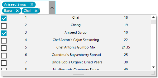
RadMultiColumnComboBox displays a popup grid which allows showing different information for each record arranged in columns. However, this control allows selecting a single record from the drop down. A common requirement is to allow the user pick up more than one option.
Telerik UI for WinForms suite offers a control that provides functionality to check multiple items in the drop down area and tokenize them in the text area. It is called RadCheckedDropDownList. However, similar to RadDropDownList, it displays just a single field for each item controlled by the DisplayMember.
This tutorial demonstrates a sample approach how to achieve checked RadMultiColumnComboBox - show several columns of data whilst being able to select multiple items with check boxes without closing the popup.
Solution
It is necessary to use a RadCheckedDropDownList and create custom visual items in the drop down. For this purpose, it is necessary to handle the CreatingVisualItem and replace the default RadCheckedListVisualItem with a custom one.
The custom RadCheckedListVisualItem will be composed of a StackLayoutElement which hosts as many LightVisualElements as you need depending on the columns count that you need to simulate:
Custom RadCheckedListVisualItem
private void RadForm1_Load(object sender, EventArgs e)
{
    this.productsTableAdapter.Fill(this.nwindDataSet.Products);
    this.radCheckedDropDownList1.CreatingVisualListItem += RadCheckedDropDownList1_CreatingVisualListItem;
    this.radCheckedDropDownList1.DataSource = this.productsBindingSource;
    this.radCheckedDropDownList1.DisplayMember = "ProductName";
    this.radCheckedDropDownList1.DropDownSizingMode = SizingMode.UpDownAndRightBottom;
    this.radCheckedDropDownList1.DropDownMinSize = new Size(500, 200);
    this.radCheckedDropDownList1.Multiline = true;
}

private void RadCheckedDropDownList1_CreatingVisualListItem(object sender, CreatingVisualListItemEventArgs args)
{
    args.VisualItem = new CustomRadCheckedListVisualItem();
}

public class CustomRadCheckedListVisualItem : RadCheckedListVisualItem
{
    private StackLayoutElement stackLayout;
    private LightVisualElement name;
    private LightVisualElement id;
    private LightVisualElement price;

    protected override RadLabelElement CreateLabelElement()
    {
        stackLayout = new StackLayoutElement();
        name = new LightVisualElement();
        id = new LightVisualElement();
        price = new LightVisualElement();

        stackLayout.Orientation = Orientation.Horizontal;
        stackLayout.StretchHorizontally = true;
        stackLayout.Children.Add(id);
        stackLayout.Children.Add(name);
        stackLayout.Children.Add(price);
        this.Children.Add(stackLayout);
        return base.CreateLabelElement();
    }

    protected override void SynchronizeProperties()
    {
        base.SynchronizeProperties();
        DataRowView rowView = this.Data.DataBoundItem as DataRowView;
        if (rowView != null)
        {
            id.Text = rowView.Row["ProductID"] + string.Empty;
            name.Text = rowView.Row["ProductName"] + string.Empty;
            price.Text = rowView.Row["UnitPrice"] + string.Empty;
        }
        this.Label.Text = "";
    }
}
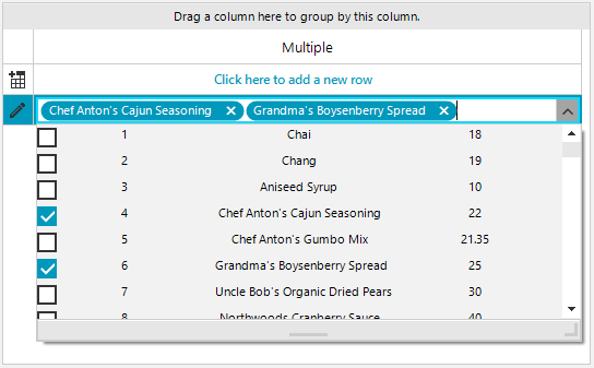
Use it as an editor in RadGridView
The above solution can be adopted for RadGridView as an editor. It is necessary to construct a custom editor and replace it in the EditorRequired event:
public RadForm1()
{
    InitializeComponent();

    GridViewTextBoxColumn checkedDropDownListColumn = new GridViewTextBoxColumn();
    checkedDropDownListColumn.FieldName = "Multiple";
    checkedDropDownListColumn.Width = 200;
    this.radGridView1.Columns.Add(checkedDropDownListColumn);
    this.radGridView1.EditorRequired += radGridView1_EditorRequired;
}

private void radGridView1_EditorRequired(object sender, EditorRequiredEventArgs e)
{
    if (this.radGridView1.CurrentColumn.Name == "Multiple")
    {
        RadCheckedDropDownListElement editor = new GridViewCheckedDropDownListEditor();
        editor.CreatingVisualItem += editor_CreatingVisualItem;
        editor.DataSource = this.productsBindingSource;
        editor.DisplayMember = "ProductName";
        editor.DropDownSizingMode = SizingMode.UpDownAndRightBottom;
        editor.DropDownMinSize = new Size(500, 200);
        e.Editor = editor;
    }
}

public class GridViewCheckedDropDownListEditor : RadCheckedDropDownListElement
{
    public override object Value
    {
        get
        {
            return this.Text;
        }
        set
        {
            this.Text = value + "";
        }
    }
}

private void editor_CreatingVisualItem(object sender, CreatingVisualListItemEventArgs args)
{
    args.VisualItem = new CustomRadCheckedListVisualItem();
}