Theme Builder Overview
The Theme Builder is a web application that enables you to create new or customize existing themes.
It renders the same look and feel as the look and feel of all other components in the suite and delivers full control over their visual elements. After you create or customize your theme, you can download it and integrate it in your project.
If you work with designers, the Theme Builder allows you to style the KendoReact components exactly as required by your application's design and to apply your brand colors.
Creating New Themes
To create a new theme:
- Go to the Theme Builder application.
- Select the Start Theming option.
- Choose a Base Theme to serve as a starting point.
- Select the components which you intent to style. You can also change the selection at a later stage.
Complex KendoReact components, such as the Grid, rely on other components to deliver their full set of features. If you select the Grid, then all of its components dependencies styles (Button, AutoComplete, DropDownList, DatePicker, and so on) will also be included in the final bundle. The Theme Builder automatically updates the styling on all required components so that you do not need to customize each of them separately.
Customizing Existing Themes
To customize an existing theme, upload the theme-name.json
file and use the styling options that the Theme Builder delivers:
Go to the Theme Builder application.
Select Import Theme.
Upload the
theme-name.json
file, which is part of the ZIP that you have previously downloaded from the Theme Builder. It contains the current parameters of the customized theme. As a result, the selected components and styling elements are loaded.Start customizing your theme by using the available options.
Previously, to import an existing custom theme, the Theme Builder accepted an SCSS (SASS) file. However, due to the lack of synchronization between the swatches in the Kendo UI Themes and the Theme Builder, the team decided to switch to a JSON import instead.
If you don't have a JSON file and your custom theme targets specific components, it is recommended that you create the JSON file from scratch:
- Create a new theme through the Theme Builder.
- Paste the variables from your SCSS file.
- Download the theme.
As a result, the JSON file is generated. The structure of the JSON file is defined in the kendo-swatch JSON schema part of our kendo-theme-tasks package.
If you don't have a JSON file and your custom theme targets all components, you can create the JSON file manually from the existing SCSS file. Make sure you consider the following specifics:
THEME_NAME
—Indicates the name of your custom theme.BASE_THEME
—The name of your base theme, for example, default, bootstrap, material, and so on.THEME_VERSION
—The recommended version of the Kendo UI Themes against which you compile your theme.components
—The list of all components that will be included in the compiled theme. Leave empty for all.groups
—The list of variables that will be customized in the Theme Builder, organized in groups.key
andvalue
variables—Thekey
of the variable outputs its name. Thevalue
of the variable outputs its value.For example:
```json "border-radius": { "name": "Border radius", "type": "number", "value": "2px" } ``` outputs ```scss $border-radius: 2px; ```
The following example demonstrates the JSON file for the Default and Bootstrap base themes.
{
"name": "THEME_NAME",
"product": "kendo",
"base": "@progress/kendo-theme-BASE_THEME",
"version": "THEME_VERSION",
"components": [],
"groups": [
{
"variables": {
"border-radius": {
"name": "Border radius",
"type": "number",
"value": "2px"
}
}
},
{
"name": "Theme colors",
"variables": {
"primary": {
"name": "Primary",
"type": "color",
"value": "#ff6358"
},
"secondary": {
"name": "Secondary",
"type": "color",
"value": "#f6f6f6"
},
"info": {
"name": "Info",
"type": "color",
"value": "#3e80ed"
},
"success": {
"name": "Success",
"type": "color",
"value": "#5ec232"
},
"warning": {
"name": "Warning",
"type": "color",
"value": "#fdce3e"
},
"error": {
"name": "Error",
"type": "color",
"value": "#d51923"
}
}
},
{
"name": "Body",
"variables": {
"body-text": {
"name": "Body text color",
"type": "color",
"value": "#424242"
},
"body-bg": {
"name": "Body background",
"type": "color",
"value": "#ffffff"
},
"headings-text": {
"name": "Headings text color",
"type": "color",
"value": "#272727"
},
"subtle-text": {
"name": "Subtle text color",
"type": "color",
"value": "#666666"
},
"disabled-text": {
"name": "Disabled text color",
"type": "color",
"value": "#8f8f8f"
}
}
},
{
"name": "Components",
"variables": {
"component-text": {
"name": "Component text color",
"type": "color",
"value": "#424242"
},
"component-bg": {
"name": "Component background",
"type": "color",
"value": "#ffffff"
},
"base-text": {
"name": "Header text color",
"type": "color",
"value": "#424242"
},
"base-bg": {
"name": "Header background",
"type": "color",
"value": "#fafafa"
},
"hovered-text": {
"name": "Hover text color",
"type": "color",
"value": "#424242"
},
"hovered-bg": {
"name": "Hover background",
"type": "color",
"value": "#ececec"
},
"selected-text": {
"name": "Selected text color",
"type": "color",
"value": "#ffffff"
},
"selected-bg": {
"name": "Selected background",
"type": "color",
"value": "#ff6358"
}
}
},
{
"name": "Button",
"variables": {
"kendo-button-text": {
"name": "Button text color",
"type": "color",
"value": "#424242"
},
"kendo-button-bg": {
"name": "Button background",
"type": "color",
"value": "#f5f5f5"
}
}
},
{
"name": "Link",
"variables": {
"link-text": {
"name": "Link text color",
"type": "color",
"value": "#ff6358"
},
"link-hover-text": {
"name": "Link hover text color",
"type": "color",
"value": "#d6534a"
}
}
},
{
"name": "Dataviz",
"variables": {
"series-a": {
"name": "Series A",
"type": "color",
"value": "#ff6358"
},
"series-b": {
"name": "Series B",
"type": "color",
"value": "#ffe162"
},
"series-c": {
"name": "Series C",
"type": "color",
"value": "#4cd180"
},
"series-d": {
"name": "Series D",
"type": "color",
"value": "#4b5ffa"
},
"series-e": {
"name": "Series E",
"type": "color",
"value": "#ac58ff"
},
"series-f": {
"name": "Series F",
"type": "color",
"value": "#ff5892"
}
}
}
]
}
The following example demonstrates the JSON file for the Material base theme.
{
"name": "THEME_NAME",
"product": "kendo",
"base": "@progress/kendo-theme-BASE_THEME",
"version": "THEME_VERSION",
"components": [],
"groups": [
{
"variables": {
"border-radius": {
"name": "Border radius",
"type": "number",
"value": "2px"
}
}
},
{
"name": "Theme colors",
"variables": {
"primary-palette-name": {
"name": "Primary",
"type": "material-colorlist",
"enum": [
{
"value": "red",
"text": "Red",
"preview": "#f44336"
},
{
"value": "pink",
"text": "Pink",
"preview": "#e91e63"
},
{
"value": "purple",
"text": "Purple",
"preview": "#9c27b0"
},
{
"value": "deepPurple",
"text": "Deep Purple",
"preview": "#673ab7"
},
{
"value": "indigo",
"text": "Indigo",
"preview": "#3f51b5"
},
{
"value": "blue",
"text": "Blue",
"preview": "#2196f3"
},
{
"value": "lightBlue",
"text": "Light Blue",
"preview": "#03a9f4"
},
{
"value": "cyan",
"text": "Cyan",
"preview": "#00bcd4"
},
{
"value": "teal",
"text": "Teal",
"preview": "#009688"
},
{
"value": "green",
"text": "Green",
"preview": "#4caf50"
},
{
"value": "lightGreen",
"text": "Light Green",
"preview": "#8bc34a"
},
{
"value": "lime",
"text": "Lime",
"preview": "#cddc39"
},
{
"value": "yellow",
"text": "Yellow",
"preview": "#ffeb3b"
},
{
"value": "amber",
"text": "Amber",
"preview": "#ffc107"
},
{
"value": "orange",
"text": "Orange",
"preview": "#ff9800"
},
{
"value": "deepOrange",
"text": "Deep Orange",
"preview": "#ff5722"
},
{
"value": "brown",
"text": "Brown",
"preview": "#795548"
},
{
"value": "gray",
"text": "Gray",
"preview": "#9e9e9e"
},
{
"value": "blueGray",
"text": "Blue Gray",
"preview": "#607d8b"
}
],
"value": "indigo"
},
"secondary-palette-name": {
"name": "Secondary",
"type": "material-colorlist",
"enum": [
{
"value": "red",
"text": "Red",
"preview": "#f44336"
},
{
"value": "pink",
"text": "Pink",
"preview": "#e91e63"
},
{
"value": "purple",
"text": "Purple",
"preview": "#9c27b0"
},
{
"value": "deepPurple",
"text": "Deep Purple",
"preview": "#673ab7"
},
{
"value": "indigo",
"text": "Indigo",
"preview": "#3f51b5"
},
{
"value": "blue",
"text": "Blue",
"preview": "#2196f3"
},
{
"value": "lightBlue",
"text": "Light Blue",
"preview": "#03a9f4"
},
{
"value": "cyan",
"text": "Cyan",
"preview": "#00bcd4"
},
{
"value": "teal",
"text": "Teal",
"preview": "#009688"
},
{
"value": "green",
"text": "Green",
"preview": "#4caf50"
},
{
"value": "lightGreen",
"text": "Light Green",
"preview": "#8bc34a"
},
{
"value": "lime",
"text": "Lime",
"preview": "#cddc39"
},
{
"value": "yellow",
"text": "Yellow",
"preview": "#ffeb3b"
},
{
"value": "amber",
"text": "Amber",
"preview": "#ffc107"
},
{
"value": "orange",
"text": "Orange",
"preview": "#ff9800"
},
{
"value": "deepOrange",
"text": "Deep Orange",
"preview": "#ff5722"
},
{
"value": "brown",
"text": "Brown",
"preview": "#795548"
},
{
"value": "gray",
"text": "Gray",
"preview": "#9e9e9e"
},
{
"value": "blueGray",
"text": "Blue Gray",
"preview": "#607d8b"
}
],
"value": "pink"
},
"theme-type": {
"name": "Theme luminosity",
"type": "color-mode",
"enum": [
{
"value": "light",
"text": "Light",
"preview": "#ffffff"
},
{
"value": "dark",
"text": "Dark",
"preview": "#000000"
}
],
"value": "light"
},
"adjust-contrast": {
"name": "Adjust contrast",
"type": "boolean",
"value": true
}
}
}
]
}
The Theme Builder provides the following styling options:
- Predefined color swatches—Allow you to give a new look to the components with minimal effort.
- Color pickers—Give you a granular control over the appearance of the components.
Implementing Design Requirements
To improve the collaboration between designers and developers, KendoReact comes with three UI Kits for Figma: Material, Bootstrap, and Kendo UI Default. Your designers will use them to create the required application design and to apply your brand colors. To implement these design requirements, you need to create a new theme in Theme Builder and customize it:
Request from the designer to send you a link to the UI kit with the customized colors in Figma.
Use the link to open the design in Figma.
If you don't have a Figma account, you can create one for free.
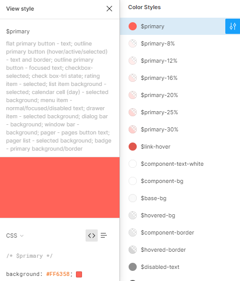
Navigate to the Components page and locate the Color Styles in the Inspect Panel, where you can find the values of all colors used in the design.
Create a new theme in the Theme Builder application.
- To select the correct Base Theme, ask your designer which UI Kit was used: Default, Bootstrap, or Material.
Copy the color codes from the Color Styles in Figma and paste them in the Theme Builder color editor with the same name. For example, copy the value of the
$primary
color in Figma and paste it in the Primary color editor in the Theme Builder.
Using the Themes in Your Project
When you finish customizing the theme, you can start using it in your project:
Download the theme files by clicking the Download button.
Register the downloaded theme in your project:
To use the complete theme for all components, include the
THEME_NAME.css
file as precompiled CSS.To use the theme as SCSS, include the
variables.scss
file in the build process of your application:// Import configuration from the theme builder @import 'variables.scss'; // Import the base theme @import '~@progress/kendo-theme-default/scss/all';
If you include the
bootstrap
framework from its source, make sure to includekendo-theme-bootstrap
and any ThemeBuilder output before you import thebootstrap
framework:@import "variables"; @import "~@progress/kendo-theme-bootstrap/scss/all"; @import "~bootstrap/scss/bootstrap";