or
1 answer
134 views
Hi
I am using Range mode for Tkclalendar in xamarion.iOS app . I have been using custom cell as per documentation and facing few issues as below.
1. How do I deselect or undo the selected date?
2. When in range mode if I need to select single date ,How could it achieved?
Please provided any way to make it work?
Thanks,
Avinash

Didi
Telerik team

answered
on
11 Jan 2019
1 answer
119 views
In the attached screenshot of a calendar, in iOS you can see the appointment "Mobile Team - Daily" is correctly rendered as 1/4 of an hour as it is 15 min long.
Android however renders it as 1/2 of the hour space which users think is 30 minutes.
Is this a bug?

Yana
Telerik team
answered
on
11 Jan 2019
1 answer
426 views
We have a problem with only the Android version, iOS is fine.
On a very complex Cell UI and using a Selector, often the Labels are rendered 1 letter wide. Rotating the device Landscape then Portrait causes a refresh and the labels render fine. Pull-to-refresh will also often fix the issue. The initial render fails.
How can I force the RadListView to recalculate the layout of the cells so that the Labels redraw. I can do that in a timer after the data is loaded. A work around.
Yana
Telerik team
answered
on
11 Jan 2019
1 answer
106 views
On Android, see screenshot, the Current Time link,e "IsCurrentTimeIndicatorVisible" renders only partway across the screen. iOS is fine.
Didi
Telerik team
answered
on
10 Jan 2019
1 answer
95 views
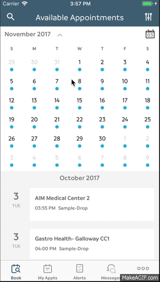
In the attached screenshot, the current time "12:38" is not rendered as a line across the calendar. How can we enable a Current Time line to show the user what time it is?
Didi
Telerik team
answered
on
10 Jan 2019
10 answers
166 views
Hello!
I am trying to find out if this is a bug or I am doing the things incorrectly I have binded the DisplayDate and SelectedDate with properties on My View Model like this:
I am trying to find out if this is a bug or I am doing the things incorrectly I have binded the DisplayDate and SelectedDate with properties on My View Model like this:
DisplayDate="{Binding CalendarDisplayDate, Mode=TwoWay}"SelectedDate="{Binding SelectedDate, Mode=TwoWay}"
But for some reason when I swipe the calendar to the next month, the circle is just visible for a second or so and then it disappears. I have also set those properties when the user swipes the calendar like this:
public override void DidNavigateToDate(TKCalendar calendar, NSDate date){ var dateTime = date.ToDateTime(); if(Element == null) { return; } Element.SelectedDate = new DateTime(dateTime.Year, dateTime.Month, 1); Element.DisplayDate = new DateTime(dateTime.Year, dateTime.Month, 1); Element.LoadMonthAppointmentsCommand.Execute(null);}
Here is a short video:
GIF
Yana
Telerik team
answered
on
09 Jan 2019
2 answers
138 views
Hey Guys, I've been working with dataforms and I have it close but not quite to the spec I'm trying to achieve. Attached is a "SignUp" screen and I'm using your "Reservation" renderer on iOS. There are two things missing from my render that I need help with. First, I'd like to put a full boarder around each field. Second, I'd like the fields to align on the left near their icons and span across the white space. I'm adding my login screen because it has the fields look and feel that I'm trying to match. If you can point me to the documentation or any additional samples that show this I would greatly appreciate it.
Attached:
SignUp - Needs help
Login - The look I'm trying to achieve...
Thank you!
Brian

1 answer
432 views
Hi we want to create dynamic tab page using telerik radtabview in our app but unfortunately we could not find any option in telerik for dynamic tab page. So now we are using xamarin forms tabbed page but its complicated. It would be great if there is any solution for that problem by using radtabview. I am sharing my code below:
<TabbedPage xmlns="http://xamarin.com/schemas/2014/forms"
xmlns:x="http://schemas.microsoft.com/winfx/2009/xaml"
xmlns:ffimageloading="clr-namespace:FFImageLoading.Forms;assembly=FFImageLoading.Forms"
xmlns:telerikDataControls="clr-namespace:Telerik.XamarinForms.DataControls;assembly=Telerik.XamarinForms.DataControls"
xmlns:telerikListView="clr-namespace:Telerik.XamarinForms.DataControls.ListView;assembly=Telerik.XamarinForms.DataControls"
xmlns:telerikPrimitives="clr-namespace:Telerik.XamarinForms.Primitives;assembly=Telerik.XamarinForms.Primitives"
x:Class="Ls.Learn.LearnPage"
ItemsSource="{Binding VolumeCategoryList}"
x:Name="lTabbedPage"
BarTextColor="White"
BarBackgroundColor="#006b91">
<TabbedPage.ItemTemplate>
<DataTemplate>
<ContentPage Title="{Binding Label}">
<telerikDataControls:RadListView ItemsSource="{Binding Volumes}" x:Name="listView" ItemTapped="Results_ItemTapped">
<telerikDataControls:RadListView.ItemTemplate>
<DataTemplate>
<telerikListView:ListViewTemplateCell>
<telerikListView:ListViewTemplateCell.View>
<Grid Padding="12">
<Grid.ColumnDefinitions>
<ColumnDefinition Width="3*"></ColumnDefinition>
<ColumnDefinition Width="7*"></ColumnDefinition>
</Grid.ColumnDefinitions>
<ffimageloading:CachedImage Grid.Row="0" Grid.Column="0" Aspect="AspectFill"
DownsampleToViewSize="true" Source="{Binding ImageUrl}">
</ffimageloading:CachedImage>
<StackLayout Grid.Column="1" VerticalOptions="StartAndExpand">
<Label class="volume-name" Text="{Binding VolumeSubject}" LineBreakMode="WordWrap"></Label>
</StackLayout>
</Grid>
</telerikListView:ListViewTemplateCell.View>
</telerikListView:ListViewTemplateCell>
</DataTemplate>
</telerikDataControls:RadListView.ItemTemplate>
<telerikDataControls:RadListView.LayoutDefinition>
<telerikListView:ListViewLinearLayout />
</telerikDataControls:RadListView.LayoutDefinition>
</telerikDataControls:RadListView>
</ContentPage>
</DataTemplate>
</TabbedPage.ItemTemplate>
</TabbedPage>

Lance | Senior Manager Technical Support
Telerik team
answered
on
08 Jan 2019
1 answer
136 views
I have a nicely working ItemTemplateSelector
<telerikDataControls:RadListView.ItemTemplateSelector> <vm:HotlistItemSelector> <vm:HotlistItemSelector.ErrorTemplate> <DataTemplate> My template hereI wish to reuse my ErrorTemplate. I have placed it in a ResourceDictionary. How can I tell my HotlistItemSelector that the ErrorTemplate is to be found in the ResourceDictionary ?
Lance | Senior Manager Technical Support
Telerik team
answered
on
08 Jan 2019
4 answers
284 views
I have a RadListView which uses a ListViewTemplateCell to specify the list item layout.
When the list is displayed initially, the layout looks OK. After using pull to refresh a few times, the layout looks weird. With the example I'm attaching below, the layout is affected typically on the fourth pull to refresh. Just watch the rightmost text how it shifts to the left and right as you pull to refresh. Keep pulling for even more movement.
Telerik_UI_for_Xamarin_2018_2_516_2_Dev
Shared code project targets .NET Standard 1.4
Xamarin Forms 2.5.1.527436
Android
Android 8.1 (API Level 27 - Oreo) - on emulator
<?xml version="1.0" encoding="utf-8" ?><ContentPage xmlns="http://xamarin.com/schemas/2014/forms" xmlns:local="clr-namespace:ListBug" xmlns:telerikDataControls="clr-namespace:Telerik.XamarinForms.DataControls;assembly=Telerik.XamarinForms.DataControls" xmlns:telerikListView="clr-namespace:Telerik.XamarinForms.DataControls.ListView;assembly=Telerik.XamarinForms.DataControls" x:Class="ListBug.MainPage" x:Name="Self"> <Grid> <Grid.ColumnDefinitions> <ColumnDefinition Width="*" /> </Grid.ColumnDefinitions> <Grid.RowDefinitions> <RowDefinition Height="*" /> </Grid.RowDefinitions> <telerikDataControls:RadListView x:Name="listView" ItemsSource="{Binding Path=Items, Source={x:Reference Name='Self'}}" IsPullToRefreshEnabled="True" RefreshRequested="listView_RefreshRequested"> <telerikDataControls:RadListView.ItemTemplate> <DataTemplate> <telerikListView:ListViewTemplateCell> <telerikListView:ListViewTemplateCell.View> <Grid RowSpacing="2" Padding="5, 0, 5, 0"> <Grid.ColumnDefinitions> <ColumnDefinition Width="4*"/> <ColumnDefinition Width="1*"/> </Grid.ColumnDefinitions> <Grid.RowDefinitions> <RowDefinition Height="Auto" /> <RowDefinition Height="Auto" /> </Grid.RowDefinitions> <Label Text="{Binding Overview}" /> <Label Grid.Row="1" Text="{Binding Details}" /> <Label Grid.Column="1" Grid.RowSpan="2" Text="{Binding Other}" HorizontalTextAlignment="End" VerticalTextAlignment="Center" /> </Grid> </telerikListView:ListViewTemplateCell.View> </telerikListView:ListViewTemplateCell> </DataTemplate> </telerikDataControls:RadListView.ItemTemplate> </telerikDataControls:RadListView> </Grid></ContentPage>
Here's the code behind:
using System.Collections.Generic;using Xamarin.Forms;namespace ListBug{ public partial class MainPage : ContentPage { public static readonly BindableProperty ItemsProperty = BindableProperty.Create(nameof(Items), typeof(List<Item>), typeof(MainPage), default(List<Item>), BindingMode.Default, null); public List<Item> Items { get { return (List<Item>)GetValue(ItemsProperty); } set { SetValue(ItemsProperty, value); } } public MainPage() { InitializeComponent(); InitializeItems(); } private void InitializeItems() { Items?.Clear(); var items = new List<Item>(); items.Add(new Item() { Overview = "First item overview", Details = "First item details", Other = "Item1" }); items.Add(new Item() { Overview = "Second item overview", Details = "Second item details", Other = "Item2" }); items.Add(new Item() { Overview = "Third item overview", Details = "Third item details", Other = "Item3" }); items.Add(new Item() { Overview = "Fourth item overview", Details = "Fourth item details", Other = "Item4" }); items.Add(new Item() { Overview = "Fifth item overview", Details = "Fifth item details", Other = "Item5" }); Items = items; } private void listView_RefreshRequested(object sender, Telerik.XamarinForms.DataControls.ListView.PullToRefreshRequestedEventArgs e) { InitializeItems(); listView.EndRefresh(true); } }}
and here's the Item class
namespace ListBug{ public class Item { public string Overview { get; set; } public string Details { get; set; } public string Other { get; set; } }}
Lance | Senior Manager Technical Support
Telerik team
answered
on
08 Jan 2019


%20(4).jpg)
