
3 Answers, 1 is accepted

Hi Benjamin,
I believe I have successfully implemented the functionality you requested. Please review the provided Dojo and let me know if it meets your requirements.
The implementation includes modifications to the visual function logic, where I've optimized the approach to reuse the existing rect object while applying rounded corners to achieve the desired visual effect.
I welcome any feedback or suggestions for further refinement to ensure this solution fully addresses your needs.
Regards,
Yordan
Progress Telerik
Love the Telerik and Kendo UI products and believe more people should try them? Invite a fellow developer to become a Progress customer and each of you can get a $50 Amazon gift voucher.
 Bronze
 Iron
Iron
 Veteran
Hello Benjamin,
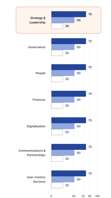
It is indeed possible to apply rounded corners exclusively to the right side of chart elements. This functionality can be achieved through custom visual functions in the Kendo UI Chart component.
For comprehensive implementation guidance, please refer to our knowledge base article: Chart Rounded Bar Corners
I have prepared two distinct methodologies to accomplish this requirement:
- Path-based Approach - Utilizing custom drawing paths with selective arc definitions
- Overlay Technique - Combining rounded rectangles with strategic masking elements
Both implementation strategies have been demonstrated in the provided Dojo example for your evaluation. Please review the solution and confirm whether it aligns with your technical requirements.
Should you require any modifications or have additional specifications, please do not hesitate to reach out.
Regards,
Yordan
Progress Telerik
Love the Telerik and Kendo UI products and believe more people should try them? Invite a fellow developer to become a Progress customer and each of you can get a $50 Amazon gift voucher.
Bronze
Iron
Veteran
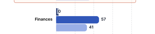
i saw that for the chart with 0 value, there seems to be overlapping
Hello Benjamin,
To address the overlapping issue, consider adding a margin property within the labels configuration object. This approach provides better spacing control and visual separation. Please refer to the updated Dojo example below for implementation details.
Regards,
Yordan
Progress Telerik
Love the Telerik and Kendo UI products and believe more people should try them? Invite a fellow developer to become a Progress customer and each of you can get a $50 Amazon gift voucher.