

1 Answer, 1 is accepted
Hello Benjamin,
You can achieve the desired by manually defining the value axis majorUnit, min, and max. Then force the Chart to generate ticks that include 25, 50, and 75 by explicitly setting the axis scale in the labels.visual function and change the label text:
valueAxis: {
  min: 0,                    // Minimum value on the value axis
  max: 100,                  // Maximum value on the value axis
  majorUnit: 25,             // Axis ticks will appear at every 25 units: 0, 25, 50, 75, 100
  labels: {
    visual: function (e) {
      var targets = [25, 50, 75, 100]; // Values at which we want to show custom labels
      var tolerance = 0.01;            // Tolerance to account for floating-point precision

      // Loop through each target value
      for (var i = 0; i < targets.length; i++) {
        // Check if current label value is close to any of the target values
        if (Math.abs(e.value - targets[i]) < tolerance) {

          // Customize label for value 25
          if (e.text == 25) {
            return new kendo.drawing.Text("Limited", e.rect.origin, {
              fill: { color: "black" },
              font: "12px Arial"
            });
          }

          // Customize label for value 50
          if (e.text == 50) {
            return new kendo.drawing.Text("Fair", e.rect.origin, {
              fill: { color: "black" },
              font: "12px Arial"
            });
          }

          // Customize label for value 75
          if (e.text == 75) {
            return new kendo.drawing.Text("Good", e.rect.origin, {
              fill: { color: "black" },
              font: "12px Arial"
            });
          }

          // Customize label for value 100
          if (e.text == 100) {
            return new kendo.drawing.Text("Excelent", e.rect.origin, {
              fill: { color: "black" },
              font: "12px Arial"
            });
          }
        }
      }

      return null; // Skip rendering labels for all other values
    }
  }
}
Dojo demo: https://dojo.telerik.com/CMMrkNJU
Regards,
Nikolay
Progress Telerik
Love the Telerik and Kendo UI products and believe more people should try them? Invite a fellow developer to become a Progress customer and each of you can get a $50 Amazon gift voucher.
 Bronze
 Iron
Iron
 Veteran
would like to check if this is possible?
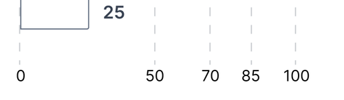

Hi Benjamin,
Could you please explain the requirement? I am not sure I understand it from the screenshot.
Regrads,
Nikolay
Bronze
Iron
Veteran
Hi Benjamin,
Can you pelase share an image of the whole Chart you need to achieve? The initial inquiry was to render words for the value axis labels instead of numbers.
Regards,
Nikolay
Bronze
Iron
Veteran
Hi Benjamin,
Here is something similar to the requested:
https://dojo.telerik.com/UBwMfmnU
You need to adjust the visual function to add the dashed lines above the labels.
Regards,
Nikolay
Bronze
Iron
Veteran
Bronze
Iron
Veteran
this is a new image for the requirement
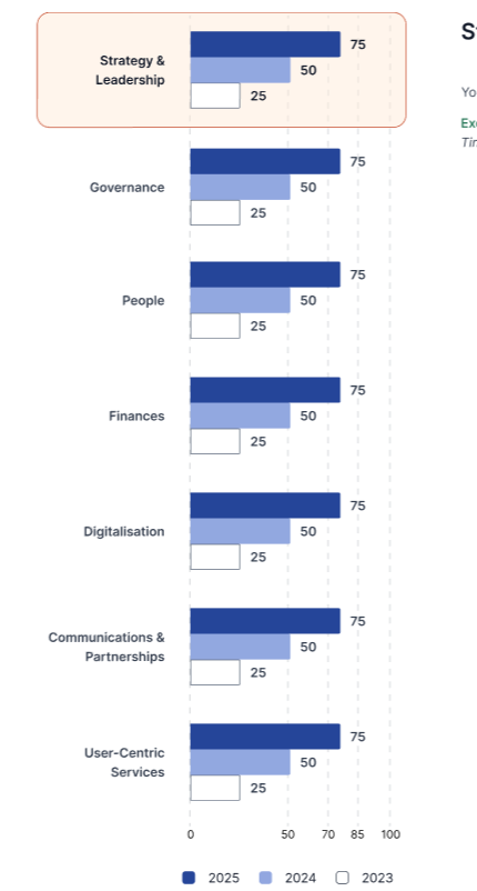
Hi Benjamin,
You have to adjust the valueAxis visual function for the labels. Please check the next Dojo: https://dojo.telerik.com/qOhigyDh
Regards,
Nikolay