Is Apple’s Liquid Glass the Next Material Design?

Summarize with AI:
Liquid Glass feels a lot like when Google introduced Material Design back in 2014. Does this mean we’re about to enter an era of glassmorphism all around the web? We’ll look at what the Liquid Glass UI entails and how this new digital material may shape the way we design apps and websites going forward.
In June 2025, Apple announced Liquid Glass. This new glassmorphic digital material has changed the way components look and feel on all its operating systems and devices.
Because of how drastically the Apple UI has changed, is it reasonable to expect that designers and developers will have to start mirroring their app and website designs to fit? And if they do, will these adaptations be minor or will it transform the way the entire web looks in the coming years?
In this post, we’re going to look at the new Liquid Glass UI and the changes it’s bringing to Apple’s operating systems. We’re also going to look at the similarities between Liquid Glass and Google’s original Material Design concept, and what this means for anyone designing digital interfaces in the near future.
What Is Apple’s Liquid Glass UI?
On June 6, 2025, Apple announced the new Liquid Glass software design.
Alan Dye, the VP of Human Design for Apple, says that goal of Liquid Design is to:
“Make something purely digital feel natural and alive—from how it looks to how it feels as it dynamically responds to touch.”
In the promotional video released with the announcement, we get to see what Liquid Glass looks like and what makes it different from previous Apple interfaces:
Let’s have a look at these changes in more detail:
Universal Design for All Platforms
It’s not just macOS or iOS that’s getting this Liquid Glass UI. All platforms have been redesigned with this new material. This includes:
- macOS
- iPadOS
- iOS
- watchOS
- tvOS
In addition, Apple apps have been reskinned with Liquid Glass elements, like Safari, Camera, Apple Music and more.
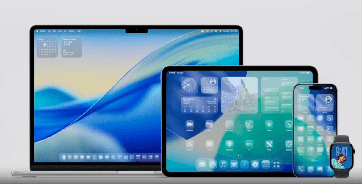
Essentially, everything went from looking like this:
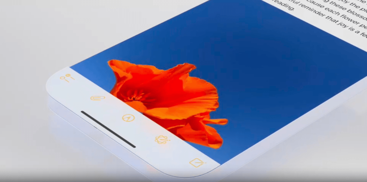
Here we see how flat and ultra-minimalist something like a toolbar looked prior to Liquid Glass. The toolbar gives off the appearance that it’s part of the phone’s hardware instead of part of the screen or software.
The icons looked touchable simply because of their illustrated appearance and because they were confined to a toolbar container, not because they looked like buttons or stuck out in any other way from the interface.
Fast forward to June 2025, and here is how this toolbar now looks:
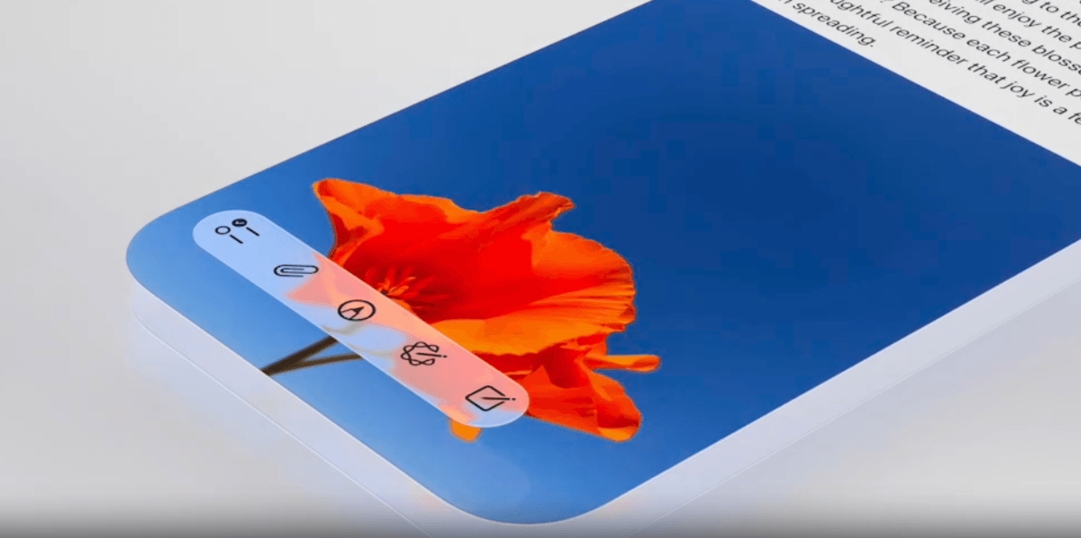
The icon designs are the same. However, the toolbar no longer appears to be part of the hardware. Nor is it separated from the content area and contained within a thick opaque space. Now, it sits within a semi-transparent component that hovers over the content.
This component (and all Liquid Glass components) also has rounded edges. This is something that Apple was intentional about when coming up with Liquid Glass as they wanted these hovering components to naturally nest within the rounded edges of Apple’s devices.
Reskinning of the Fundamental Elements
Unlike some design trends or brand redesigns that reenvision how every part of the UI looks, Liquid Glass only affects the fundamental elements. As Apple explains to developers and designers wanting to adopt it for their own purposes:
“Liquid Glass seeks to bring attention to the underlying content, and overusing this material in multiple custom controls can provide a subpar user experience by distracting from that content. Limit these effects to the most important functional elements in your app.”
So, which parts of the UI have changed exactly?
If we’re talking about Apple’s operating systems specifically, then Liquid Glass has transformed quite a bit of it.
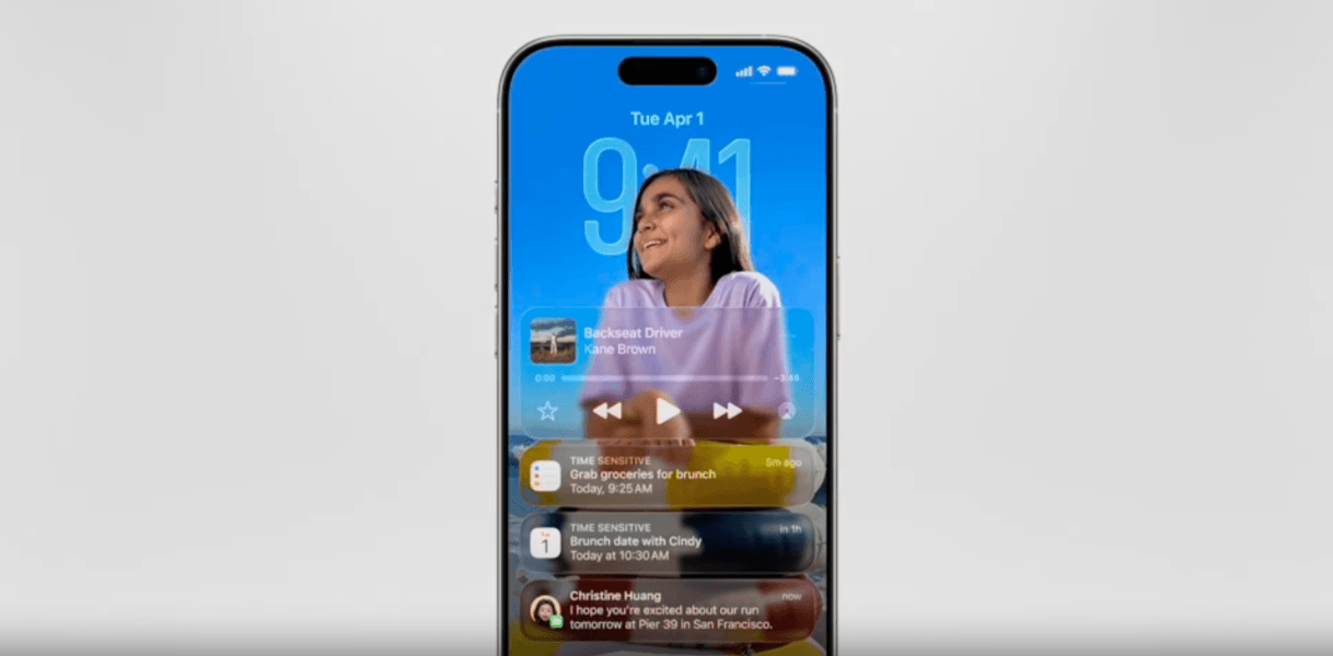
On the lock screen, for instance, these elements are Liquid Glass:
- Date and time
- Notification bars
- Audio/video controllers
The home screen is majorly transformed as well. For example, these elements are now skinned using Liquid Glass:
- App icons
- Calendars
- Weather tracker
- Docks
- Sidebars
- Search bars
- Cards
- Navigation/screen slide controls
Here’s what the home screen of an iPhone looks like with Liquid Glass components:
![]()
Unlike previously where the background graphic or design would’ve been masked by all the icons, Liquid Glass allows us to see through them. So the content is no longer hidden by the components that sit atop it.
Now, here’s what a larger screen might look like if someone were to search for something to watch on a streaming service:
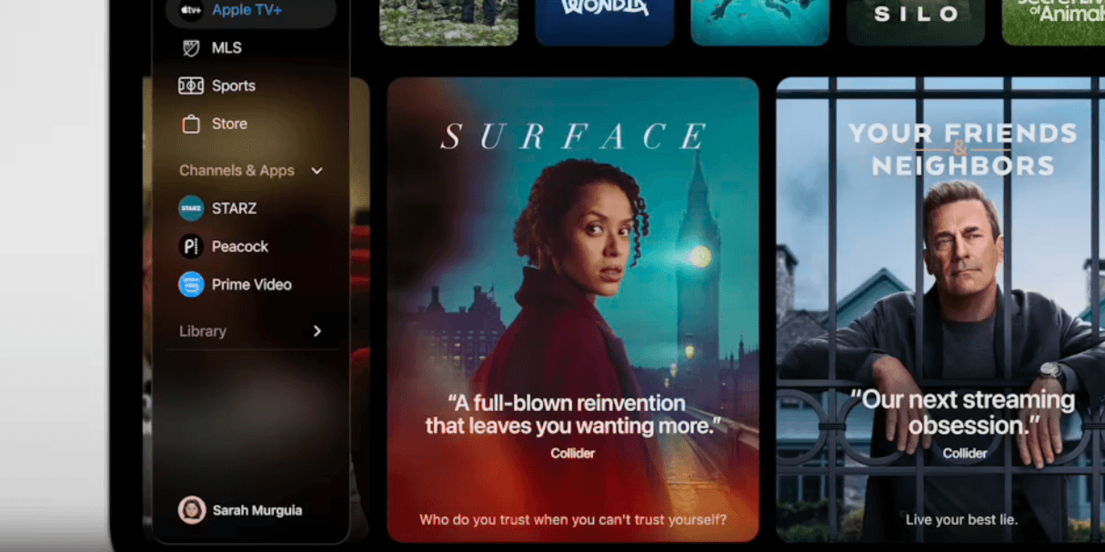
This has a much different appearance than the iPhone example above. In part, because the background is darker. But also because the Liquid Glass components don’t appear as see-through. (I’ll talk about that in the next section.)
These are just examples of how the Apple operating systems have changed. But their apps look different too.
For example, here’s what the controls look like when watching a movie or video in one of Apple’s apps:
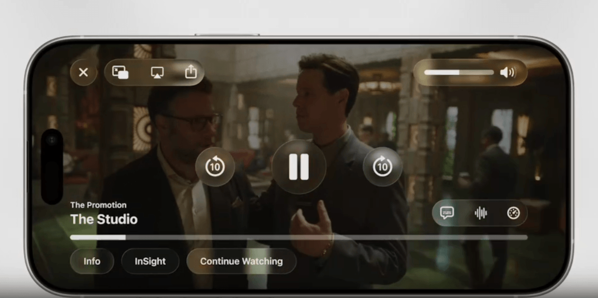
You can see that the content is untouched. However, all the controls and settings in the layered foreground now have the distinctive Liquid Glass frosted look. These include:
- “X” exit button
- Screen sharing options
- Volume control
- Video player controls
- Closed captioning controls
- Video timeline bar
- Info buttons
Essentially, buttons, toolbars, sidebars, navigation and controls will now take on the look of Liquid Glass.
Translucent and Fluid Layers
Liquid Glass was designed to be a digital material that looks and acts like glass does in our physical world. So, these components are translucent and also refract light. If you watch the video above, you’ll see how moving an iPhone back and forth makes it look as though light is shining on the “glass” of the time displayed there.
Now, Liquid Glass can’t be completely transparent as it would create a readability and accessibility nightmare for Apple users. So, these elements have more of a soft glazed or foggy glass appearance than anything.
Refraction, however, does work a lot like it does in the real world. For example, here’s what the address bar and other navigational components might look like on an iPhone:
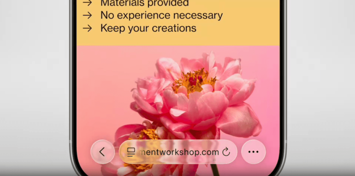
There are pink flowers in the center of the background. On top of this section is where you’ll find the address bar. You can see how pieces of the flower (the yellow and pink) still poke through.
That said, refraction doesn’t work equally the same way for all components.
For smaller, less intrusive elements like the address bar, it does. For larger elements that cover more of the content, it does not.
Here we see how clicking open a menu of controls gives us a more frosted Liquid Glass layer. Yes, we can still see some of the content and colors beneath it, but not as much as we do with smaller layers.
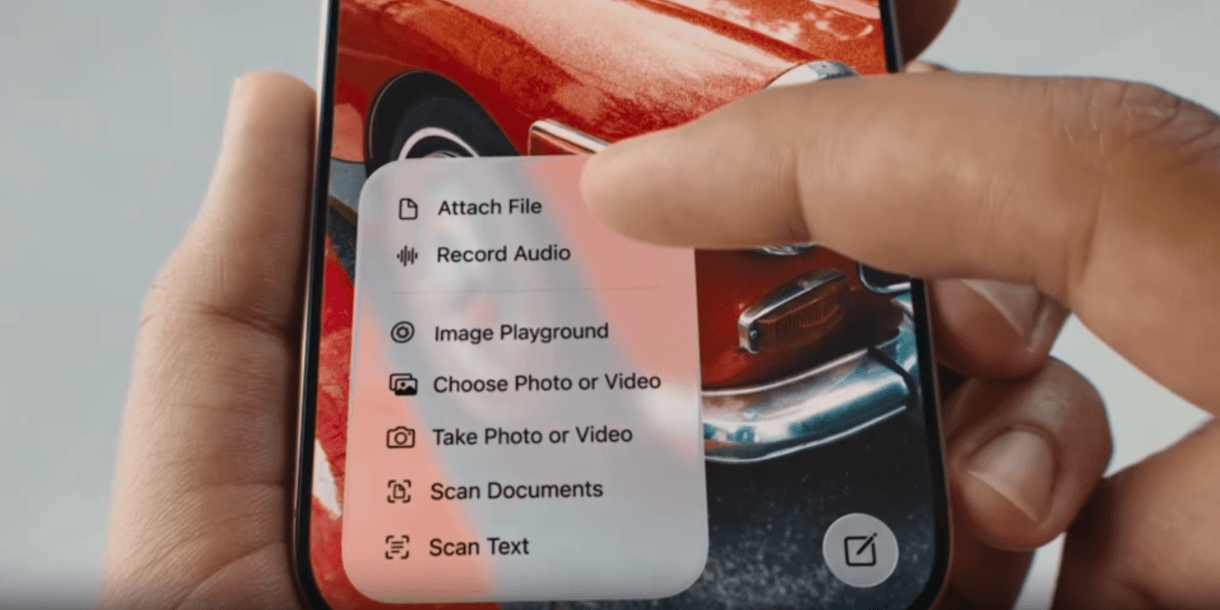
Without this extra-frosted effect, it would be very difficult to read the image editing settings in this menu.
We can’t forget that Liquid Glass is called “liquid” for a reason. This is something that we didn’t see much of in the above video (which is where these image stills come from), but it’s an important part of the new Apple user experience.
In terms of how this plays out, there are a couple of new effects to be aware of. One is the illumination effect. When touched or clicked, Liquid Glass components glow. Depending on the flexibility of the component, it may also flow beneath your finger or cursor if you move it.
The video quality here isn’t the best, but you’ll get a good sense for how this fluidity “feels” around the 4-minute mark.
Intuitive Adaptions
Something else that makes Liquid Glass different from what we’ve seen before is how it adapts to the environment as well as to user interaction.
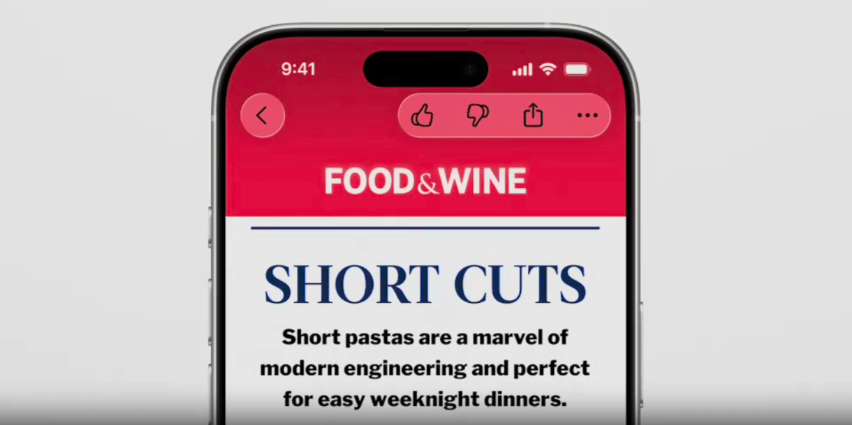
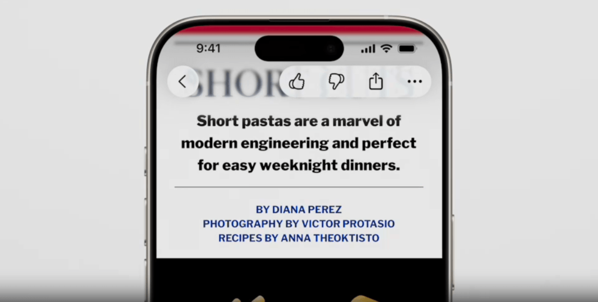
To start, Liquid Glass components change color based on what’s behind them. We saw the example earlier of the pink flower behind the address bar. In the following example, we see how the blog interaction toolbar and back button change color as a user scrolls down this blog post.
The frosted glass starts out red at the top of the page:
As the user scrolls over the main content where the white background is, the Liquid Glass color changes to match it:
It’s not merely changing the background of the “glass” layer though. Liquid Glass will alter the color of the icons or text, too. For example, when these components pass over a darker section, the glass goes black while the icons turn white:
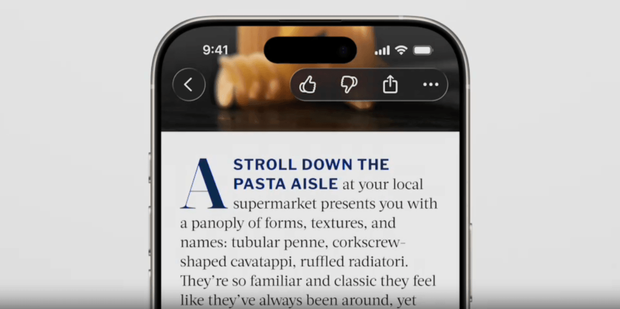
Ultimately, the color of your glass adapts to whatever content is behind it.
The shadow behind the glass will change, too. What we’ve seen so far is what happens when images and sold color blocks appear beneath Liquid Glass layers. However, if large swaths of text happen to show up behind them, then a shadow will appear to keep the text or icons on the Liquid Glass layers readable.
Another way in which Liquid Glass has been designed to adapt has to do with its size.
Liquid Glass is meant to have a minimal footprint. For starters, Apple has taken these components out of the content areas of the screen and layered them on top. By making them translucent, they feel lighter and less cumbersome, too.
But not every component is going to be small or stay small. For example, this is a search bar for Apple Maps:
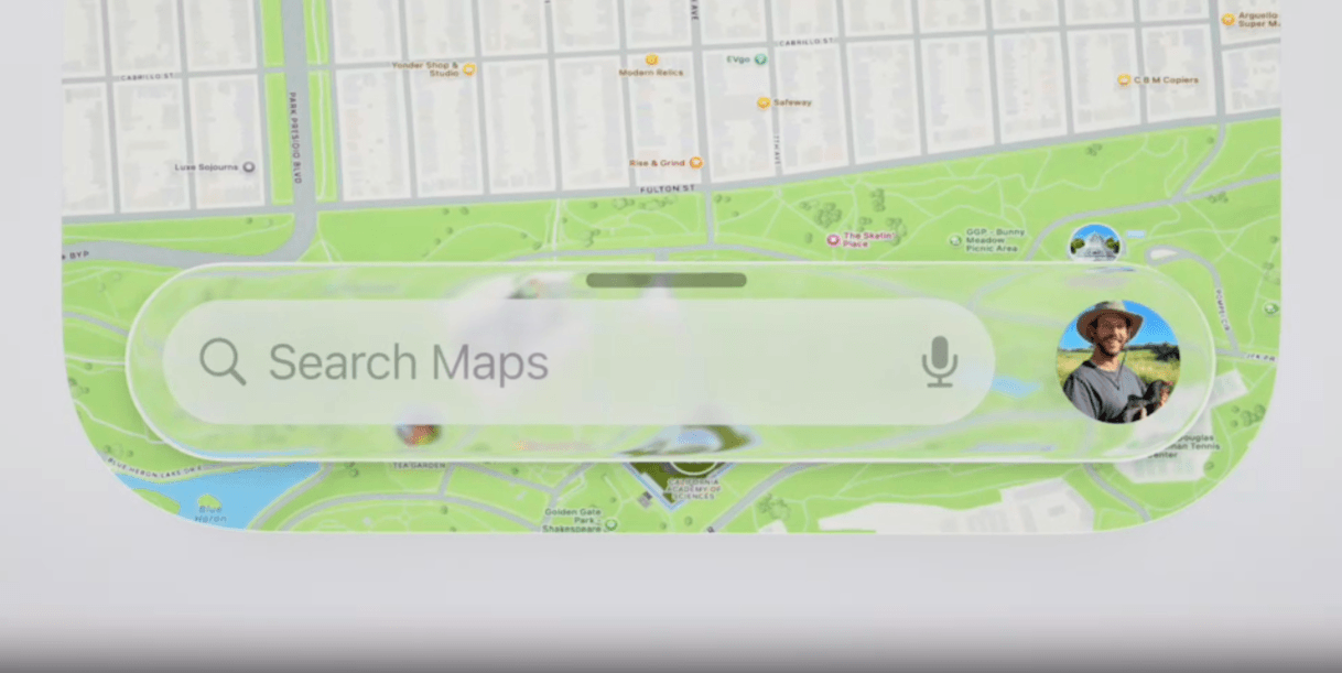
It sits at the bottom of the phone screen, allowing the user to focus on the map. When clicked, though, it doesn’t just enable you to type a query into the field.
Instead, it opens up a panel with helpful search options.
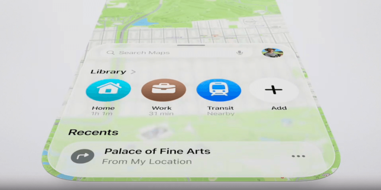
This panel will disappear and shrink down to the minimal search bar if the user engages with the map outside of it. The same thing will happen with other small components that expand. The second a user disengages, scrolls, clicks away, etc., the Liquid Glass component shrinks down to its minimum size.
At the same time, the opacity of components changes based on their size. So, when you’re seeing the smaller version of them, they’ll be more translucent. When the larger menus or additional options appear, the component will take on a more opaque appearance. This is to improve readability as well.
Comparing Liquid Glass to Material Design
For those who don’t remember, Material Design was Google’s design system and UI framework that went mainstream in 2014.
As Ina Tontcheva explained:
“The team chose to use a metaphor of paper surface as the unifying principle because people have a long history of interacting with paper and surface and because they are physical and exist in the world. The team relied on the tangible metaphor that users understand intuitively to accelerate the understanding of their UI.”
At the time, Material Design was a breath of fresh air. It offered a much-needed shift away from skeuomorphism and the flat design trend that followed it.
The thing is, it didn’t just change the appearance of all of Google’s products, it went on to become the hottest design trend. It altered the face of the web for a couple of years—but not entirely for good. Many websites and apps looked and felt the same because they’d all followed Google’s specific guidelines (and even color palettes).
This era of design made it difficult to stand out visually. It also had its flaws when it came to usability and accessibility.
Why do I bring this up? Well, I suspect we’re about to see something similar happen with Liquid Glass.
There are some key differences, though, that may keep Liquid Glass and the glassmorphism trend as a whole from taking over the web. Or even from sticking around too long within the Apple ecosystem.
Google’s Reach
Right now, Liquid Glass is strictly for Apple devices and apps. Google’s Material Design, on the other hand, was for all Google products, which could be accessed on any device. (Not to mention the sheer popularity of Google Chrome and Search.)
So, unless Android, Google and other operating systems decide to follow suit, we may only see this trend within the Apple ecosystem.
That brings up an important question: Will these other tech giants make the move to a frosted glassy effect as well? What’s in it for them if they do? And how long will it take before they’re all in sync with this glassmorphism trend?
UI vs. Functionality
Material Design completely changed everything within the UI—the colors, fonts, components, backgrounds, layering and shading, animation, etc. Liquid Glass, on the other hand, is only concerned with functional components.
Because of this, Liquid Glass might not be something that designers and developers decide to adopt for their websites and apps.
Glassmorphism isn’t the kind of look that melds well with a lot of brands visually speaking. It’s a tricky medium as its glossiness and futuristic feel doesn’t work for many brands. Material Design had its limitations, too, but it didn’t have as exclusive of a feel to it. Plenty of brands were willing to play with the vibrant color palettes and paper-like layers.
If Liquid Glass were transforming the entire interface, some brands might be able to make that transition. But if we’re just talking layered components, most won’t be able to make that switch seamlessly.
Practicality
While Material Design may have been groundbreaking compared to the design trends we had before it, it still felt grounded. Basing the redesign on paper helped with this. It’s a simple and practical medium.
On the other hand, Liquid Glass reminds me of the kinds of things you see in sci-fi movies like Minority Report.
I think Apple was thinking many years ahead when it decided on glass as its medium. Right now, our hardware is still too solid and clunky to blend with glassmorphic UIs. Perhaps in three, four or maybe 10 years from now our devices will resemble those of Minority Report. But, for now, Liquid Glass doesn’t feel natural.
So, unless our tech catches up, I’m not sure it’ll have staying power.
Will Liquid Glass Be the Next Big Trend?
Apple has gone all in on Liquid Glass, changing the look and feel of all its products and proprietary apps.
Do I think we’ll see widespread adoption of it across the web? Not likely.
The one thing that may change this trajectory is what developers and designers do with it.
Let’s say that developers and designers feel pressured to add glassmorphic components to their apps for their Apple users. Without a Liquid Glass app icon or in-app components, the experience might not feel as seamless anymore.
But unless those developers and designers are working for a major enterprise with massive resources and budgets, can they afford to create a Liquid Glass-inspired experience for Apple users and a completely different one for everyone else? What’s more, do they want to have such a huge disparity between the user experience for these user segments?
We’ll have to see how things go with Liquid Glass in the next year or two. If popularity wanes, if it causes massive problems for accessibility (which there are rumblings of) or if Apple decides to revert back to the old design, then things will stay as they are. However, if Liquid Glass succeeds and wins the support from the huge user base that is Apple users, then non-Apple operating systems and devices will have to go all in on glassmorphism.

Suzanne Scacca
A former project manager and web design agency manager, Suzanne Scacca now writes about the changing landscape of design, development and software.

