Getting Started with the Circular Gauge
This tutorial explains how to set up a basic Telerik UI for ASP.NET MVC Circular Gauge and highlights the major steps in the configuration of the component.
You will initialize a Circular Gauge and configure its Scale, which is responsible for the visualization of the gauge. Then, you will handle the basic JavaScript keydown event to acknowledge when the user presses the Up or Down arrow keys and update the value of the Circular Gauge using its client-side reference.
Prerequisites
To successfully complete the tutorial, you need a project that is already configured to use the Telerik UI for ASP.NET MVC components:
-
To create a new pre-configured project for the Telerik UI for ASP.NET MVC components, you can use a project template.
-
To manually configure an existing project by using NuGet, see the Adding Telerik UI through NuGet.
1. Prepare the CSHTML File
The first step is to add the required directives at the top of the .cshtml document:
-
To use the Telerik UI for ASP.NET MVC HtmlHelpers:
cshtml@using Kendo.Mvc.UI
Optionally, you can structure the document by adding the desired HTML elements like headings, divs, and paragraphs. In this tutorial, you will also apply some styles to the gauge and its container.
<style>
#gauge-container {
width: 386px;
height: 386px;
text-align: center;
margin: 20px auto 30px auto;
}
#gauge {
width: 350px;
height: 300px;
margin: 0 auto;
}
</style>
<div id="example">
<div id="gauge-container">
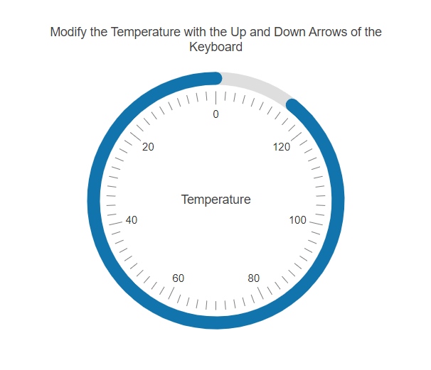
<p>Modify the Temperature with the Up and Down Arrows of the Keyboard</p>
<!-- Component Configuration -->
</div>
</div>2. Initialize the Circular Gauge
Use the Circular Gauge HtmlHelper to add the component to a page:
- The
Name()configuration method is mandatory as its value is used for theidand thenameattributes of the Circular Gauge element. - Configure the text in the center of the gauge with the
CenterTemplateproperty. - Set the color of the value pointer with the
Colorconfiguration method. - Utilize the
Valuemethod to set an initial value for the Circular Gauge.
    @using Kendo.Mvc.UI

    @(Html.Kendo().CircularGauge()
        .Name("gauge")
        .Value(55)
        .Color("#1274AC")
        .CenterTemplate("Temperature")
    )
3. Configure the Circular Gauge
Configure the Scale configuration method of the Circular Gauge. It exposes the CircularGaugeSettingsBuilder which allows you to then set up the Min, Max, MajorTicks, MinorTicks, Labels and Reverse properties.
    @using Kendo.Mvc.UI

    @(Html.Kendo().CircularGauge()
        .Name("gauge")
        .Value(55)
        .Scale(x =>
           x.Min(0)
            .Max(140)
            .MajorTicks(M=>M.Visible(true))
            .MinorTicks(m => m.Visible(true))
            .Labels(l => l.Visible(true))
        )
        .Color("#1274AC")
        .CenterTemplate("Temperature")
    )
4. (Optional) Reference Existing Circular Gauge Instances
You can reference the Circular Gauge instances that you have created and build on top of their existing configuration:
-
Use the
idattribute of the component instance to establish a reference.JavaScript$(document).ready( function (e) { var circulargaugeReference = $("#gauge").data("kendoCircularGauge"); // circulargaugeReference is a reference to the existing Circular Gauge instance of the helper. }); -
Use the Circular Gauge client-side API to control the behavior of the component. In this example, you will use the
value()method to change the value of the Circular Gauge when the user presses theArrowUporArrowDownkeyboard buttons.JavaScript$("body").on("keydown",function(e){ if(e.key=="ArrowUp"){ updateValue(1); }else if(e.key=="ArrowDown"){ updateValue(-1); } }) function updateValue(number) { var gauge = $("#gauge").data("kendoCircularGauge"); gauge.value(gauge.value()+number); }