Bullet Charts
The Telerik UI Bullet HtmlHelper for ASP.NET MVC is a server-side wrapper for the Kendo UI Bullet widget.
Bullet Charts represent a variation of the Bar Chart.
Getting Started
You can use the Bullet Chart component to visualize a comparison between an expected (target) and actual (current) value—for example, company profit, employee performance, weather data, and so on.
To create a Bullet series in the Chart component, use Bullet and VerticalBullet in the Series configuration.
Configuring the Axes
To configure the axes, use the CategoryAxis and ValueAxis settings. Multiple value axes are also supported.
@(Html.Kendo().Chart()
.Name("chart")
.Legend(legend => legend
.Visible(false)
)
.Series(series => {
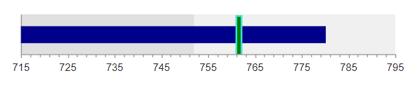
series.Bullet(new double[][] { new double[] { 750, 762.5 }});
})
.ChartArea(chartArea => chartArea.Margin(0))
.CategoryAxis(axis => axis
.MajorGridLines(lines => lines.Visible(false))
.MajorTicks(lines => lines.Visible(false))
)
.ValueAxis(axis => axis
.Numeric()
.Min(715)
.Max(795)
.MinorTicks(lines => lines.Visible(true))
.MajorGridLines(lines => lines.Visible(false))
.PlotBands(bands => {
bands.Add().From(715).To(752).Color("#ccc").Opacity(0.6);
bands.Add().From(752).To(772).Color("#ccc").Opacity(0.3);
})
)
.Tooltip(tooltip => tooltip
.Visible(true)
.Shared(true)
.Template("Maximum: #= value.target # <br /> Average: #= value.current #")
)
)The configuration from the previous example results in the following Bullet Chart.
Customizing the Target Value Lines
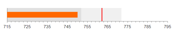
You can customize the line that represents the target value through the Target series configuration. Target exposes the Border, Color, and Line main settings that control the line appearance.
The following example demonstrates how to use all three options to customize the target line.
    .Series(series =>
    {
        series
        .Bullet(new double[][] { new double[] { 780, 762.5 } })
        .Color("darkblue")
        .Target(target=>target
        .Color("green")
        .Border(b=>b
            .Color("turquoise")
            .Width(2)
        )
        .Line(l=>l.Width(6))
        );
    })