Styling
The Badge supports a set of built-in geometry types for styling its appearance and provides custom geometry types for rendering a custom styling logic.
-
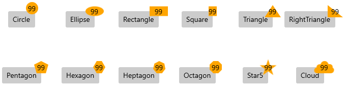
Geometry—A property of typeGeometrythat gets or sets the geometry of the Badge component.The geometry markup extension supports the following geometries:
CircleEllipseRectangleSquareTriangleRightTrianglePentagonHexagonHeptagonOctagonStar5Cloud
Set the Built-In Badge Geometry
<primitives:RadBadgeView Grid.Row="0" Grid.Column="4" BadgePosition="1, 0"  VerticalAlignment="Center" HorizontalAlignment="Center" >
	<Button Content="Triangle"  Foreground="Black" />
	<primitives:RadBadgeView.Badge>
		<primitives:RadBadge x:Name="badgeButton" Background="Orange" Content="99" Foreground="Black"  Geometry="{core:Geometry Type=Triangle}"  />
	</primitives:RadBadgeView.Badge>
</primitives:RadBadgeView>
To apply a geometry type in code-behind, use the GeometryFactory.SetGeometry() method.
Set a Custom Badge Geometry in Code
public Example()
{
	this.InitializeComponent();
	this.badgeButton.Geometry = GeometryFactory.GetGeometry(GeometryType.Hexagon);
}-
Stroke—A property of typeBrushthat gets or sets the stroke color of the Badge. -
StrokeThickness—A property of typedoublethat gets or sets the stroke thickness of the Badge. -
StrokeDashArray—A property of typeDoubleCollectionthat gets or sets the stroke dash array of the Badge. -
TextAlignment—An enumeration property of typeMicrosoft.UI.Xaml.TextAlignmentthat gets or sets the text alignment of the underlyingTextBlock. -
PlayChangeAnimationCommand—A property of typeICommandthat gets or sets the change animation of the Badge. -
InheritDataContext—A property of typeboolthat gets or sets a value indicating whether the Badge will take the data context from its target element.
Badge Geometries