Kendo UI for Vue
What's New 2025 Q2
What's New HistoryWhat's New 2025 Q2
New Breadcrumb Component for Seamless Hierarchical Navigation
Kendo UI for Vue now includes a Breadcrumb component - a modern, accessible navigation header that helps users track their current location within a website or app's hierarchy. Designed with flexibility in mind, it supports custom icons, font sizes, and delimiters, along with disabled items to guide user flow. The component is fully responsive, adapting gracefully to different screen sizes with an optional collapse mode for cleaner display.
Developers can customize the navigation behavior, allow users to edit long paths directly, and localize the interface for global audiences. The component meets WCAG 2.2 AA accessibility standards and includes full RTL support and keyboard navigation, making it a robust solution for high-quality, user-friendly navigation in any Vue app.
See Kendo UI for Vue Breadcrumb demo

New Heatmap Component: Visualize Dense Data for High Impact
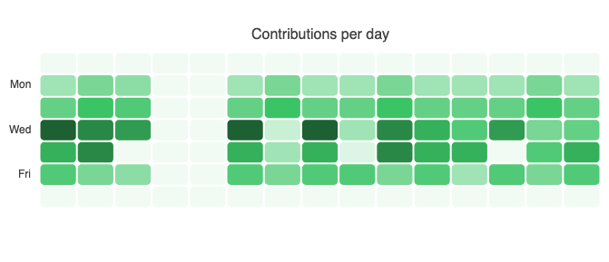
The Kendo UI for Vue library now includes a powerful Heatmap component for visualizing complex, two-dimensional data patterns at a glance. This new chart type uses color intensity to represent values across X and Y axes, helping users instantly identify clusters, trends, and outliers. It supports both array and object data binding, with customizable X and Y categories, making it easy to map any dataset.
The Heatmap comes packed with features including built-in color scales (or custom ones using callbacks), a variety of marker shapes (rectangles, circles, triangles, and more), and interactive behaviors like panning, zooming, and crosshairs for deeper insights. Developers can also fine-tune tooltips with access to all relevant data point metadata. Whether you’re analyzing heat distribution, user engagement, or correlation matrices, this new component makes it fast and intuitive to render dense information in a clean, insightful format.
See Kendo UI for Vue Heatmap demo

Kendo UI for Vue Embraces Composition API for a Better Developer Experience
Kendo UI for Vue has fully migrated all product demos from the Options API to Vue’s modern Composition API, embracing the recommended paradigm for building maintainable and scalable Vue applications. This shift provides a more consistent and modular code structure, ideal for real-world projects and enterprise-grade development.
With the Composition API, developers benefit from improved logic reuse across components and cleaner organization of features within the same component. This update not only aligns our demos with current Vue best practices but also helps customers evaluate components in a format that mirrors how modern Vue apps are built today - making onboarding easier, reducing context switching, and offering a more intuitive development experience.
Check out the updated Kendo UI for Vue getting started article

What's New 2025 Q1
Kendo UI for Vue: Adaptive Mode for ColorPicker, Tabstrip and Toolbar
The new adaptive rendering feature allows the ColorPicker, Tabstrip and Toolbar components to adapt to the screen size by adjusting dynamically based on the screen dimensions.
Adaptive behavior needs to be defined per component as a UI-specific solution. For example, the adaptive Kendo UI for Vue TabStrip enables users to scroll through its tabs when the tab list cannot fit in the component boundaries. For the Vue ColorPicker, you can adjust the rendering of its popup element based on the device's screen resolution by using pre-set breakpoints. The ToolBar adjusts its rendering based on screen size, ensuring overflowing tools remain accessible.
See the Vue ColorPicker Appearance demo
See the Vue TabStrip Appearance demo
See the Vue Toolbar Appearance demo

Kendo UI for Vue Data Grid: Responsive Columns and Built-in Print
The latest enhancements to the Kendo UI for Vue Data Grid include:
- Responsive columns – the visibility of the Grid columns changes based on the viewport width.
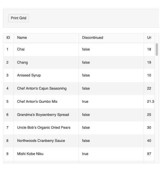
- Built-in Print – users can now print the grid in multiple use case scenarios using the browser’s print window – the component provides the the option to print both a scrollable and a pageable grid and also to control the print output based on their needs.

Kendo UI for Vue Charts: Patterns, No Data Template and Sankey Keyboard Navigation
The latest enhancements to the Kendo UI for Vue Charts include:
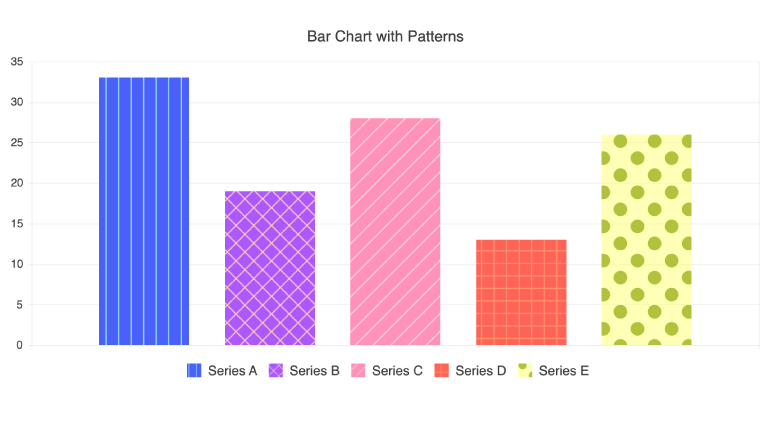
- Support for a customizable pattern fill of the chart series. Now, instead of using only solid colors, you can spice things up by filling chart elements with different patterns such as diagonal stripes, dots or a grid pattern.
- No-data template – this ready-to-use template improves the user experience in empty-state scenarios when there is no data to visualize.
- Keyboard navigation for the Sankey diagram – the component now comes with keyboard navigation enabled out of the box, making sure the main interactive parts of the Sankey diagram are reachable through the keyboard.

Kendo UI for Vue - 2025 Q2
- What's New 2025 Q2
- New Breadcrumb Component for Seamless Hierarchical Navigation
- New Heatmap Component: Visualize Dense Data for High Impact
- Kendo UI for Vue Embraces Composition API for a Better Developer Experience
- What's New 2025 Q1
- Kendo UI for Vue: Adaptive Mode for ColorPicker, Tabstrip and Toolbar
- Kendo UI for Vue Data Grid: Responsive Columns and Built-in Print
- Kendo UI for Vue Charts: Patterns, No Data Template and Sankey Keyboard Navigation


