This question is locked. New answers and comments are not allowed.
Hi,
I want to style the tabitem. By default the top tabitem has an inclined side on the right end( slanting from top to bottom on the right side). I want to make it inclined on left side, slanting up from bottom to top( similar to the look of tabitem in Visual Studio 2008). What is the quickest way to do this.
I had a sample template of tabitem which I tweaked.
1) Created a style for TabItem and gave it a key.
2) Set the style of tabitem created in xaml to the value of key above.
However, it does not show any change in the style of tabitem.
What could be wrong? I did not specify the style of tabcontrol, only for tabitem in the xaml page whihc references the style created.
Regards,
Sandeep
42 Answers, 1 is accepted
0
Accepted

Hi Sandeep,
The reason for the strange behavior is the fact that the TabItem and the TabControl have 4 templates each, not just one. These templates change depending on the tabStripPlacement of the TabControl and have similar names, e.g.
TopTemplate -> for Top TabStripPlacement
You need to set these properties in your style.
We chose this approach for performance reasons. (The alternative approach was to have all the visual elements in one template and hide/show different parts of them as needed). Other controls also have several templates - the RadMenuItem for example.
For your particular template: applying a ScaleTransofrm(){ XScale = -1 } from the center of the path and then positioning it within the grid seems to be the quickest way.
Do come back to us if you need more help with the styling.
Best wishes,
Miroslav
the Telerik team
Check out Telerik Trainer, the state of the art learning tool for Telerik products.
0

Sandeep
Top achievements
 Rank 1
Rank 1
answered on 21 Oct 2008, 09:03 PM
Thanks Miroslav.
However, I am not able to move ahead in this much. I am not able to modify the look and feel of the tabitem at all. This is what I am trying:
In the post for Silvelight titled "Where can I find the predefined themes? ", Valentin had uploaded a zip file containing predefined themes. From that set, I took the template for "TabItemTopTemplate" from TabItem.xaml.
In the resource of the xaml page which contains the radtabitem of my project, I created a style like this
In the xaml page where I am using radTabItem, I have assigned the style to the style defined with the key in the resources. Style="{StaticResource tlTabItemTemplate}".
However, the look of the tabitem does not change at all.
I am not sure what is wrong.
I have not specified the style for tabcontrol though in the xaml page containing the tabs, only the style for tabitem.
Can you please guide me what is it that I am doing wrong.
Your help will be highly appreciated.
Thanks,
Sandeep
However, I am not able to move ahead in this much. I am not able to modify the look and feel of the tabitem at all. This is what I am trying:
In the post for Silvelight titled "Where can I find the predefined themes? ", Valentin had uploaded a zip file containing predefined themes. From that set, I took the template for "TabItemTopTemplate" from TabItem.xaml.
In the resource of the xaml page which contains the radtabitem of my project, I created a style like this
<
Style x:Key="tlTabItemTemplate" TargetType="telerik:RadTabItem">
<Setter Property="Template">
<Setter.Value>
I copied the <ControlTemplate> from the TabItem.xaml. I modified it for color, path, etc.
In the xaml page where I am using radTabItem, I have assigned the style to the style defined with the key in the resources. Style="{StaticResource tlTabItemTemplate}".
However, the look of the tabitem does not change at all.
I am not sure what is wrong.
I have not specified the style for tabcontrol though in the xaml page containing the tabs, only the style for tabitem.
Can you please guide me what is it that I am doing wrong.
Your help will be highly appreciated.
Thanks,
Sandeep
0
Hi Sandeep,
Sorry, if I was not very clear with my reply.
The TabItem will not use the Template property but one of the four specific templates: TopTemplate, LeftTemplate, BottomTemplate, RightTemplate. So when you need to set the template of an item, you set one of those properties and not the Template property.
The same applies for the TabControl, MenuItem, ComboBox, etc.
I will reply with an example of VS-like tab theme later today.
All the best,
Miroslav
the Telerik team
Check out Telerik Trainer, the state of the art learning tool for Telerik products.
0
Sandeep
Top achievements
Rank 1
Rank 1
answered on 22 Oct 2008, 02:26 PM
Thanks Miroslav.
Really appreciate your help. Thanks a lot for your offer to provide a VS like Tabtheme template.
Regards,
Sandeep
Really appreciate your help. Thanks a lot for your offer to provide a VS like Tabtheme template.
Regards,
Sandeep
0
Sandeep
Top achievements
Rank 1
Rank 1
answered on 24 Oct 2008, 01:28 PM
Hi Miroslav,
Can you please help me by providing a example of VS-like tab theme.
Regards,
Sandeep
Can you please help me by providing a example of VS-like tab theme.
Regards,
Sandeep
0
Hello Sandeep,
I got as close as this:
Here is the caml behind it:
Please note that this is just the TopTemplate. The other 3 templates are symmetrical.
Hopefully this is what you need.
Greetings,
Miroslav
the Telerik team
Check out Telerik Trainer, the state of the art learning tool for Telerik products.
I got as close as this:
Here is the caml behind it:
| <UserControl x:Class="TestBench.TabControlStudioTheme" |
| xmlns="http://schemas.microsoft.com/winfx/2006/xaml/presentation" |
| xmlns:x="http://schemas.microsoft.com/winfx/2006/xaml" |
| xmlns:test="clr-namespace:TestBench" |
| xmlns:nav="clr-namespace:Telerik.Windows.Controls;assembly=Telerik.Windows.Controls.Navigation" |
| xmlns:navPrimitive="clr-namespace:Telerik.Windows.Controls.Primitives;assembly=Telerik.Windows.Controls.Navigation" |
| xmlns:primitive="clr-namespace:Telerik.Windows.Controls.Primitives;assembly=Telerik.Windows.Controls" |
| xmlns:dock="clr-namespace:Telerik.Windows.Controls;assembly=Telerik.Windows.Controls.Docking"> |
| <UserControl.Resources> |
| <!--Brushes--> |
| <LinearGradientBrush EndPoint="0,1" |
| x:Key="TabItemBackgroundNormal"> |
| <GradientStop Offset="0" |
| Color="#ECF5FC" /> |
| <GradientStop Offset="1" |
| Color="#98B4D2" /> |
| </LinearGradientBrush> |
| <SolidColorBrush x:Key="TabItemOuterBorderNormal" |
| Color="#9196A2" /> |
| <SolidColorBrush x:Key="TabItemInnerBorderNormal" |
| Color="#F2FAFF" /> |
| <SolidColorBrush x:Key="TabItemForeground" |
| Color="#000000" /> |
| <SolidColorBrush x:Key="TabItemOuterBorderMouseOver" |
| Color="#69A1BF" /> |
| <SolidColorBrush x:Key="TabItemInnerBorderMouseOver" |
| Color="#FFFFFF" /> |
| <LinearGradientBrush EndPoint="0,1" |
| x:Key="TabItemBackgroundMouseOver"> |
| <GradientStop Offset="0" |
| Color="#EFF9FD" /> |
| <GradientStop Offset="1" |
| Color="#81D0F1" /> |
| </LinearGradientBrush> |
| <SolidColorBrush x:Key="TabItemOuterBorderSelected" |
| Color="#69A1BF" /> |
| <SolidColorBrush x:Key="TabItemInnerBorderSelected" |
| Color="#FFFFFF" /> |
| <LinearGradientBrush EndPoint="0,1" |
| x:Key="TabItemBackgroundSelected"> |
| <GradientStop Offset="0" |
| Color="#FCFDFE" /> |
| <GradientStop Offset="1" |
| Color="#D2E6FA" /> |
| </LinearGradientBrush> |
| <SolidColorBrush x:Key="TabItemForegroundSelected" |
| Color="#000000" /> |
| <ControlTemplate TargetType="nav:RadTabItem" |
| x:Key="TabItemTemplate"> |
| <Grid x:Name="wrapper" |
| Margin="-1 4 0 0"> |
| <VisualStateManager.VisualStateGroups> |
| <VisualStateGroup x:Name="CommonStateGroup"> |
| <VisualState x:Name="MouseOver"> |
| <Storyboard> |
| <ObjectAnimationUsingKeyFrames Storyboard.TargetProperty="BorderBrush" |
| Storyboard.TargetName="outerBorder"> |
| <DiscreteObjectKeyFrame KeyTime="0:0:0.1" |
| Value="{StaticResource TabItemOuterBorderMouseOver}" /> |
| </ObjectAnimationUsingKeyFrames> |
| <ObjectAnimationUsingKeyFrames Storyboard.TargetProperty="BorderBrush" |
| Storyboard.TargetName="innerBorder"> |
| <DiscreteObjectKeyFrame KeyTime="0:0:0.1" |
| Value="{StaticResource TabItemInnerBorderMouseOver}" /> |
| </ObjectAnimationUsingKeyFrames> |
| <ObjectAnimationUsingKeyFrames Storyboard.TargetProperty="Border.Background" |
| Storyboard.TargetName="innerBorder"> |
| <DiscreteObjectKeyFrame KeyTime="0:0:0.1" |
| Value="{StaticResource TabItemBackgroundMouseOver}" /> |
| </ObjectAnimationUsingKeyFrames> |
| </Storyboard> |
| </VisualState> |
| <VisualState x:Name="Normal" /> |
| <VisualState x:Name="Selected"> |
| <Storyboard> |
| <ObjectAnimationUsingKeyFrames Storyboard.TargetProperty="BorderBrush" |
| Storyboard.TargetName="innerBorder"> |
| <DiscreteObjectKeyFrame KeyTime="0:0:0.1" |
| Value="{StaticResource TabItemInnerBorderSelected}" /> |
| </ObjectAnimationUsingKeyFrames> |
| <ObjectAnimationUsingKeyFrames Storyboard.TargetProperty="Background" |
| Storyboard.TargetName="innerBorder"> |
| <DiscreteObjectKeyFrame KeyTime="0:0:0.1" |
| Value="{StaticResource TabItemBackgroundSelected}" /> |
| </ObjectAnimationUsingKeyFrames> |
| <!--<ObjectAnimationUsingKeyFrames Storyboard.TargetProperty="FontWeight" |
| Storyboard.TargetName="HeaderElement"> |
| <DiscreteObjectKeyFrame KeyTime="0:0:0.1" |
| Value="Bold" /> |
| </ObjectAnimationUsingKeyFrames>--> |
| </Storyboard> |
| </VisualState> |
| </VisualStateGroup> |
| <VisualStateGroup x:Name="FocusStates"> |
| <VisualState x:Name="Unfocused" /> |
| <VisualState x:Name="Focused" /> |
| </VisualStateGroup> |
| </VisualStateManager.VisualStateGroups> |
| <Grid.Resources> |
| <navPrimitive:TabItemMarginConverter x:Key="TabItemMarginConverter" |
| SelectedMargin="-1 3 0 -2" |
| UnselectedMargin="-1 5 0 0" /> |
| </Grid.Resources> |
| <Border x:Name="outerBorder" |
| BorderThickness="{TemplateBinding BorderThickness}" |
| BorderBrush="{StaticResource TabItemOuterBorderNormal}" |
| CornerRadius="3 3 0 0" |
| Margin="-1 0 0 0"> |
| <Border x:Name="innerBorder" |
| BorderThickness="1 1 1 0" |
| BorderBrush="{StaticResource TabItemInnerBorderNormal}" |
| CornerRadius="2 2 0 0" |
| Padding="2 0 2 0" |
| Background="{StaticResource TabItemBackgroundNormal}"> |
| <ContentControl x:Name="HeaderElement" |
| Content="{TemplateBinding Header}" |
| ContentTemplate="{TemplateBinding HeaderTemplate}" |
| Margin="{TemplateBinding Padding}" |
| Foreground="{TemplateBinding Foreground}" /> |
| </Border> |
| </Border> |
| </Grid> |
| </ControlTemplate> |
| <Style TargetType="nav:RadTabItem" |
| x:Key="TabItemStyle"> |
| <Setter Property="Template" |
| Value="{StaticResource TabItemTemplate}" /> |
| <Setter Property="TopTemplate" |
| Value="{StaticResource TabItemTemplate}" /> |
| <Setter Property="BorderThickness" |
| Value="1 1 1 0" /> |
| <Setter Property="BorderBrush" |
| Value="{StaticResource TabItemOuterBorderNormal}" /> |
| <Setter Property="Background" |
| Value="{StaticResource TabItemBackgroundNormal}" /> |
| <Setter Property="Padding" |
| Value="4 0 4 0" /> |
| <Setter Property="Margin" |
| Value="0" /> |
| <Setter Property="FontSize" |
| Value="10" /> |
| <Setter Property="Foreground" |
| Value="{StaticResource TabItemForeground}" /> |
| <!--TODO: Remove the conent template!--> |
| <Setter Property="ContentTemplate"> |
| <Setter.Value> |
| <DataTemplate> |
| <TextBlock Text="{Binding}" |
| FontSize="20" |
| Foreground="Gray" |
| Margin="20" /> |
| </DataTemplate> |
| </Setter.Value> |
| </Setter> |
| </Style> |
| <!--Brushes--> |
| <SolidColorBrush x:Key="TabControlBackground" |
| Color="#F8F8F8" /> |
| <SolidColorBrush x:Key="TabControlDarkerBorder" |
| Color="#69A1BF" /> |
| <SolidColorBrush x:Key="TabControlHighlight" |
| Color="#FFFFFF" /> |
| <SolidColorBrush x:Key="TabControlColor" |
| Color="#D2E6FA" /> |
| <!--Tab Item ContelTemplate--> |
| <ControlTemplate x:Key="TabControlTopTemplate" |
| TargetType="nav:RadTabControl"> |
| <Grid> |
| <VisualStateManager.VisualStateGroups> |
| <VisualStateGroup x:Name="CommonStates"> |
| <VisualState x:Name="Disabled"> |
| <Storyboard /> |
| </VisualState> |
| <VisualState x:Name="Normal" /> |
| </VisualStateGroup> |
| </VisualStateManager.VisualStateGroups> |
| <Grid.RowDefinitions> |
| <RowDefinition Height="auto" /> |
| <RowDefinition Height="*" /> |
| </Grid.RowDefinitions> |
| <!--Content--> |
| <Border BorderThickness="1" |
| BorderBrush="{StaticResource TabControlDarkerBorder}" |
| CornerRadius="3" |
| Grid.Row="1"> |
| <Border BorderThickness="1" |
| BorderBrush="{StaticResource TabControlHighlight}" |
| CornerRadius="2" |
| Background="{StaticResource TabControlColor}"> |
| <Border BorderBrush="{StaticResource TabControlDarkerBorder}" |
| Margin="2" |
| Padding="{TemplateBinding Padding}" |
| BorderThickness="1" |
| Background="{TemplateBinding Background}"> |
| <ContentPresenter x:Name="ContentElement" |
| Content="{TemplateBinding SelectedContent}" |
| ContentTemplate="{TemplateBinding SelectedContentTemplate}" /> |
| </Border> |
| </Border> |
| </Border> |
| <!--TabStrip--> |
| <ItemsPresenter Margin="2 3 0 0" |
| x:Name="ItemsPresenterElement" /> |
| </Grid> |
| </ControlTemplate> |
| <Style TargetType="nav:RadTabControl" |
| x:Key="TabControlStudioStyle"> |
| <Setter Property="Template" |
| Value="{StaticResource TabControlTopTemplate}" /> |
| <Setter Property="TopTemplate" |
| Value="{StaticResource TabControlTopTemplate}" /> |
| <Setter Property="Background" |
| Value="{StaticResource TabControlBackground}" /> |
| </Style> |
| </UserControl.Resources> |
| <Grid x:Name="LayoutRoot"> |
| <test:LayoutTester> |
| <nav:RadTabControl x:Name="tabControl" |
| Style="{StaticResource TabControlStudioStyle}" |
| ItemContainerStyle="{StaticResource TabItemStyle}"> |
| </nav:RadTabControl> |
| </test:LayoutTester> |
| </Grid> |
| </UserControl> |
Please note that this is just the TopTemplate. The other 3 templates are symmetrical.
Hopefully this is what you need.
Greetings,
Miroslav
the Telerik team
Check out Telerik Trainer, the state of the art learning tool for Telerik products.
0
Sandeep
Top achievements
Rank 1
Rank 1
answered on 24 Oct 2008, 03:47 PM
Thanks for you reply Miroslav.
I am afraid this is not I was looking for.
I would have uploaded an image of what I want to do but did not find a way to do so in this post.
Let me try to explain what I am looking for.
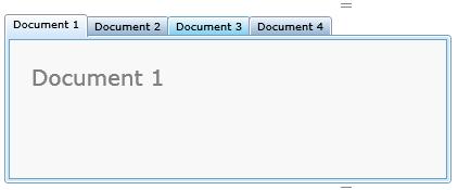
Normally the shape of header in top tabitem in the telerik control has a slant on the right end of the header. It looks something like a combination of rectangle on the left and a right angled triangle immediately right to the rectangle( I am sorry I cannot draw it here). The slant of the triangle is from top left to bottom right. This is how the default telerik tabitem looks.
My requirement is to have a shape where the triangle comes to the left of the rectangle. Triangle slants from bottom left to top right and then immediately to its right is the rectangle shape. ( If you open VS 2008 project and open multiple files, you get them as tabitems with the shape I am mentioning).
I am sorry I have not been able to attach an image to this message becuase I did not find a way to do that.
Can you please help me with an example of that shape.
Thanks a lot for all your help.
Regards,
Sandeep
I am afraid this is not I was looking for.
I would have uploaded an image of what I want to do but did not find a way to do so in this post.
Let me try to explain what I am looking for.
Normally the shape of header in top tabitem in the telerik control has a slant on the right end of the header. It looks something like a combination of rectangle on the left and a right angled triangle immediately right to the rectangle( I am sorry I cannot draw it here). The slant of the triangle is from top left to bottom right. This is how the default telerik tabitem looks.
My requirement is to have a shape where the triangle comes to the left of the rectangle. Triangle slants from bottom left to top right and then immediately to its right is the rectangle shape. ( If you open VS 2008 project and open multiple files, you get them as tabitems with the shape I am mentioning).
I am sorry I have not been able to attach an image to this message becuase I did not find a way to do that.
Can you please help me with an example of that shape.
Thanks a lot for all your help.
Regards,
Sandeep
0
Hello Sandeep,
I believe this is what you need?
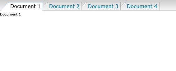
Here is th examl for it:
Best wishes,
Miroslav
the Telerik team
Check out Telerik Trainer, the state of the art learning tool for Telerik products.
I believe this is what you need?
Here is th examl for it:
| <UserControl x:Class="TestBench.TabControlInvertedTheme" |
| xmlns="http://schemas.microsoft.com/winfx/2006/xaml/presentation" |
| xmlns:x="http://schemas.microsoft.com/winfx/2006/xaml" xmlns:test="clr-namespace:TestBench" |
| xmlns:nav="clr-namespace:Telerik.Windows.Controls;assembly=Telerik.Windows.Controls.Navigation" |
| xmlns:navPrimitive="clr-namespace:Telerik.Windows.Controls.Primitives;assembly=Telerik.Windows.Controls.Navigation" |
| xmlns:vsm="clr-namespace:System.Windows;assembly=System.Windows" |
| xmlns:primitive="clr-namespace:Telerik.Windows.Controls.Primitives;assembly=Telerik.Windows.Controls" |
| xmlns:dock="clr-namespace:Telerik.Windows.Controls;assembly=Telerik.Windows.Controls.Docking"> |
| <UserControl.Resources> |
| <SolidColorBrush x:Key="TabItemMouseOverInnerBorder" Color="#6600BCFF" /> |
| <LinearGradientBrush x:Key="TabItemMouseOverBackground" StartPoint="0.500008,1.00006" |
| EndPoint="0.500008,0"> |
| <GradientStop Color="#FFE3F6FF" Offset="0" /> |
| <GradientStop Color="#FFBFEAFF" Offset="1" /> |
| </LinearGradientBrush> |
| <SolidColorBrush x:Key="TabItemSelectInnerBorder" Color="#fff" /> |
| <LinearGradientBrush x:Key="TabItemSelecteBackground" EndPoint="0.5,1" StartPoint="0.5,0"> |
| <GradientStop Color="#4000BCFF" Offset="0" /> |
| <GradientStop Color="#6600BCFF" Offset="1" /> |
| </LinearGradientBrush> |
| <SolidColorBrush x:Key="TabItemSelectForeground" Color="#000000" /> |
| <SolidColorBrush x:Key="TabItemOuterBorder" Color="#33000000" /> |
| <SolidColorBrush x:Key="TabItemInnerBorder" Color="#FFFFFFFF" /> |
| <LinearGradientBrush x:Key="TabItemBackground" StartPoint="0.500008,1.00006" |
| EndPoint="0.500008,0"> |
| <GradientStop Color="#FFF5F5F6" Offset="0" /> |
| <GradientStop Color="#FFE1E3E4" Offset="1" /> |
| </LinearGradientBrush> |
| <SolidColorBrush x:Key="TabItemSeterBackground" Color="#87C6EF" /> |
| <SolidColorBrush x:Key="TabItemSeterForeground" Color="#FF027BA6" /> |
| <!--TabItemTopTemplate--> |
| <ControlTemplate x:Key="TabItemTopTemplate" TargetType="nav:RadTabItem"> |
| <Grid x:Name="wrapper" Margin="0 4 -10 0"> |
| <Grid.Resources> |
| <navPrimitive:TabItemMarginConverter x:Key="TabItemMarginConverter" |
| SelectedMargin="0 4 -10 -2" UnselectedMargin="0 4 -10 0" /> |
| </Grid.Resources> |
| <VisualStateManager.VisualStateGroups> |
| <VisualStateGroup x:Name="CommonStateGroup"> |
| <VisualState x:Name="MouseOver"> |
| <Storyboard> |
| <ObjectAnimationUsingKeyFrames Storyboard.TargetProperty="Stroke" |
| Storyboard.TargetName="OuterPath"> |
| <DiscreteObjectKeyFrame KeyTime="0:0:0.1" |
| Value="{StaticResource TabItemMouseOverInnerBorder}" /> |
| </ObjectAnimationUsingKeyFrames> |
| <ObjectAnimationUsingKeyFrames Storyboard.TargetProperty="Stroke" |
| Storyboard.TargetName="OuterFill"> |
| <DiscreteObjectKeyFrame KeyTime="0:0:0.1" |
| Value="{StaticResource TabItemMouseOverInnerBorder}" /> |
| </ObjectAnimationUsingKeyFrames> |
| <ObjectAnimationUsingKeyFrames |
| Storyboard.TargetProperty="Border.Background" |
| Storyboard.TargetName="InnerFill"> |
| <DiscreteObjectKeyFrame KeyTime="0:0:0.1" |
| Value="{StaticResource TabItemMouseOverBackground}" /> |
| </ObjectAnimationUsingKeyFrames> |
| <ObjectAnimationUsingKeyFrames |
| Storyboard.TargetProperty="Shape.Fill" |
| Storyboard.TargetName="InnerPath"> |
| <DiscreteObjectKeyFrame KeyTime="0:0:0.1" |
| Value="{StaticResource TabItemMouseOverBackground}" /> |
| </ObjectAnimationUsingKeyFrames> |
| </Storyboard> |
| </VisualState> |
| <VisualState x:Name="Normal" /> |
| <VisualState x:Name="Selected"> |
| <Storyboard> |
| <ObjectAnimationUsingKeyFrames Storyboard.TargetProperty="Stroke" |
| Storyboard.TargetName="OuterPath"> |
| <DiscreteObjectKeyFrame KeyTime="0:0:0.1" |
| Value="{StaticResource TabItemSelecteBackground}" /> |
| </ObjectAnimationUsingKeyFrames> |
| <ObjectAnimationUsingKeyFrames Storyboard.TargetProperty="Stroke" |
| Storyboard.TargetName="OuterFill"> |
| <DiscreteObjectKeyFrame KeyTime="0:0:0.1" |
| Value="{StaticResource TabItemSelecteBackground}" /> |
| </ObjectAnimationUsingKeyFrames> |
| <ObjectAnimationUsingKeyFrames |
| Storyboard.TargetProperty="Border.Background" |
| Storyboard.TargetName="InnerFill"> |
| <DiscreteObjectKeyFrame KeyTime="0:0:0.1" |
| Value="{StaticResource TabItemSelectInnerBorder}" /> |
| </ObjectAnimationUsingKeyFrames> |
| <ObjectAnimationUsingKeyFrames |
| Storyboard.TargetProperty="Shape.Fill" |
| Storyboard.TargetName="InnerPath"> |
| <DiscreteObjectKeyFrame KeyTime="0:0:0.1" |
| Value="{StaticResource TabItemSelectInnerBorder}" /> |
| </ObjectAnimationUsingKeyFrames> |
| <ObjectAnimationUsingKeyFrames |
| Storyboard.TargetProperty="Foreground" |
| Storyboard.TargetName="HeaderElement"> |
| <DiscreteObjectKeyFrame KeyTime="0:0:0.1" |
| Value="{StaticResource TabItemSelectForeground}" /> |
| </ObjectAnimationUsingKeyFrames> |
| </Storyboard> |
| </VisualState> |
| <VisualState x:Name="Disabled"> |
| <Storyboard> |
| <DoubleAnimation Storyboard.TargetProperty="Opacity" |
| Storyboard.TargetName="HeaderElement" To="0.5" |
| Duration="0:0:0.1" /> |
| </Storyboard> |
| </VisualState> |
| </VisualStateGroup> |
| <VisualStateGroup x:Name="FocusStates"> |
| <VisualState x:Name="Unfocused" /> |
| <VisualState x:Name="Focused" /> |
| </VisualStateGroup> |
| </VisualStateManager.VisualStateGroups> |
| <Grid.ColumnDefinitions> |
| <ColumnDefinition Width="Auto" MinWidth="30" /> |
| <ColumnDefinition Width="*" /> |
| </Grid.ColumnDefinitions> |
| <Path Stretch="Fill" Grid.Column="0" |
| Data="M9.6881278,9.58467 L9.6882972,9.61667 9.716718,9.61667 9.699018,9.59048 C9.696858,9.58728 9.691948,9.58467 9.688078,9.58467 z" |
| Stroke="{StaticResource TabItemOuterBorder}" HorizontalAlignment="Stretch" |
| VerticalAlignment="Stretch" Margin="0,0,0,0" x:Name="OuterPath" |
| RenderTransformOrigin="0.5 0.5"> |
| <Path.RenderTransform> |
| <ScaleTransform ScaleX="-1" /> |
| </Path.RenderTransform> |
| </Path> |
| <Rectangle Stroke="{StaticResource TabItemOuterBorder}" StrokeThickness="1" |
| Grid.Column="1" x:Name="OuterFill" /> |
| <Path Stretch="Fill" |
| Data="M9.6881278,9.58467 L9.6882972,9.61667 9.716718,9.61667 9.699018,9.59048 C9.696858,9.58728 9.691948,9.58467 9.688078,9.58467 z" |
| Stroke="{StaticResource TabItemInnerBorder}" HorizontalAlignment="Stretch" |
| Grid.Column="0" VerticalAlignment="Stretch" StrokeThickness="1" |
| Margin="0,1,-1,0" x:Name="InnerPath" |
| Fill="{StaticResource TabItemBackground}" RenderTransformOrigin="0.5 0.5"> |
| <Path.RenderTransform> |
| <ScaleTransform ScaleX="-1" /> |
| </Path.RenderTransform> |
| </Path> |
| <Border BorderBrush="{StaticResource TabItemInnerBorder}" BorderThickness="0 1 1 1" |
| Margin="0 1 1 0" x:Name="InnerFill" Grid.Column="1" |
| Background="{StaticResource TabItemBackground}"> |
| <!--Content--> |
| <navPrimitive:TabItemContentPresenter x:Name="HeaderElement" |
| Content="{TemplateBinding Header}" |
| ContentTemplate="{TemplateBinding HeaderTemplate}" |
| HorizontalAlignment="Stretch" VerticalAlignment="Stretch" |
| Foreground="{TemplateBinding Foreground}" |
| Margin="{TemplateBinding Padding}" /> |
| </Border> |
| </Grid> |
| </ControlTemplate> |
| <Style TargetType="nav:RadTabItem" x:Key="TabItemStyle"> |
| <Setter Property="TopTemplate" Value="{StaticResource TabItemTopTemplate}" /> |
| <Setter Property="Padding" Value="0 0 5 0" /> |
| </Style> |
| </UserControl.Resources> |
| <Grid x:Name="LayoutRoot"> |
| <test:LayoutTester> |
| <nav:RadTabControl x:Name="tabControl" |
| ItemContainerStyle="{StaticResource TabItemStyle}"> |
| </nav:RadTabControl> |
| </test:LayoutTester> |
| </Grid> |
| </UserControl> |
Best wishes,
Miroslav
the Telerik team
Check out Telerik Trainer, the state of the art learning tool for Telerik products.
0
Sandeep
Top achievements
Rank 1
Rank 1
answered on 28 Oct 2008, 01:52 PM
Thanks a lot Miroslav.
This is exactly what I was looking for.
Cheers :)
This is exactly what I was looking for.
Cheers :)
0
Sys
Top achievements
Rank 1
Rank 1
answered on 25 Jun 2009, 11:48 AM
Is it possible to have a complete sample solution for this?
I'm still new at using telerik and this would serve great for learning purpse.
I'm still new at using telerik and this would serve great for learning purpse.
0

Hi Sys,
You can find the project sample attached.
Regards,
Kiril Stanoev
the Telerik team
Instantly find answers to your questions on the new Telerik Support Portal.
Check out the tips for optimizing your support resource searches.
You can find the project sample attached.
Regards,
Kiril Stanoev
the Telerik team
Instantly find answers to your questions on the new Telerik Support Portal.
Check out the tips for optimizing your support resource searches.
0
Sys
Top achievements
Rank 1
Rank 1
answered on 06 Jul 2009, 12:17 PM
Thanks!
After running the example i noticed that the colore scheme is static. How would i change the code to integrate Telerik.themes if i only want to have the tab item shape customized?
After running the example i noticed that the colore scheme is static. How would i change the code to integrate Telerik.themes if i only want to have the tab item shape customized?
0
Happy
Top achievements
Rank 1
Rank 1
answered on 05 Aug 2009, 06:02 PM
How can I "wrap" this so that all the TabControls used, no matter where, use this? Ideally, I'd like to just inherit my own tabcontrol from yours and place this "style" into either MyCustomTabControl.xaml or the generic.xaml in my wrapper control library.
Also, is there a quick easy way to change the top header's background color?
thanks!
Also, is there a quick easy way to change the top header's background color?
thanks!
0
Hi Happy,
In order to create a custom control that derives from RadTabControl and RadTabItem you have to do the following:
1. Add folder Themes in to your project and add some generic.xaml into it
2.Create two clases : CustomTabItem : RadTabItem and CustomTabControl:TabControl and add the following code into them:
public class CustomTabControl : RadTabControl
{
public CustomTabControl()
{
DefaultStyleKey = typeof(CustomTabControl);
}
public override void OnApplyTemplate()
{
base.OnApplyTemplate();
}
}
public class CustomTabItem : RadTabItem
{
public CustomTabItem ()
{
DefaultStyleKey = typeof(CustomTabItem );
}
public override void OnApplyTemplate()
{
base.OnApplyTemplate();
}
}
2. In the generic.xaml you can define your new styles like for example:
<Style TargetType="local:CustomTabControl">
//some setters here
</Style>
<Style TargetType="local:CustomTabItem">
//some setters here
</Style>
3.After you have done all this you are ready to use your new custom control:
<local:CustomTabControl>
<local:CustomTabItem Header="Item1" Content="Document" />
<local:CustomTabItem Header="Item2" />
<local:CustomTabItem Header="Item3" />
</local:CustomTabControl>
As to the other question about the background you can change it in to your CustomTabControl style.
Please take a look at the following articles:
http://www.telerik.com/help/silverlight/extend-and-modify-builtin-themes.html
http://www.telerik.com/help/silverlight/radcontrols-for-silverlight-expression-blend-support.html
I hope that this will help you.
Please let us know if you have any other questions.
Best wishes,
Boryana
the Telerik team
Instantly find answers to your questions on the new Telerik Support Portal.
Check out the tips for optimizing your support resource searches.
0
Happy
Top achievements
Rank 1
Rank 1
answered on 11 Aug 2009, 03:29 PM
Thanks. What I can't figure out is
1) In my generic.xaml, what exactly do I put into the styles? What's an example of changing just the background color of the whole top strip where the tabs are? I don't want the dark grey.
2) Instead of putting this into generic.xaml, what would the xaml look like to put it into MyCustomTabControl.xaml ?
All the code you have above works and compiles great, but then the tab control doesn't render at all and all the contents of the tabs are just displayed from top to bottom. So it seems like I need to supply a complete subsitute working replacement for a complete tab control and tab item?
thanks!
0
Happy
Top achievements
Rank 1
Rank 1
answered on 11 Aug 2009, 03:45 PM
I dug through your theme's generic.xaml and I see "relevant" portions in there and I copied them into my generic.xaml and editted but then I get just get parser exceptions at runtime. Is this really the "easiest" way to tweak a theme? Do I have to copy essentialy an entire control out of your xaml and into my xaml? Won't that make getting future updates much harder as then I'd need to keep updating everything? And all I want to do is change one color?
0
Happy
Top achievements
Rank 1
Rank 1
answered on 11 Aug 2009, 06:02 PM
So I got past the parser exceptions and finally have this working. I basically had to copy the entire contents of the tabcontrol from your generic.xaml into mine. All just to change one color.
1) What happens when a new release comes out?
2) Is this really the easiest way? or the only way?
Seems like the ultimate ability to customize every single aspect of a control into a new control at the expense and complete loss to make very simple changes to an existing control?
1) What happens when a new release comes out?
2) Is this really the easiest way? or the only way?
Seems like the ultimate ability to customize every single aspect of a control into a new control at the expense and complete loss to make very simple changes to an existing control?
0
Hi Happy,
Obviously some misunderstanding happened. In the previous tickets you ask how to create custom control that derives from RadTabControl/RadtabItem. So the answer I gave you is about the custom control.
If you just want to change the color of the tabs there is no need to use custom controls (you need to use such a control only if you want to add some new functionality to the tabs this means some custom logic like for example extend functionality,adding new properties etc.).
If you just want to change the color you can use Style or ItemsContainerStyle property of RadTabControl/RadTabItem as demonstrated in the previous sent example "stylingtabcontrol-example.zip".
Another approach is to change the build in theme and set it again as global theme for the application:
http://www.telerik.com/help/silverlight/extend-and-modify-builtin-themes.html
Verify also that you are using the latest released assemblies from this week SP1 release.
I apologize once again for the misunderstanding and hope that this will help you. Please let us know if you need more help or have any other questions.
Sincerely yours,
Boryana
the Telerik team
Instantly find answers to your questions on the new Telerik Support Portal.
Check out the tips for optimizing your support resource searches.
0
Happy
Top achievements
Rank 1
Rank 1
answered on 13 Aug 2009, 03:01 PM
No need to aplogize, you did understand me correctly. I want to change one color, not have to do the same thing over and over again in every page so I was thinking a custom control, but at the same time I want to be compatible with future updates. Even in your referenced sample, 95% of the xaml in the page is copied out of your theme. What if I just want to change my top tab header background? One color....
What if you update the theme? New features? Improved animations and storyboards?
It seems like as soon as I customize this route, I'm setting myself up to have to migrate customizations repeatedly over and over again in the future everytime I upgrade to a newer version of telerik controls.
In winforms, asp.net, etc, I could make my custom control inherit from your control and then usually do something like this.TabHeader.Background=Color.Red. Very simple, small basic custom control class with just one line needed to customize the appearance that would still keep working even if I updated the underlying controls. Is this not possible any more with xaml?
0

Hi Happy,
You are correct. We identified this problem and we will be adding new Style properties to our controls to address this weakness. Can you take a minute and let us know what properties you may need for the TabControl?
Just to clarify that this change will be applied to all Telerik controls and it will be available with the next major update.
Thank you in advance for your time!
Kind regards,
Valentin.Stoychev
the Telerik team
Instantly find answers to your questions on the new Telerik Support Portal.
Check out the tips for optimizing your support resource searches.
0

Tim
Top achievements
Rank 1
Rank 1
answered on 05 Oct 2009, 05:57 PM
You are correct. We identified this problem and we will be adding new
Style properties to our controls to address this weakness. Can you take
a minute and let us know what properties you may need for the
TabControl?
Just to clarify that this change will be applied to all Telerik controls and it will be available with the next major update.
I was curious if the above style property(ies) have been addressed in Q2_2009_812? For example, your OfficeBlue theme is nearly perfect as-is, except the white on light blue unselected tabs are a bit too low-contrast for our tastes.
I would rather not have to copy the entire style out of the theme, if at all possible.
Thx,
Tim
0
Hi Tim,
No this is still not implemented. It is planned for the SP1 of Q3 - around the end of November ...
Regards,
Valentin.Stoychev
the Telerik team
Instantly find answers to your questions on the new Telerik Support Portal.
Watch a video on how to optimize your support resource searches and check out more tips on the blogs.
0
Robert Hames
Top achievements
Rank 1
Rank 1
answered on 17 Jun 2010, 03:39 PM
I was wondering if the new styles have been implemented in Q1 2010?
0
Tim
Top achievements
Rank 1
Rank 1
answered on 17 Jun 2010, 05:32 PM
The tabs are definitely restyled in Q1_2010_0603. Notably, the backgrounds are now WHITE (which I overrode) and the tabs themselves are much more pleasantly contrasted.
See attached for a sample (where the background blue is my doing.)
Tim
See attached for a sample (where the background blue is my doing.)
Tim
0
Robert Hames
Top achievements
Rank 1
Rank 1
answered on 17 Jun 2010, 06:51 PM
I just dowloaded and installed Q1_2010_0603, and the tab backgrounds are still black.
0
Hi Robert Hames,
Regards,
Dimitrina
the Telerik team
Unfortunately, we were not able to reproduce the issue you've encountered. Please find attached a sample file. You can compare it with your project. If you still have any problems you can send us the your project.
On a side note, I'd like to inform you that we've just released an online tool that allows you to reduce the size of your Silverilght applications. For more information, please visit http://blogs.telerik.com/blogs/posts/10-06-10/telerik_assembly_minifier.aspx.Regards,
Dimitrina
the Telerik team
Do you want to have your say when we set our development plans?
Do you want to know when a feature you care about is added or when a bug fixed?
Explore the
Telerik Public Issue Tracking
system and vote to affect the priority of the items
0
Robert Hames
Top achievements
Rank 1
Rank 1
answered on 21 Jun 2010, 01:41 PM
Ok, I downloaded your project, and unzipped it, and opened it in Visual Studio 2010 without touching it. I then ran the project, and the tabs that it produced are grey background (except for the selected one), and there is no contrast between the different menus.
I have attached a screenshot of the project's result as it ran on my machine. I am running version 2010.1.603.1040 of the controls, and I included a second screenshot with the version of the file.
Earlier in this thread you said the backgrounds are now WHITE (which I overrode) and the tabs themselves are much more pleasantly contrasted. I'm not seeing that, and since I'm running your project, I'm confused.
Is the output of your project in my first screenshot what you expected to see, or is there something else going on?
0
Hi Robert,
In the project I sent you in the previous post i used the default theme (OfficeBalck) of our controls.
For further reference you can take a look at the demo of the RadTabControl, where you can apply different themes to the control and choose the best suited for you.
Also, you can apply a custom theme to any of the RadControls. For more information you can follow the link below: http://www.telerik.com/help/silverlight/radcontrols-for-silverlight-expression-blend-support.html
I hope this information will help you. Please do not hesitate to contact us again if you need further assistance.
Regards,
Dimitrina
the Telerik team
In the project I sent you in the previous post i used the default theme (OfficeBalck) of our controls.
Therefore the first attached screenshot does represent the expected style of the RadTabControl in the OfficeBlack theme.
Earlier in this thread you said the backgrounds are now WHITE (which I overrode) and the tabs themselves are much more pleasantly contrasted. - this comment is made in regards to the OfficeBlue theme.For further reference you can take a look at the demo of the RadTabControl, where you can apply different themes to the control and choose the best suited for you.
Also, you can apply a custom theme to any of the RadControls. For more information you can follow the link below: http://www.telerik.com/help/silverlight/radcontrols-for-silverlight-expression-blend-support.html
I hope this information will help you. Please do not hesitate to contact us again if you need further assistance.
Regards,
Dimitrina
the Telerik team
Do you want to have your say when we set our development plans?
Do you want to know when a feature you care about is added or when a bug fixed?
Explore the
Telerik Public Issue Tracking
system and vote to affect the priority of the items
0
Robert Hames
Top achievements
Rank 1
Rank 1
answered on 21 Jun 2010, 02:35 PM
When you said the backgrounds are now WHITE (which I overrode) and the tabs themselves are much more pleasantly contrasted, I presumed it was for all styles as you didn't mention that it was for a specific style.
IMHO, the tabs in Office Black theme look more like a menu than tabs, and our client has asked us if we can use tabs other than yours due to this fact. I would like to suggest that in the future that the tabs have more of a file folder look, with diagonal cuts, and spacing between the tabs to make them appear distinct, and have that in ALL styles.
I realize that I could do that now with Expression Blend, but I would have to do it for every style, and then redo it everytime you put out a new release. I do not have that kind of time, but I thank you for clearing this up.
0
Hello Robert Hames,
Thanks for your feedback.
I believe that the best way to proceed would be the following:
Any further details you consider helpful will be greatly appreciated.
I hope this is acceptable for you.
Greetings,
Dimitrina
the Telerik team
Thanks for your feedback.
I believe that the best way to proceed would be the following:
- You can send us a sample project or a screen-dump on how you want the tabs to look like. If you decide to send a sample project you can attach the zip file to a new support thread. Also, please state the exact theme you are using
- We will customize the theme you use to make the tabs look the way you want them to
Any further details you consider helpful will be greatly appreciated.
I hope this is acceptable for you.
Greetings,
Dimitrina
the Telerik team
Do you want to have your say when we set our development plans?
Do you want to know when a feature you care about is added or when a bug fixed?
Explore the
Telerik Public Issue Tracking
system and vote to affect the priority of the items
0
Stephane
Top achievements
Rank 1
Rank 1
answered on 03 Nov 2010, 08:01 PM
Hi,
this post is very interesting.
I try your sample to set dynamically in code behind the Style of my RadTabItem, it's wonderful.
But i don't find the converter TabItemMarginConverter.
Can you say me where i can find this converter or post the code?
Thanks.
this post is very interesting.
I try your sample to set dynamically in code behind the Style of my RadTabItem, it's wonderful.
But i don't find the converter TabItemMarginConverter.
Can you say me where i can find this converter or post the code?
Thanks.
0
Hi Stephane,
Let me know if this helps. Regards,
Kiril Stanoev
the Telerik team
Please find the code for the TabItemMarginConverter class.
using System;using System.Globalization;using System.Windows;using System.Windows.Data;public class TabItemMarginConverter : IValueConverter{ // Methods public object Convert(object value, Type targetType, object parameter, CultureInfo culture) { if ((bool)value) { return this.SelectedMargin; } return this.UnselectedMargin; } public object ConvertBack(object value, Type targetType, object parameter, CultureInfo culture) { throw new NotImplementedException(); } // Properties public Thickness SelectedMargin { get; set; } public Thickness UnselectedMargin { get; set; }}Let me know if this helps. Regards,
Kiril Stanoev
the Telerik team
Do you want to have your say when we set our development plans?
Do you want to know when a feature you care about is added or when a bug fixed?
Explore the
Telerik Public Issue Tracking
system and vote to affect the priority of the items
0
Stephane
Top achievements
Rank 1
Rank 1
answered on 09 Nov 2010, 12:29 PM
Ok for me.
Thanks.
Regards,
Stephane
Thanks.
Regards,
Stephane
0
Vijay
Top achievements
Rank 1
Rank 1
answered on 13 Jul 2012, 09:12 AM
Hi
when i am using the same style in telerik 2009 version works well but i am using the 2012 version then i got "TabItemMarginConverter" error then i added TabItemMarginConverter as suggested by Stephane but there is a small UI issues please help us to solver the Issue
Thanks,
RK
when i am using the same style in telerik 2009 version works well but i am using the 2012 version then i got "TabItemMarginConverter" error then i added TabItemMarginConverter as suggested by Stephane but there is a small UI issues please help us to solver the Issue
Thanks,
RK
0
Hello RK,
I modified the solution to work with the latest version of our controls for Silverlight 5. I implemented the changes you requested both in the style and in the code-behind file. The logic in the code-behind file is used to set the ZIndex of the selected items to a higher value so that it can be displayed on top of the other tab items.
Please have a look at the solution and let me know if it works for you.
Greetings,
Tina Stancheva
the Telerik team
Explore the entire Telerik portfolio by downloading Telerik DevCraft Ultimate.
0

Jo-Anne
Top achievements
Rank 1
Rank 1
answered on 04 Dec 2012, 06:23 AM
Could you please tell me how to get the tab items of the example zip to be right side and vertical, rather than across the top of the content area?
Thank you,
Jo
Thank you,
Jo
0
Hello Jo,
In order to display the tabs on the right and vertical, you'll have to set the RadTabControl TabStripPlacement to Right, the TabOrientation to Vertical and the Align to Right. However, you'll also have to further modify the templates of the RadTabControl and the RadTabItems to work with this alignment.
I slightly modified the solution, so that you can get started on customizing the controls to better fit your design requirements. However, as I'm not sure how exactly you'd like to align the tabs, please let me know if you have any troubles editing the templates.
Kind regards,
Tina Stancheva
the Telerik team
Explore the entire Telerik portfolio by downloading Telerik DevCraft Ultimate.
0
Jo-Anne
Top achievements
Rank 1
Rank 1
answered on 07 Dec 2012, 04:58 PM
Works great - thanks very much!
Jo
Jo
0
Jo-Anne
Top achievements
Rank 1
Rank 1
answered on 07 Dec 2012, 07:01 PM
Sorry, is there a rotate or similar to make the words on the tabs also spin 90 degrees?
Thanks again,
Jo
Thanks again,
Jo
0

0
Hello Jo,
In order to leave the TabItem.Content alignment horizontal, you can remove the TabOrientation setting. Along with that you may want to display the header value centered in the tab item so I modified the RadTabItem style to set the Vertical/HorizontalContentAlignment properties on the TabItemContentPresenter element. Please take a look at the solution and let me know if it helps.
Regards,
Tina Stancheva
the Telerik team
Explore the entire Telerik portfolio by downloading Telerik DevCraft Ultimate.
0
Jo-Anne
Top achievements
Rank 1
Rank 1
answered on 12 Dec 2012, 02:57 PM
Thanks very much again!
Jo
Jo