Hi,
1- Is there a way to auto select the item like in image1 with binding? I even tried setting IsSelected property of the list item to "True", but it doesn't select the item. I want some items pre selected when list loads.
2- How can I change the selection color? (the selection with blue border and the check sign at the top right corner in image1 )
3- How can I remove the background of the selection? I want to use transparent color instead of white color. Like list item 1 is selected in image1
4- When multi select is enabled, I selected item 3 and then un-selected it but the white selection background persists. How can I remove that? I guess when I am able to do what I asked in question 3, then it should also get fixed (image2)
Regards,
Asif
8 Answers, 1 is accepted

 Rank 1
I tried the solution provided in this post:
http://www.telerik.com/forums/change-selecteditem-background-color
But the application crashes with the Latest Telerik Controls


To manage which items are selected or not, you need to add or remove items from the RadListView's SelectedItems property. The easiest way to do this is to use the built-in methods for managing selected items:
The RadListView exposes the following methods that allow programmatic modification of the selected items.
- SelectItem(object item): Selects the specified data item and adds it in the SelectedItems collection.
- DeselectItem(object item): Removes the selection for the specified data item and removes it from the SelectedItems collection.
- SelectAll(): If multiple selection is allowed, this method selects all items in the list view.
- DeselectAll(): Clears the currently selected items.
Regarding the styling, you can edit the RadListViewItemStyle and override/replace the parts that determines the visual state when the selection is made.
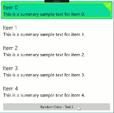
To help you with this, I've attached a demo. Go to App.xaml.cs and see line 88, that is in the Selected VisualState. To make it a little more user-friendly, I created a MySelectedBackgroundBrushSolidColorBrush StaticResource in App.xaml and assigned that in the Style.
Then to demonstrate it's effectiveness, I placed a Button on MainPage.xaml that generates a random color and updates MySelectedBackgroundBrush.
// Generate a random color and assign it to the custom brush(App.Current.Resources["MySelectedBackgroundBrush"] as SolidColorBrush).Color = Color.FromArgb(255, (byte)rand.Next(0, 255), (byte)rand.Next(0, 255), (byte)rand.Next(0, 255));The change will be seen immediately in the RadListView, here's a GIF of it in action:
Regards,
Lance | Tech Support Engineer, Sr.
Telerik by Progress
Rank 1
Thanks for the reply, but I am still unable to meet my requirements.
I have a pivot control and each pivot item has a RadListView in it and everything is dynamic using binding. See the code:
<Pivot x:Name="pivotProductCategories" Grid.Column="1" Grid.ColumnSpan="3" Grid.Row="1" Grid.RowSpan="2" Style="{StaticResource IQLobbyPivotStyle}" ItemsSource="{Binding Categories}" SelectionChanged="pivotProductCategories_SelectionChanged"> <Pivot.HeaderTemplate> <DataTemplate> <TextBlock Text="{Binding CategoryName}"/> </DataTemplate> </Pivot.HeaderTemplate> <Pivot.ItemTemplate> <DataTemplate> <Data:RadListView x:Name="lrvProductList" RequestedTheme="Light" HorizontalAlignment="Left" VerticalAlignment="Top" mdl:ProductService.ProductCatId="{Binding CategoryId}" ItemsSource="{Binding Products}" LayoutDefinition="{Binding Layout}" SelectionMode="Multiple" Margin="0,10,0,0" SelectionChanged="RadListView_SelectionChanged" ItemStyle="{StaticResource MyListViewItemStyle}" SelectedItem="{Binding SelectedProducts, Mode=TwoWay}" Loaded="RadListView_Loaded"> <Data:RadListView.ItemTemplate> <DataTemplate> <Grid> <Image Source="Assets/ProductImage2.png" MinHeight="100" MinWidth="100" Stretch="Uniform" /> <TextBlock Padding="10,140,10,10" HorizontalAlignment="Center" VerticalAlignment="Top" Text="{Binding ProductName}" TextWrapping="WrapWholeWords" Style="{StaticResource IQLobbyProductName}" MaxWidth="160"/> </Grid> </DataTemplate> </Data:RadListView.ItemTemplate> </Data:RadListView> </DataTemplate> </Pivot.ItemTemplate> </Pivot>1- I am able to select one item through binding as mentioned in your provided code, how can I select multiple items when SelectionMode is set to "Multiple". The binding solution is more convenient for my scenario. I tried setting this property in the style of RadListViewItem
<Setter Property="IsSelected" Value="{Binding Selected, Mode=TwoWay}"/>Selected is a bool type property in Model, but this doesn't seem to work
2- Selection color problem is solved using your provided solution
3- Selection Background color problem is also solved
4- Try setting Background="Gray" on your MainPage grid and run the app. Now click on "Item 1". So far so good. Now click on "Item 1" again to unselect. Now you see, there is a white background of the unselected item. How can I make this white color to transparent? I want to make this transparent because the background of the page is an image in my case and it looks really bad.
Thanks in Advance.
Asif
Rank 1
I am able to do my selection using a work around.
The only thing that I need help now is the following:
4- Try setting Background="Gray" on your MainPage grid and run the app. Now click on "Item 1". So far so good. Now click on "Item 1" again to unselect. Now you see, there is a white background of the unselected item. How can I make this white color to transparent? I want to make this transparent because the background of the page is an image in my case and it looks really bad.
Thanks
The selection behavior in my demo was just to illustrate that the storyboard I point out is the one that sets the background of the item. That code is not for production use.
For your scenario, just hardcode the brush(es) you want to "Transparent" color.
Regards,
Lance | Tech Support Engineer, Sr.
Telerik by Progress
Rank 1
Hi Lance,
I know, I am not supposed to get production ready code and I don't expect it either.
I have already posted Here that selection background color problem is solved, see point 3 after the code section.
The problem is something else, to explain it more clearly with the code, created a support ticket (1088881)
Regards,
Asif
Thank you for the clarification, and for submitting a ticket. I have opened Karl's ticket and will start on it now.
Regards,
Lance | Tech Support Engineer, Sr.
Telerik by Progress
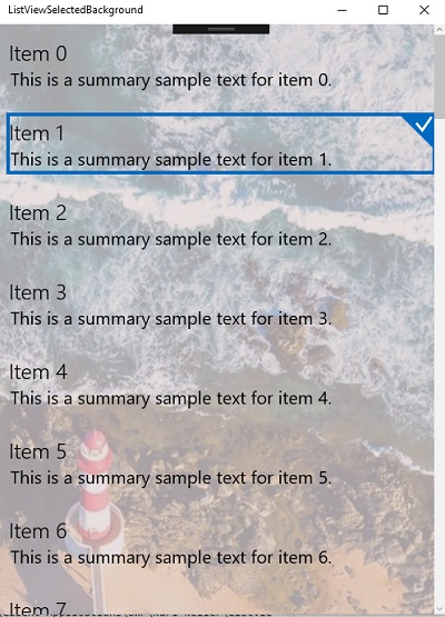
I have completed my response to the support ticket. So that you also have the information, I have attached the updated application with the solution and a summary below:
In your scenario, since you don't need a high level of customization to the visual states, you can use implicit styling to style the ListViewCurrencyControl ('Currency' meaning 'current item'). That control is what the RadListView uses to style the "current" item.
Therefore, you can make the current item's background transparent by only doing the following in your resources:
<!-- NOTE: if you only want it in local scope do this in Page.Resources --><Application.Resources> <Style TargetType="primitives:ListViewCurrencyControl"> <Setter Property="Background" Value="Transparent" /> </Style></Application.Resources>You do not need to do anything to your RadListView instances, they will use that style implicitly:
<data:RadListView ItemsSource="{Binding Items}" SelectedItem="{Binding SelectedListItem, Mode=TwoWay}" >...</<data:RadListView>The result is the following:
I hope this resolves all your issues. If you have any further trouble, have Karl respond in the ticket thread directly with more information.
Thank you for choosing Telerik UI for UWP!
Regards,
Lance | Tech Support Engineer, Sr.
Telerik by Progress