
We use only nested properties in and we whould like to have the same width of name column like group is it somehow possible to do it?
in the picture is group "Expand this group" and property with nested properties "Expand this nested object" where we do not care about value but want to span the columns to one to look similar like group "Expand this group".
Hi Pavel,
It is unclear to me which control is used in this case. In the subject, you have mentioned a property grid. Are you using PropertyGrid or DataGrid? Can you share the XAML and your business object? This will allow us to test this locally and provide a solution.
I am looking forward to your reply.
Here is the example where i tested it is Property grid. Basically we want to have object "Expand this nested object" look the same like the group "Expand this group"
Thank you.
Pavel
Hello Pavel,
Can you tell me what you mean by that the "Expand this nested object" should look the same like "Expand this group"? Do you mean that you want to align both texts one under another, which is a slightly different with the default behavior where the property label can be slightly offset from the group name? Or do yo want to style the "+" icon of the property field to look the same as the group's expand/collapse arrow?
I think a drawing of the expected result compared to the current one will be very useful.
In the meantime here is some general information on customizing the group headers and the property fields. To customize the property fields, you can use the FieldStyle property of RadPropertyGrid.
 <controls:RadPropertyGrid.FieldStyle>
     <Style TargetType="propertyGrid:PropertyGridField" BasedOn="{StaticResource PropertyGridFieldStyle}">
         <Setter Property="Opacity" Value="0.2" />
     </Style>
 </controls:RadPropertyGrid.FieldStyle>
For more complex customizations, you can re-template the PropertyGridField element.
To customize the group header, you can use the same approaches as above, but with the GroupStyle property of RadPropertyGrid and the RadToggleButton element.
<controls:RadPropertyGrid.GroupStyle> <Style TargetType="controls:RadToggleButton" BasedOn="{StaticResource PropertyGridToggleButtonStyle}"> </Style> </controls:RadPropertyGrid.GroupStyle>Sorry it was clearly hard to explain by text what i mean. But this is what i mean.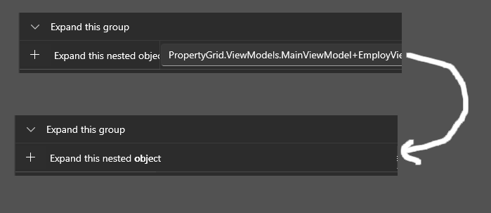
On the top we see in field edit some default value and my question was if such a property with nested properties can look like on bottom part of image.
Sorry that i was not so clear.
Pavel
Hey Pavel, thank you for the clarification. The easiest way to achieve your requirement is to use the EditorAttribute in order to assign an empty editor to the field. However, keep in mind that this will leave the border between the label and editor areas of the property field.
    [Telerik.UI.Xaml.Controls.Data.PropertyGrid.Editor(typeof(UserControl))]
    [Display(Name = "Expand2 this nested object",
Description = "",
GroupName = "Expand this group",
Order = 11
)]
    public EmployViewModel Employe
    {
        get; set;
    }
In case you want to remove the border between the label and the editor area, you will need to modify the ControlTemplate of the PropertyGridField control. I have updated your project to show this idea. You can find the changes in the template marked with XML comments. I hope that helps.