Hello everyone,
I want to add expander control to my app.
What I want to achieve is the same thing as Denna app have for expanding content at the top of the app.
I don't care about the inner design of Denna expander. I only want to have the header for example with 1 image and 1 textblock and when i tap at the expanding icon at the bottom of the header I want that part to expand and show more info but to keep header visible. I want to add a new grid at the content part where I will put my design. When content is visible I still want expander icon to be at the bottom of expander. And when I click it again to only show header again.
I have tried to search for an example that will provide the answer to my needs for hours but I couldn't find anything that I wanted.
I would really appreciate help.
Thank you.
6 Answers, 1 is accepted


The RadExpander gives you complete freedom as to what you want in the content, in both the collapsed state and the expanded state, see the available properties here.
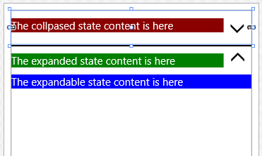
As an example for you see see this visualized, I've placed two identical RadExpanderControls in s StackPanel (separated by a black line). The top one is collapsed and the bottom one is expanded, you'll see in the expanded one you can have a separately defined 'header' (in green).
Here's a screenshot:
Here's the code:
<StackPanel Margin="10"> <primitives:RadExpanderControl IsExpanded="False"> <primitives:RadExpanderControl.Content> <Grid Background="DarkRed"> <TextBlock Text="The collpased state content is here" Foreground="White" /> </Grid> </primitives:RadExpanderControl.Content> <primitives:RadExpanderControl.ExpandableContent> <Grid Background="Blue"> <TextBlock Text="The expandable state content is here" Foreground="White" /> </Grid> </primitives:RadExpanderControl.ExpandableContent> <primitives:RadExpanderControl.ExpandedStateContent> <Grid Background="Green"> <TextBlock Text="The expanded state content is here" Foreground="White" /> </Grid> </primitives:RadExpanderControl.ExpandedStateContent> </primitives:RadExpanderControl> <Rectangle Height="2" Fill="Black"></Rectangle> <primitives:RadExpanderControl IsExpanded="True"> <primitives:RadExpanderControl.Content> <Grid Background="DarkRed"> <TextBlock Text="The collpased state content is here" Foreground="White" /> </Grid> </primitives:RadExpanderControl.Content> <primitives:RadExpanderControl.ExpandableContent> <Grid Background="Blue"> <TextBlock Text="The expandable state content is here" Foreground="White" /> </Grid> </primitives:RadExpanderControl.ExpandableContent> <primitives:RadExpanderControl.ExpandedStateContent> <Grid Background="Green"> <TextBlock Text="The expanded state content is here" Foreground="White" /> </Grid> </primitives:RadExpanderControl.ExpandedStateContent> </primitives:RadExpanderControl></StackPanel>You can also use the alternative ContentTemplate versions of each of you want to use DataTemplate instead of direct content.
Regards,
Lance | Tech Support Engineer, Sr.
Telerik by Progress
My apologies, I missed adding this hyperlink to the properties page of the RadExpandControl in my last reply.
Regards,
Lance | Tech Support Engineer, Sr.
Telerik by Progress

 Rank 1
Not out of the box, you could however add your own button to the ExpandableContent area and when clicked, toggles the control's IsExpanded value to false. Note that the expandable content is hidden when the control is collapsed, so that button won't be available.
Alternatively, you could edit the control template and make a custom version of the RadExpander. Such a custom implementation is outside the scope of Telerik Support, thus I couldn't guide you through a redesign. However, this is relatively straightforward component with only a few moving parts and states, you could hide the main arrow when in the expanded state without breaking any major functionality.
Regards,
Lance | Tech Support Engineer, Sr.
Telerik by Progress
Rank 1
To do this, you'll want to follow the custom approach idea I mentioned in my last reply. You can edit the ControlTemplate to hide the indicator. Note that you do not want to remove it completely as parts of the logic relies on that TemplatePart being available (you'll know which parts you cannot remove if the name is prefixed with "PART_").
If you don't know where to find the styles, locate the C:\Program Files (x86)\Telerik\UI for Universal Windows Platform R1 2017\Binaries\Telerik.UI.Xaml.Primitives.UWP\Themes folder. In there you'll find the style for RadExpanderControl is in the Generic.xaml file.
Regards,
Lance | Tech Support Engineer, Sr.
Telerik by Progress