Build the Team Efficiency Dashboard Project
Telerik UI Charts
In this chapter you'll learn how to add Telerik UI Chart widgets to your application. The Telerik ASP.NET MVC Chart, powered by Kendo UI, is a powerful data visualization component, which allows you to graphically represent your data. It is useful when you want to utilize modern browser technologies such as SVG or Canvas (with a fallback to VML for older IE versions) for interactive data visualizations.
The component offers a variety of chart types such as area, bar, line, scatter, polar, radar, pie and donut, stock (OHLC) and many more.
Chart API
The Chart HtmlHelper extension is a server-side wrapper for the Telerik UI Chart widget.
@(Html.Kendo().Chart(Model) // The chart will be bound to the Model which is the InternetUsers list
    .Name("internetUsersChart") // The name of the chart is mandatory. It specifies the "id" attribute of the widget.
    .Title("Internet Users")
    .Series(series => {
        series.Bar(model => model.Value) // Create a bar chart series bound to the "Value" property
                .Name("United States");
    })
    .CategoryAxis(axis => axis
        .Categories(model => model.Year)
    )
)
Bullet Series Chart
Overview
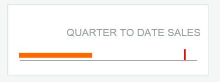
Begin by adding a Bullet chart, a variation of a bar chart. Bullet charts make great dashboard gauges or meters. The bullet graph compares a given quantitative measure against qualitative ranges and a symbol marker.
Exercise: Add a Bullet Series Chart
-
Since changes to the controller are necessary, stop the application if it is running.
-
Use partials to keep the markup tidy. Under
Views/Home/, add a new empty partial view_QuarterToDateSales.cshtml. -
In the new partial
_QuarterToDateSales.cshtmlview, add a new Telerik UI Chart helper of typeQuarterToDateSalesViewModel. TheQuarterToDateSalesViewModelis part of the quick start boilerplate.Razor@(Html.Kendo().Chart<KendoQsBoilerplate.QuarterToDateSalesViewModel>() ) -
Set the
Nameproperty toEmployeeAverageSales.Razor.Name("EmployeeQuarterSales") -
Using the
.HtmlAttributesproperty, set the controls height to30px.Razor.HtmlAttributes(new { style = "height:30px;" }) -
Next, add and define a
Bulletchart with the following properties:- Set the current value to the
Currentproperty on the model. - Set the target value to the
Targetproperty on the model.
Razor.Series(series => { series.Bullet(model => model.Current, model => model.Target); }) - Set the current value to the
-
Next, add and configure the
CategoryAxis. Since the chart will be a spark line visualization, set theVisibleandMajorGridLinesproperties tofalse.Razor.CategoryAxis(ca => ca.Labels(lab => lab.Visible(false)) .MajorGridLines(m => m.Visible(false)).Visible(false) ) -
Next, add and configure the
ValueAxiswith a Numeric configuration. Since the chart will be a spark line visualization, set theLabels,MajorGridLines, andMajorTicksVisibleproperties tofalseto disable them.Razor.ValueAxis(va => va.Numeric() .Labels(lab => lab.Visible(false)) .MajorGridLines(m => m.Visible(false)) .MajorTicks(mT => mT.Visible(false)) ) -
Also set the
Legendtofalse.Razor.Legend(leg => leg.Visible(false)) -
Configure the
DataSourceby settingReadto the actionEmployeeQuarterSaleson theHomecontroller. -
Using the
Dataproperty, set the value togetEmployeeFiltersending filter data back to theReadaction. -
Since the DataSource will be invoked manually, set
AutoBindtofalse.Razor.AutoBind(false)The resulting code should be like the one shown in the example below.
Razor@(Html.Kendo().Chart<KendoQsBoilerplate.QuarterToDateSalesViewModel>() .Name("EmployeeQuarterSales") .HtmlAttributes(new { style = "height:30px;" }) .Series(series => { series.Bullet(model => model.Current, model => model.Target); }) .CategoryAxis(ca => ca.Labels(lab => lab.Visible(false)) .MajorGridLines(m => m.Visible(false)).Visible(false) ) .ValueAxis(va => va.Numeric() .Labels(lab => lab.Visible(false)) .MajorGridLines(m => m.Visible(false)) .MajorTicks(mT => mT.Visible(false)) ) .Legend(leg => leg.Visible(false)) .DataSource(ds => ds .Read(read => read.Action("EmployeeQuarterSales", "Home") .Data("getEmployeeFilter")) ) .AutoBind(false) ) -
Open
controllers/HomeController.csand create a controller action namedEmployeeQuarterSaleson theHomecontroller. This action will supply the Chart with data. -
The boilerplate installed in the Getting Up and Running chapter has a function named
EmployeeQuarterSales. This query will select the data required for the chart. Return the results ofEmployeeQuarterSalesQueryas JSON.Razorpublic ActionResult EmployeeQuarterSales(int employeeId, DateTime statsTo) { DateTime startDate = statsTo.AddMonths(-3); var result = EmployeeQuarterSalesQuery(employeeId, statsTo, startDate); return Json(result, JsonRequestBehavior.AllowGet); } -
Add the partial view to the main application page.
-
In
Views/Home/Index.cshtm, find the<!-- QTD Sales Chart -->placeholder.Razor<!-- QTD Sales Chart --> @Html.Placehold(430, 120, "Chart") -
Replace the placeholder with the
_QuarterToDateSalespartial.Razor<!-- QTD Sales Chart --> @Html.Partial("_QuarterToDateSales")
-
Find the scripts section. Add a new function named
refreshEmployeeQuarterSales, this function will invokereadon the chart's DataSource.Razor<script> ... </script>The resulting code should be like the one shown in the example below.
Razorfunction refreshEmployeeQuarterSales() { var employeeQuarterSales = $("#EmployeeQuarterSales").data("kendoChart"); employeeQuarterSales.dataSource.read(); } -
Find and modify the
onCriteriaChangefunction so it callsrefreshEmployeeQuarterSalesupdating the bullet chart's data source when the filter or the employee selection is changed.Razorfunction onCriteriaChange() { updateEmployeeAvatar(); refreshGrid(); refreshEmployeeQuarterSales(); } -
Run the application to see the chart render on the dashboard. Change the filter criteria to see the chart update along with other UI elements.
Line Chart
Overview
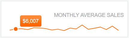
Next, add a Line chart, a Line chart shows data as continuous lines that pass through points defined by their items' values. It can be useful for showing a trend over time and comparing several sets of similar data. For this example, you'll use a Line chart to show trend data.
Exercise: Trigger the Grid DataSource from a DatePicker Event
-
Since changes to the controller are necessary, stop the application if it is running.
-
Use partials to keep the markup tidy. Under
Views/Home, add a new empty partial view_MonthlySalesByEmployee.cshtml. -
In the new partial
_MonthlySalesByEmployee.cshtmlview, add a new Telerik UI Chart helper.Razor@(Html.Kendo().Chart<KendoQsBoilerplate.MonthlySalesByEmployeeViewModel>() ) -
Set the
Nameproperty toEmployeeAverageSales.Razor.Name("EmployeeAverageSales") -
Set the controls height to
30px.Razor.HtmlAttributes(new { style = "height:30px;" }) -
Next, add and define a Series chart with the following properties:
- Set
Lineto theEmployeeSalesproperty on the model. - Set the
Widthto1.5. - Disable markers by setting the
Markersvisible property tofalse. - Set the tooltip using a valid number format and enabling its visibility.
Razor.Series(series => { series.Line(model => model.EmployeeSales) .Width(1.5) .Markers(m => m.Visible(false)) .Tooltip(t => t.Format("{0:c0}").Visible(true)); }) - Set
-
Next, add and configure the
CategoryAxiswith aDateconfiguration. Set the Category to theDatefield of the view model. -
Since the chart will be a formatted like a sparkline, set the
AxisandMajorGridLinesVisibleproperties tofalseto disable them.Razor.CategoryAxis(ca => ca .Date() .Categories(model => model.Date) .Visible(false) .MajorGridLines(m => m.Visible(false)) ) -
Next, add and configure the
ValueAxiswith a Numeric configuration. -
Set the
Axis,Visible, andMajorGridLinesproperties tofalseto disable them.Razor.ValueAxis(va => va.Numeric() .Visible(false) .Labels(lab => lab.Visible(false)) .MajorGridLines(m => m.Visible(false)) ) -
Also set the
Legendtofalse.Razor.Legend(leg => leg.Visible(false)) -
Configure the
DataSourceby settingReadto the actionEmployeeAverageSaleson theHomecontroller. -
Using the
Dataproperty, set the value togetEmployeeFiltersending filter data back to theReadaction. -
Add an
Aggregateson the DataSource toAveragetheEmployeeSales.Razor.DataSource(ds => ds .Read(read => read.Action("EmployeeAverageSales", "Home") .Data("getEmployeeFilter")) .Aggregates(a => a.Add(model => model.EmployeeSales).Average()) ) -
Since the DataSource will be invoked manually, set
AutoBindtofalse.Razor.AutoBind(false)The resulting code should be like the one shown in the example below.
Razor@(Html.Kendo().Chart<KendoQsBoilerplate.MonthlySalesByEmployeeViewModel>() .Name("EmployeeAverageSales") .HtmlAttributes(new { style = "height:30px;" }) .Series(series => { series.Line(model => model.EmployeeSales) .Width(1.5) .Markers(m => m.Visible(false)) .Tooltip(t => t.Format("{0:c0}").Visible(true)); }) .CategoryAxis(ca => ca .Date() .Categories(model => model.Date) .Visible(false) .MajorGridLines(m => m.Visible(false)) ) .ValueAxis(va => va.Numeric() .Visible(false) .Labels(lab => lab.Visible(false)) .MajorGridLines(m => m.Visible(false)) ) .Legend(leg => leg.Visible(false)) .DataSource(ds => ds .Read(read => read.Action("EmployeeAverageSales", "Home") .Data("getEmployeeFilter")) .Aggregates(a => a.Add(model => model.EmployeeSales).Average()) ) .AutoBind(false) ) -
Open
controllers/HomeController.csand create a controller action namedEmployeeAverageSaleson theHomecontroller. This action will supply the Chart with data. -
The boilerplate installed in the Getting Up and Running chapter has a function named
EmployeeAverageSalesQuery. This query will select the data required for the chart. Return the results ofEmployeeAverageSalesQueryas JSON.Razorpublic ActionResult EmployeeAverageSales( int employeeId, DateTime statsFrom, DateTime statsTo) { var result = EmployeeAverageSalesQuery(employeeId, statsFrom, statsTo); return Json(result, JsonRequestBehavior.AllowGet); } -
Add the partial view to the main application page. In
Views/Home/Index.cshtmfind the<!-- Montly Sales Chart -->placeholder.Razor<!-- Montly Sales Chart --> @Html.Placehold(430, 120, "Chart") -
Replace the placeholder with the
_MonthlySalesByEmployeepartial.Razor<!-- Montly Sales Chart --> @Html.Partial("_MonthlySalesByEmployee")
-
Find the scripts section and add a new function named
refreshEmployeeAverageSales. This function will invokereadon the chart's data source.Razor<script> ... </script>The resulting code should be like the one shown in the example below.
Razorfunction refreshEmployeeAverageSales() { var employeeAverageSales = $("#EmployeeAverageSales").data("kendoChart"); employeeAverageSales.dataSource.read(); } -
Find and modify the
onCriteriaChangefunction so it callsrefreshEmployeeAverageSalesupdating the chart's data when a filter or employee selection is changed.Razorfunction onCriteriaChange() { updateEmployeeAvatar(); refreshGrid(); refreshEmployeeQuarterSales(); refreshEmployeeAverageSales(); } -
Run the application to see the chart render on the dashboard. Change the filter criteria to see the chart update along with other UI elements.
Client-Side API
Overview
Charts, like other Kendo UI widgets are easy to interact with on the client side. By handling the chart's events additional functionality can be added to the application. Use the DataBound event and the DataSource to populate values on labels within the Team Efficiency Dashboard.
Exercise: Display Chart Values Using Client APIs
-
In
Views/Home/Index.cshtm, find the scripts section.Razor<script> ... </script> -
Add a function named
onQuarterSalesDataBound, find the first element of the datasource and displays the Current value inEmployeeQuarterSalesLabel.Razorfunction onQuarterSalesDataBound(e) { var data = this.dataSource.at(0); $("#EmployeeQuarterSalesLabel").text(kendo.toString(data.Current, "c2")); } -
Add a function named
onAverageSalesDataBoundfind thedataSourceaggregates and display the average ofEmployeeSalesin theEmployeeAverageSalesLabel.Razorfunction onAverageSalesDataBound(e) { var label = $("#EmployeeAverageSalesLabel"), data = this.dataSource.aggregates() if (data.EmployeeSales) { label.text(kendo.toString(data.EmployeeSales.average, "c2")); } else { label.text(kendo.toString(0, "c2")); } } -
Open the partial view
_MonthlySalesByEmployee.cshtmland add aDataBoundevent handler to the chart, set the event handler toonQuarterSalesDataBound.Razor@(Html.Kendo().Chart<KendoQsBoilerplate.MonthlySalesByEmployeeViewModel>() ... .AutoBind(false) .Events(e => e.DataBound("onAverageSalesDataBound")) ) -
Open the partial view
_QuarterToDateSales.cshtmland add aDataBoundevent handler to the chart. Set the event handler toonQuarterSalesDataBound.Razor@(Html.Kendo().Chart<KendoQsBoilerplate.QuarterToDateSalesViewModel>() ... .AutoBind(false) .Events(e => e.DataBound("onQuarterSalesDataBound")) )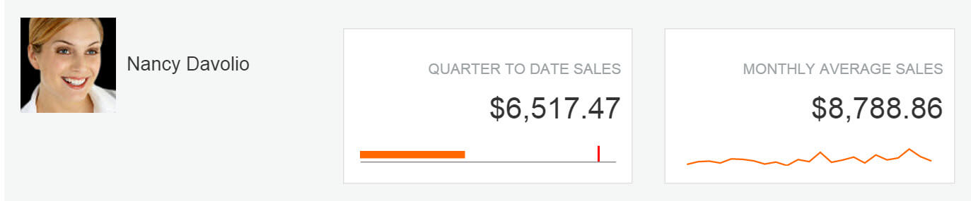
The Team Efficiency Dashboard is starting to look complete, but it hasn't been tested for devices like mobile phones or tablets yet. In the next chapter you'll use responsive web design techniques to support devices beyond the desktop.