Build the Team Efficiency Dashboard Project
Step 9: Make the Application Responsive
In this chapter you'll learn how to make the dashboard application look amazing on any device size. The Team Efficiency Dashboard layout uses Bootstrap for some basic responsive functionality. However, more detailed controls, such as the Grid, need extra attention to ensure a proper user experience on any device size. In the next few steps you'll take the app from desktop, to anywhere, with a few key changes.
Responsive Grid
Overview
Run the project and shrink the browser window horizontally to about 400 pixels wide. Refresh the browser and observe how the application elements stack nicely, but the grid bleeds off the page. There is simply too much information in the grid to show at this screen size. By setting a few properties we can remove non-essential columns from the grid for small screens.
Exercise: Make the Grid Mobile Friendly with Responsive APIs
-
Open
Views/Invoice/Index.cshtmland find where theColumnsare defined in theEmployeeSalesgrid.Razor.Columns(columns => { ... })Remove the
Salespersoncolumn completely. The sales person is already displayed at the top of the page. -
Set the
MinScreenWidthof theCustomerNamecolumn to900. This means that the column will no longer be displayed on screen sizes less than 900 pixels wide. -
Set the
MinScreenWidthof theProductNamecolumn to768. This means that the column will no longer be displayed on screen sizes less than 768 pixels wide.Razor.Columns(columns => { columns.Bound(c => c.CustomerName).MinScreenWidth(900); columns.Bound(c => c.OrderDate).Format("{0:MM/dd/yyyy}"); columns.Bound(c => c.ProductName).MinScreenWidth(768); columns.Bound(c => c.UnitPrice); columns.Bound(c => c.Quantity); }) -
Refresh the page, then shrink and grow the browser to different widths to see how the grid reacts at various sizes.
Responsive Panel
Overview
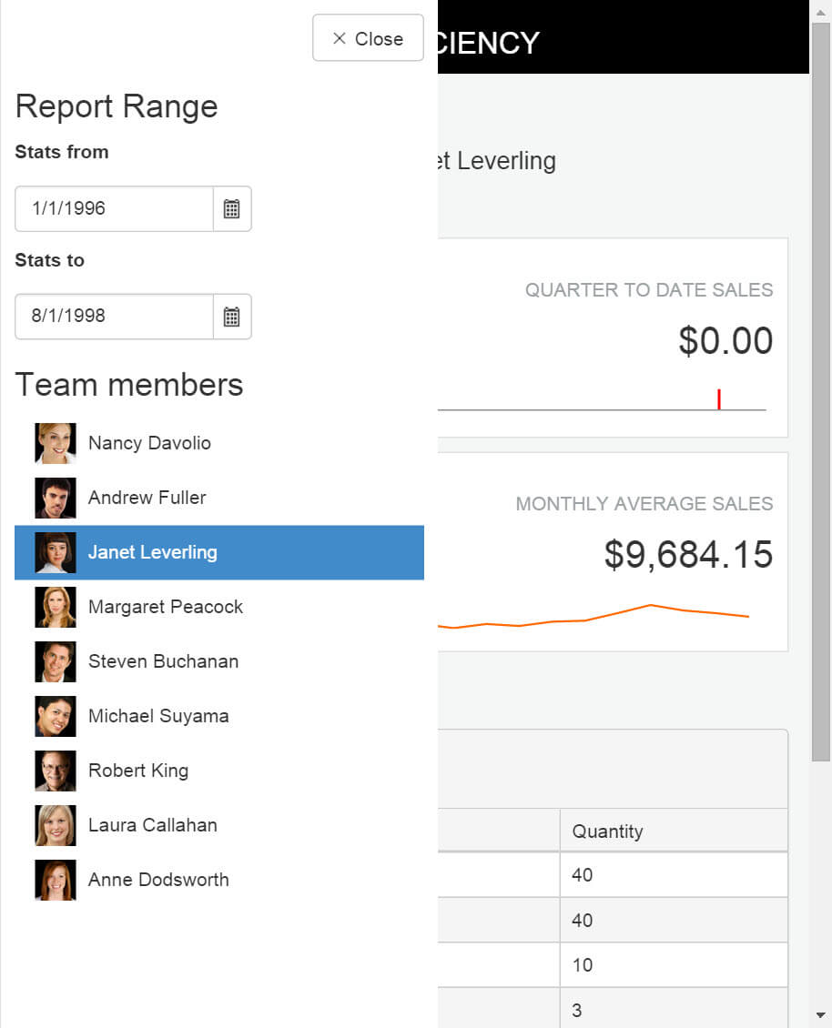
When changing the screen size, you may have noticed the Report Range side bar disappear. If not, take a moment to adjust the browser width again to see the side bar's behavior. Currently, the sidebar is hidden using the Bootstrap's hidden-xs class. Bring back the side bar using a Kendo UI ResponsivePanel and make a seamless user experience on any device size.
Exercise: Add a Responsive Panel Side Bar
-
Open
Views/Home/Index.cshtmland find the<!-- Menu Panel -->placeholder. Below the<!-- Menu Panel -->placeholder add aResponsivePanel. Set theNametomenuPaneland set the Breakpoint to768. -
Add a
Contentproperty and include all of the elements until you reach the ending<!-- /Menu Panel -->placeholder.The
atsymbol@is used as an escape charter for HTML content.The resulting code should be like the one shown in the example below.
Razor<!-- Menu Panel --> @(Html.Kendo().ResponsivePanel().Name("menuPanel").Breakpoint(768).Content( @<div class="hidden-xs" style="float:left;"> ... </div> )) <!-- /Menu Panel --> -
Remove
class="hidden-xs" style="float:left;"from thedivelement in the newly added responsive panel.Razor<!-- Menu Panel --> @(Html.Kendo().ResponsivePanel().Name("menuPanel").Breakpoint(768).Content( @<div> ... </div> )) <!-- /Menu Panel --> -
Next, add a button for users to tap and toggle the responsive panel.
-
Find the block of code shown in the example below.
Razor<section id="app-title-bar" class="row"> <div class="col-sm-3"> <h1 class="title">@ViewBag.Title</h1> </div> </section>After the section's closing tag
</section>, add a newdivwith aclassofhamburger. -
Inside the hamburger
div, create a Kendo UI Button. Set the following button's properties:Name: menuPanelOpenContent: menuIcon: more-horizontalHtmlAttributes: new { @class = "k-rpanel-toggle" }
Any element with the
k-rpanel-toggleclass will be able to toggle the current page's responsive panel.Razor<div class="hamburger"> <!-- toggle button for responsive panel, hidden on large screens --> @(Html.Kendo().Button() .Name("menuPanelOpen") .Content("menu") .Icon("more-horizontal") .HtmlAttributes(new { @class = "k-rpanel-toggle" }) ) </div> -
Open
Content/Site.cssand find the/* Top Bar */placeholder.Razor/* Top Bar */
-
Add a style that selects the
hamburgerelement and sets thepositiontoabsolute. Give the style atopof5andleftof5to create a margin around the element.Razor.hamburger { position: absolute; top: 5px; left: 5px; } -
Add a style that selects the
menuPanel. Set a solid background color of#fff(white), include apaddingof10pxandz-indexof3. This style will ensure that the panel appears above other UI elements and has a solid background.Razor#menuPanel { background-color: #fff; padding: 10px; z-index: 3; } -
Run or refresh the application. Expand and contract the browser's width, notice the Menu button appear when the browser is small. Click the Menu button to open the panel. Click beside the panel to collapse it.
-
For a better user experience, add a Close button to the panel so the interaction is discoverable and intuitive.
-
Find the
menuPaneland add a Kendo UI Button inside the Content's firstdiv. Set the following button's properties:Name: menuPanelCloseContent: CloseIcon: closeHtmlAttributes: new { @class = "k-rpanel-toggle" }
-
Wrap the button in a
divwith a class oftext-rightto position the button on the right hand edge of the panel.Razor@(Html.Kendo().ResponsivePanel().Name("menuPanel").Breakpoint(768).Content( @<div> <div class="text-right"> @(Html.Kendo().Button() .Name("menuPanelClose") .Content("Close") .Icon("x") .HtmlAttributes(new { @class = "k-rpanel-toggle" }) ) </div> ... </div> -
Refresh the application. Expand and contract the browser's width until the Menu button is shown. Toggle the responsive panel using the Menu and Close buttons.
The application is almost complete, just apply a nice bright theme and it will be ready to ship.