
Build Your Own AI Application Using Prebuilt Blazor Components

Summarize with AI:
With prebuilt components, you can easily build a Blazor application that connects to AI model services for chat conversations. Check it out.
If you’ve ever had the opportunity to use applications that allow you to converse with a large language model (an LLM) such as ChatGPT, Gemini, DeepSeek, etc., you know about the potential and usefulness they offer.
Additionally, if you’re a software developer, you should know that there are APIs that allow you to create your own applications based on your requirements, making even better use of AI models in a personalized way. In this article, I will show you how to create your own AI application thanks to some pre-created components for Blazor.
Creating the Chat Project Using Blazor
The first step to creating your own chat application is to create a project using Blazor. In this case, let’s use a Blazor Web App template, specifying an Interactive render mode equal to Server and an Interactivity location equal to Global.
Next, you should follow the Progress Telerik UI for Blazor components installation guide, which consists of a wide variety of flexible and easy-to-use components that you can implement in just a few minutes to achieve a spectacular graphical interface.
Configuring the Connection to an AI Model Service
Once the project has been created, you need to configure a service that can be injected across the pages and that you can reuse to invoke your preferred AI service.
In this case, we will use Microsoft.Extensions.AI, which allows us to easily connect to both Azure OpenAI and OpenAI services, and there are even independent projects like Bruno Capuano’s that allows the use of Claude models on Azure using these extensions. In our case, we will install the packages:
Azure.AI.OpenAIMicrosoft.Extensions.AIMicrosoft.Extensions.AIMicrosoft.Extensions.AI
After installing the packages, we need to go to Program.cs to make the service configuration, which, if it’s for OpenAI, can be done like this:
var key = builder.Configuration["OPENAI_API_KEY"];
if (!string.IsNullOrEmpty(key))
{
    builder.Services
        .AddChatClient(new OpenAIClient(
            new ApiKeyCredential(key))
        .GetChatClient("gpt-4o-mini").AsIChatClient());
}
else
{
    Debug.WriteLine("Warning: OPENAI_API_KEY not configured. AI features will not be available.");
}
Or if you prefer Azure OpenAI, the configuration would look like this:
var key = builder.Configuration["AZURE_OPENAI_API_KEY"];
if (!string.IsNullOrEmpty(key))
{
    builder.Services
        .AddChatClient(new AzureOpenAIClient(
                new Uri("https://your-endpoint.openai.azure.com/"),
            new ApiKeyCredential(key))
        .GetChatClient("gpt-4.1").AsIChatClient());
}
else
{
    Debug.WriteLine("Warning: AZURE_OPENAI_API_KEY not configured. AI features will not be available.");
}
With the AI model configuration ready, we can proceed to create the main graphical interface.
Initial Setup of the Chat Page
The next step in the project is to create a new page component where we will implement the chat. In this new page, we will replace the content with the following:
@page "/chat"

@using Microsoft.Extensions.AI
@inject IChatClient ChatClient

<PageTitle>AI Chat</PageTitle>
In the code above, we are defining the route for the new page, as well as injecting a reference of type IChatClient (previously configured) using ChatClient. We also specify the title of the page, which you can change as you see fit.
Using Blazor AppBar to Create the Application Header
The first prebuilt component we will use is a Blazor AppBar, which allows us to define sections that can configure actions or visual elements to indicate some type of status in the application.
To add it, simply define a TelerikAppBar tag, specifying parameters such as ThemeColor and Class:
<div class="d-flex flex-column bg-light rounded-3 overflow-hidden shadow-lg" style="height: 80vh;">
    <TelerikAppBar ThemeColor="@ThemeConstants.AppBar.ThemeColor.Dark" Class="rounded-top flex-shrink-0">

    </TelerikAppBar>
</div>
As part of a TelerikAppBar, AppBarSection type tags must be created to define the sections of the AppBar. In the following example, I will show you how to define three AppBarSections:
...
<div...>
    <TelerikAppBar ThemeColor="@ThemeConstants.AppBar.ThemeColor.Dark" Class="rounded-top flex-shrink-0">
        <AppBarSection Class="flex-grow-1">
            <TelerikSvgIcon Icon="@SvgIcon.Comment" Size="@ThemeConstants.SvgIcon.Size.Large" />
            <span class="fw-semibold fs-5 ms-2">MyOwnChat</span>
        </AppBarSection>
        <AppBarSection>
            <TelerikDropDownList Data="@ModelOptions"
                                    @bind-Value="@SelectedModel"
                                    Width="180px"
                                    Size="@ThemeConstants.DropDownList.Size.Small">
            </TelerikDropDownList>
        </AppBarSection>
        <AppBarSection>
            <TelerikButton OnClick="@ClearChat"
                            Icon="@SvgIcon.Trash"
                            Title="New conversation"
                            ThemeColor="@ThemeConstants.Button.ThemeColor.Light">
            </TelerikButton>
        </AppBarSection>
    </TelerikAppBar>
</div>

@code{
    private List<string> ModelOptions { get; set; } = new()
    {
        "GPT-5.2",
        "Gemini 2.5",
        "Claude Opus 4.5"
    };
    private string SelectedModel { get; set; } = "GPT-5.2";

    private void ClearChat()
    {
    }
}
In the code above, the AppBarSections show the following:
- The first one defines the name of the application.
- The second shows a dropdown that allows selecting an LLM, in case multiple options are available (in the app it works demonstratively).
- The last one allows clearing the conversation.
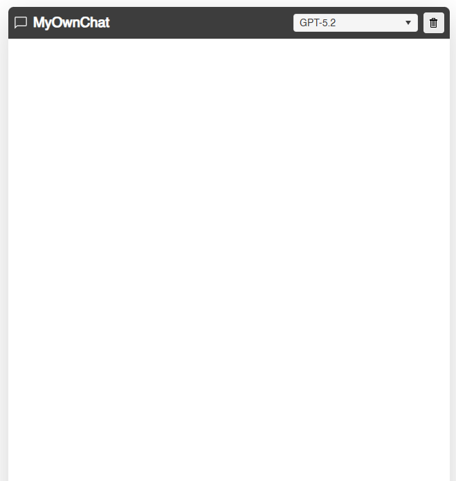
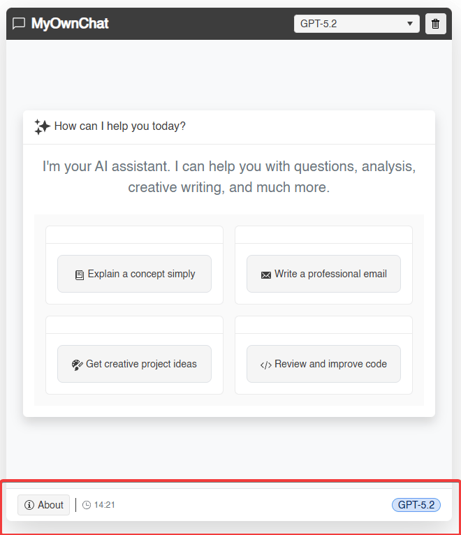
Additionally, you can also see the use of other very useful components such as the Blazor DropDownList, which only needs to be bound to a list of strings, as well as a Button that allows executing actions. The result with just a few lines of code is as follows:
Building an Initial Suggestions List Using Components for Blazor
The main part of the chat section is divided into two parts. The first determines whether the user has previously interacted with the AI model. This can be done by defining a list of ChatMessages where the conversation history will be accumulated. If this list is empty, we can make use of a Blazor Card that appears in the center with predefined prompt suggestions.
We can start by defining a CardHeader that displays an icon and some welcome text:
<TelerikCard Class="shadow border-0">
    <CardHeader>
        <CardTitle>
            <TelerikSvgIcon Icon="@SvgIcon.Sparkles" Size="@ThemeConstants.SvgIcon.Size.ExtraLarge" />
            <span>How can I help you today?</span>
        </CardTitle>
    </CardHeader>
</TelerikCard>
Next, we need to build the body of the card using the CardBody tag. It is important to mention that this component is highly flexible and allows you to insert other components within it, making the interface as complex as you wish.
For example, we have used a Blazor TileLayout component to define multiple options for the user to press, which is fully configurable. Additionally, you can configure the TileLayoutItems tag within a TelerikTileLayout, where you can define the content for each of these elements.
In our case, we combined the use of a Blazor Button together with a span to display the content, resulting in the final code as follows:
<div class="flex-grow-1 bg-white position-relative" style="min-height: 0; overflow: hidden;">
    @if (ChatData.Count == 0)
    {
        @* Welcome screen when there are no messages *@
        <div class="d-flex align-items-center justify-content-center h-100 p-4 bg-light">
            <div style="max-width: 700px; width: 100%;">
                <TelerikCard Class="shadow border-0">
                    <CardHeader>
                        <CardTitle>
                            <TelerikSvgIcon Icon="@SvgIcon.Sparkles" Size="@ThemeConstants.SvgIcon.Size.ExtraLarge" />
                            <span>How can I help you today?</span>
                        </CardTitle>
                    </CardHeader>
                    <CardBody>
                        <p class="text-secondary fs-5 mb-4 lh-base text-center">
                            I'm your AI assistant. I can help you with questions, analysis, creative writing, and much more.
                        </p>
                        <TelerikTileLayout Columns="2"
                                           ColumnWidth="100%"
                                           RowHeight="auto"
                                           Reorderable="false"
                                           Resizable="false"
                                           Class="mt-3">
                            <TileLayoutItems>
                                @foreach (var suggestion in QuickSuggestions)
                                {
                                    <TileLayoutItem>
                                        <Content>
                                            <TelerikButton OnClick="@(() => UseSuggestion(suggestion.Text))"
                                                           Class="w-100 text-start d-flex align-items-center gap-2 p-3 border rounded-3"
                                                           ThemeColor="@ThemeConstants.Button.ThemeColor.Base">
                                                <TelerikSvgIcon Icon="@suggestion.Icon" />
                                                <span>@suggestion.Text</span>
                                            </TelerikButton>
                                        </Content>
                                    </TileLayoutItem>
                                }
                            </TileLayoutItems>
                        </TelerikTileLayout>
                    </CardBody>
                </TelerikCard>
            </div>
        </div>
    }
    else
    {

    }
</div>

@code{

    private List<ChatMessage> ChatData { get; set; } = new();
    private List<SuggestionItem> QuickSuggestions { get; set; } = new()
    {
        new SuggestionItem { Text = "Explain a concept simply", Icon = SvgIcon.Book },
        new SuggestionItem { Text = "Write a professional email", Icon = SvgIcon.Envelope },
        new SuggestionItem { Text = "Get creative project ideas", Icon = SvgIcon.Palette },
        new SuggestionItem { Text = "Review and improve code", Icon = SvgIcon.Code }
    };

    private async Task UseSuggestion(string suggestion)
    {

    }
    ...
    public class SuggestionItem
    {
        public string Text { get; set; } = string.Empty;
        public ISvgIcon Icon { get; set; } = SvgIcon.Star;
    }
}
...
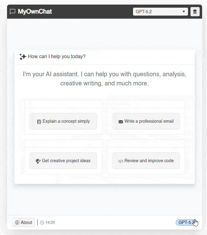
The result of rendering with the previous changes gives us the following:
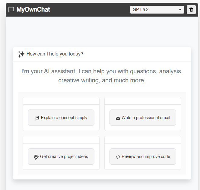
You can see that the application begins to take shape, showing an initial suggestions section for the user to interact with the LLM as quickly as possible.
Sending Messages to the LLM
At this point, let’s make the initial suggestion buttons send an instruction to the chat section. To do this, we will define some pieces of code that will be necessary for the graphical interface to function:
Properties:
IsProcessing: Property to indicate to the application whether a request is being processed to the AI model.CurrentUserId: ID of the current user. While we will set it as user, you could adapt it for the user to input their own nickname.ConversationHistory: A second list that allows interaction with the service that hosts the LLM. We use this becauseChatDatahas an incompatible structure with the methods withinMicrosoft.Extensions.AI.ChatSuggestions: List that will be used by the Chat component to show the user prompt suggestions they can use during the conversation.
Methods:
UseSuggestion: Method used from eachTelerikButtondefined inTelerikTileLayout, which invokes theOnSendMessagemethod.OnSendMessage: This is where the magic happens. The method serves to markIsProcessingas true, indicating that processing of the prompt has started. Then, two elements of typeChatMessageare generated, the first calleduserMessage, which defines the user’s query, and the second calledaiTypingMessage, which will contain the response from the AI model. Next, within atry/catch/finally, the AI model service is invoked and the information inaiTypingMessageis updated.UpdateSuggestions: Method that allows updating the suggestions listChatSuggestionsthat will be used by the Chat component in real time. These suggestions are fixed in the example, but you could modify the method to suggest a new list to the user based on the flow of information generated by AI.
Classes:
ChatMessage: Class that will be used in the Chat component, allowing the management of information about a chat message such as the author’s name, author’s image, text, whether the status is typing, etc.
The code updates are as follows:
@code{

    private bool IsProcessing { get; set; } = false;
    private string CurrentUserId { get; set; } = "user";
    private List<Microsoft.Extensions.AI.ChatMessage> ConversationHistory { get; set; } = new();
    private List<string> ChatSuggestions { get; set; } = new();

    ...

    private async Task UseSuggestion(string suggestion)
    {
        var args = new ChatSendMessageEventArgs { Message = suggestion };
        await OnSendMessage(args);
    }

    private async Task OnSendMessage(ChatSendMessageEventArgs args)
    {
        if (string.IsNullOrWhiteSpace(args.Message) || IsProcessing)
            return;

        IsProcessing = true;

        var userMessage = new ChatMessage
        {
            Id = Guid.NewGuid().ToString(),
            AuthorId = CurrentUserId,
            AuthorName = "You",
            AuthorImageUrl = "https://api.dicebear.com/7.x/avataaars/svg?seed=user",
            Text = args.Message,
            Timestamp = DateTime.Now,
            Status = "Sent"
        };
        ChatData.Add(userMessage);

        ConversationHistory.Add(new Microsoft.Extensions.AI.ChatMessage(ChatRole.User, args.Message));

        var aiTypingMessage = new ChatMessage
        {
            Id = Guid.NewGuid().ToString(),
            AuthorId = "ai",
            AuthorName = "AI Assistant",
            AuthorImageUrl = "https://api.dicebear.com/7.x/bottts/svg?seed=ai",
            Text = "",
            Timestamp = DateTime.Now,
            IsTyping = true
        };
        ChatData.Add(aiTypingMessage);
        RefreshChat();

        try
        {
            var response = await ChatClient.GetResponseAsync(ConversationHistory);

            aiTypingMessage.IsTyping = false;
            aiTypingMessage.Text = response.Text ?? "Sorry, I couldn't generate a response.";
            aiTypingMessage.Status = "Delivered";

            ConversationHistory.Add(new Microsoft.Extensions.AI.ChatMessage(ChatRole.Assistant, aiTypingMessage.Text));

            UpdateSuggestions();
            ShowNotification("Response received", ThemeConstants.Notification.ThemeColor.Success);
        }
        catch (Exception ex)
        {
            aiTypingMessage.IsTyping = false;
            aiTypingMessage.Text = $"Error processing the request: {ex.Message}";
            aiTypingMessage.Status = "Error";

            ShowNotification("Processing error", ThemeConstants.Notification.ThemeColor.Error);
        }
        finally
        {
            IsProcessing = false;
            RefreshChat();
        }
    }

    private void ClearChat()
    {
    }


    private void RefreshChat()
    {
    }

    private void ShowNotification(string message, string themeColor)
    {
    }


    private void UpdateSuggestions()
    {
        if (ChatData.Count == 0)
        {
            ChatSuggestions = new List<string>
            {
                "What can you do?",
                "Tell me a fun fact",
                "Help me with code"
            };
        }
        else
        {
            ChatSuggestions = new List<string>
            {
                "Continue",
                "Explain more",
                "Give me an example",
                "Summarize please"
            };
        }
    }

    ...

    public class ChatMessage
    {
        public string Id { get; set; } = string.Empty;
        public string AuthorId { get; set; } = string.Empty;
        public string AuthorName { get; set; } = string.Empty;
        public string AuthorImageUrl { get; set; } = string.Empty;
        public string Text { get; set; } = string.Empty;
        public DateTime Timestamp { get; set; }
        public string Status { get; set; } = string.Empty;
        public bool IsTyping { get; set; }
        public bool IsPinned { get; set; }
    }
}
The execution of the application gives us the following result:
In the previous image, you can see the transition that occurs when there are elements in ChatData, which would allow the Chat component to be displayed.
Defining the Chat Section
In the previous section, we left everything set up to start a chat conversation. Now, we’re going to use the Blazor Chat component from Progress Telerik to manage the conversation with the LLM in a straightforward way, as this component is highly customizable and has all the necessary functionality for rapid implementation.
The code we’ll add in the UI is as follows:
else
{
    <TelerikChat @ref="@ChatRef"
                 TItem="ChatMessage"
                 Data="@ChatData"
                 AuthorId="@CurrentUserId"
                 OnSendMessage="@OnSendMessage"
                 Suggestions="@ChatSuggestions"
                 OnSuggestionClick="@OnSuggestionClick"
                 SuggestionsLayoutMode="@ChatSuggestionsLayoutMode.ScrollButtons"
                 Height="100%"
                 Width="100%"
                 Class="border-0 bg-white">
        <HeaderTemplate>
            <div class="d-flex align-items-center gap-3 px-3 py-2 bg-light border-bottom">
                <TelerikChip Size="@ThemeConstants.Chip.Size.Small"
                             ThemeColor="@ThemeConstants.Chip.ThemeColor.Success"
                             Rounded="@ThemeConstants.Chip.Rounded.Full"
                             Icon="@SvgIcon.CheckCircle"
                             Text="Connected">
                </TelerikChip>
                <span class="small text-secondary">@ChatData.Count messages</span>
            </div>
        </HeaderTemplate>
        <ReceiverMessageContentTemplate>
            <div class="lh-lg">
                @if (context.Message.IsTyping)
                {
                    <TelerikLoader Size="@ThemeConstants.Loader.Size.Small">
                    </TelerikLoader>
                    <span class="ms-2 text-secondary fst-italic">Thinking...</span>
                }
                else
                {
                    <MarkdownContent Message="@context.Message.Text" />
                }
            </div>
        </ReceiverMessageContentTemplate>
        <AuthorMessageContentTemplate>
            <div class="lh-lg">
                @context.Message.Text
            </div>
        </AuthorMessageContentTemplate>
        <NoDataTemplate>
            <div class="d-flex flex-column align-items-center justify-content-center p-5 text-secondary">
                <TelerikSvgIcon Icon="@SvgIcon.Comment" Size="@ThemeConstants.SvgIcon.Size.ExtraLarge" />
                <p class="mt-3 fs-5">No messages yet. Start a conversation!</p>
            </div>
        </NoDataTemplate>
    </TelerikChat>
}
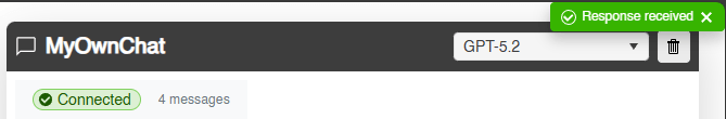
In the code above, as part of the else that is shown if ChatData contains items, a TelerikChat bound to ChatData is created, which contains all the conversation information. Additionally, properties such as Suggestions, AuthorId, among others, are used to configure the component.
In addition to configuring the component through parameters, other tags like HeaderTemplate can also be defined to display the connection status to the service, as well as the number of messages within the conversation.
ReceiverMessageContentTemplate is also used to define the content depending on the status of the request to the AI service. If the message is awaited, a Blazor Loader component is used to show a loading state. If a response is available, the content is displayed in the chat.
At this point, we have defined a component called MarkdownContent, which is based on the NuGet package Markdig that allows converting the markdown text received from the LLM into a HTML version, enabling the correct format for each markdown element in the conversation.
In addition to the above, AuthorMessageContentTemplate is also specified to define the template for user messages and NoDataTemplate in case we want to show content when there are no chat messages in the conversation.
In the code section, we need to add a reference to the component TelerikChat, which allows us to execute the method Refresh from the method RefreshChat, in addition to the event handler definition OnSuggestionClick, which allows handling the suggestions from the component (different from the options at the beginning of execution), as follows:
@code{

    private TelerikChat<ChatMessage>? ChatRef { get; set; }

    private async Task OnSuggestionClick(ChatSuggestionClickEventArgs args)
    {
        await UseSuggestion(args.Suggestion);
    }
    ...
    private void RefreshChat()
    {
        ChatRef?.Refresh();
        StateHasChanged();
    }
    ...
}
With the code above, we already have a Chat section that allows us to interact with an LLM:
With this, you have been able to see that the chat implementation is already working correctly.
Creating a ToolBar-like Footer
The last section we will work on is the footer. We will do this using a Blazor ToolBar, which allows us to add a toolbar for buttons, separators, and even custom content. Our code looks as follows:
<div class="bg-white border-top flex-shrink-0">
    <TelerikToolBar Class="bg-transparent border-0 px-3 py-2">
        <ToolBarButton Icon="@SvgIcon.InfoCircle" OnClick="@ShowAboutDialog">About</ToolBarButton>
        <ToolBarSeparator />
        <ToolBarTemplateItem>
            <span class="d-flex align-items-center gap-1 text-secondary small">
                <TelerikSvgIcon Icon="@SvgIcon.Clock" Size="@ThemeConstants.SvgIcon.Size.Small" />
                @DateTime.Now.ToString("HH:mm")
            </span>
        </ToolBarTemplateItem>
        <ToolBarSpacer />
        <ToolBarTemplateItem>
            <TelerikChip ThemeColor="@ThemeConstants.Chip.ThemeColor.Info"
                            Rounded="@ThemeConstants.Chip.Rounded.Full"
                            Size="@ThemeConstants.Chip.Size.Small"
                            Selectable="false"
                            Text="@SelectedModel">
            </TelerikChip>
        </ToolBarTemplateItem>
    </TelerikToolBar>
</div>

...

@code {

    private bool ShowAboutDialogVisible { get; set; } = false;

    private void ShowAboutDialog()
    {
        ShowAboutDialogVisible = true;
    }
    ...
}
In the code above, we see the following elements in sequence:
ToolBarButtonto display a button that we can press to show an information window about the app.ToolBarSeparatorto display a separator line between elements.ToolBarTemplateItemto show custom content, specifically the current time.ToolBarSpacerto push the subsequent elements to the right of the main control.ToolBarTemplateItemto display custom content. In this case, we are using aTelerikChip, which allows displaying tag-like elements that we use to show the selected model.
In addition to the above, we have prepared the logic to display application information through the definition of the ShowAboutDialogVisible property and the ShowAboutDialog method.
The result of running the application after applying the changes is as follows:
Displaying Application Information
In most applications, it is essential to be able to show application information to users, whether to specify the version, usage quotas, payment information, etc. We can easily achieve this by using the Blazor Dialog component, which we can show and hide at will, customizing its content thanks to the DialogContent tag.
In our case, we used a TelerikCard to show information about the application as follows:
...
<TelerikDialog @bind-Visible="@ShowAboutDialogVisible"
               Title="About MyOwnChat"
               Width="400px">
    <DialogContent>
        <TelerikCard>
            <CardBody>
                <div class="text-center p-3">
                    <TelerikSvgIcon Icon="@SvgIcon.Sparkles" Size="@ThemeConstants.SvgIcon.Size.ExtraLarge" />
                    <h3 class="mt-3 mb-2">MyOwnChat</h3>
                    <p class="text-secondary mb-4">An AI-powered chat interface, built with Blazor and Telerik UI.</p>
                    <TelerikChipList Data="@AboutChips"
                                     SelectionMode="@ChipListSelectionMode.None">
                    </TelerikChipList>
                </div>
            </CardBody>
        </TelerikCard>
    </DialogContent>
    <DialogButtons>
        <TelerikButton OnClick="@(() => ShowAboutDialogVisible = false)"
                       ThemeColor="@ThemeConstants.Button.ThemeColor.Dark">
            Close
        </TelerikButton>
    </DialogButtons>
</TelerikDialog>

@code {


    private List<ChipItem> AboutChips { get; set; } = new()
    {
        new ChipItem { Text = "Blazor" },
        new ChipItem { Text = "Telerik UI" },
        new ChipItem { Text = "AI Powered" }
    };

    ...

    public class ChipItem
    {
        public string Text { get; set; } = string.Empty;
    }
}
The previous code results in the following interaction:
Now, let’s look at the last component that allows us to show notifications.
Displaying Notifications in the Blazor Chat App
The last component we will use for our chat application is Blazor Notification, which allows displaying notifications to users to keep them informed about the status of actions in the application. Defining it is very simple:
<TelerikNotification @ref="@NotificationRef"
                     VerticalPosition="@NotificationVerticalPosition.Top">
</TelerikNotification>

@code {

    private TelerikNotification? NotificationRef { get; set; }
    ...
    private void ShowNotification(string message, string themeColor)
    {
        NotificationRef?.Show(new NotificationModel
        {
            Text = message,
            ThemeColor = themeColor,
            CloseAfter = 3000
        });
    }
}
In the code above, the TelerikNotification tag is defined by assigning the @ref parameter a property defined in the code, which allows displaying a notification. Within ShowNotification, the Show method is invoked, where we specify the message to display, color and how long the notification should be shown:
Clearing the Chat
To finish the application, we will complete the implementation of the ClearChat method so that the user can restart a conversation from scratch:
private void ClearChat()
{
    ChatData.Clear();
    ConversationHistory.Clear();
    UpdateSuggestions();
    ShowNotification("Conversation cleared", ThemeConstants.Notification.ThemeColor.Info);
}
In the code above, the conversation lists are reset, the suggestions are updated with the initials, and a message is displayed to the user regarding the clearing of conversations.
Conclusion
Throughout this article, we have selected prebuilt Telerik components for Blazor that allowed us to create a chat application that connects to AI model services for chat conversations.
Using prebuilt components helps make your development faster by providing a wide list of parameters that assist in customizing the graphical interface, as we have seen throughout the article. Additionally, you can be assured that the components are robust and are constantly updated, improving them through user feedback.
If you aren't already using Telerik UI for Blazor, you can try it free for 30 days:

Héctor Pérez
Héctor Pérez is a Microsoft MVP with more than 10 years of experience in software development. He is an independent consultant, working with business and government clients to achieve their goals. Additionally, he is an author of books and an instructor at El Camino Dev and Devs School.
Related Posts
Comments
All articles
Topics
Web MobileMobile
Desktop
Design
Productivity
People
