
Exploring the .NET MAUI DataPager Control

Summarize with AI:
Explore the .NET MAUI DataPager control, which allows you to add pagination to collection-type controls, such as a CollectionView or a Telerik DataGrid.
In this article, we will explore the .NET MAUI DataPager control, which allows you to add pagination to collection-type controls, such as a CollectionView or a Telerik DataGrid. Let’s get started!
About the .NET MAUI DataPager Control
The Progress Telerik UI for .NET MAUI DataPager control is designed to enable pagination in any data collection. It is especially useful when you need to split a long list of items into pages automatically, as it provides a property called PagedSource, which we can bind to a control to achieve automatic pagination.
Building an Example List Without Pagination
Let’s start by creating a small application without using pagination. You probably have a similar project among the ones you’ve created. Follow these steps:
- Create a project using the .NET MAUI App template without including the example content.
- Install the Telerik Ui for .NET MAUI controls by following the installation guide.
- Install the CommunityToolkit.Mvvm NuGet package.
- Navigate to
MainPage.xaml, where you should replace the content of theContentPagewith the following:
<ContentPage...>

<ContentPage.Resources>
    <ResourceDictionary>
        <Style x:Key="HeaderLabelStyle" TargetType="Label">
            <Setter Property="FontSize" Value="24" />
            <Setter Property="FontAttributes" Value="Bold" />
            <Setter Property="TextColor" Value="White" />
            <Setter Property="HorizontalOptions" Value="Center" />
            <Setter Property="VerticalOptions" Value="Center" />
        </Style>
        <Style x:Key="CardStyle" TargetType="Frame">
            <Setter Property="CornerRadius" Value="15" />
            <Setter Property="Padding" Value="15" />
            <Setter Property="Margin" Value="10" />
            <Setter Property="BackgroundColor" Value="White" />
            <Setter Property="HasShadow" Value="True" />
        </Style>
        <Style x:Key="TitleLabelStyle" TargetType="Label">
            <Setter Property="FontSize" Value="18" />
            <Setter Property="FontAttributes" Value="Bold" />
            <Setter Property="TextColor" Value="#333" />
        </Style>
        <Style x:Key="DetailLabelStyle" TargetType="Label">
            <Setter Property="FontSize" Value="14" />
            <Setter Property="TextColor" Value="#666" />
        </Style>
    </ResourceDictionary>
</ContentPage.Resources>

<Grid RowDefinitions="Auto,*">
    <Grid Grid.Row="0" HeightRequest="80">
        <Grid.Background>
            <LinearGradientBrush StartPoint="0,0" EndPoint="1,0">
                <GradientStop Offset="0.0" Color="#4A90E2" />
                <GradientStop Offset="1.0" Color="#007AFF" />
            </LinearGradientBrush>
        </Grid.Background>
        <Label Style="{StaticResource HeaderLabelStyle}" Text="Amiibos" />
    </Grid>
    <telerik:RadDataGrid
        x:Name="dataGrid"
        Grid.Row="1"
        AutoGenerateColumns="False"
        GridLinesVisibility="None"
        ItemsSource="{Binding Amiibos}"
        RowHeight="90"
        SelectionMode="Single">
        <telerik:RadDataGrid.AlternateRowBackgroundStyle>
            <Style TargetType="telerik:DataGridAlternateRowBackgroundAppearance">
                <Setter Property="BackgroundColor" Value="#F2FAF9" />
            </Style>
        </telerik:RadDataGrid.AlternateRowBackgroundStyle>
        <telerik:RadDataGrid.Columns>
            <telerik:DataGridTemplateColumn Width="100" HeaderText="Image">
                <telerik:DataGridTemplateColumn.CellContentTemplate>
                    <DataTemplate>
                        <Border
                            Padding="0"
                            BackgroundColor="Transparent"
                            HeightRequest="80"
                            HorizontalOptions="Center"
                            StrokeShape="RoundRectangle 40"
                            VerticalOptions="Center"
                            WidthRequest="80">
                            <Image Aspect="AspectFill" Source="{Binding image}" />
                        </Border>
                    </DataTemplate>
                </telerik:DataGridTemplateColumn.CellContentTemplate>
            </telerik:DataGridTemplateColumn>
            <telerik:DataGridTextColumn
                HeaderText="Name"
                PropertyName="name"
                SizeMode="Fixed" />
            <telerik:DataGridTextColumn
                HeaderText="Character"
                PropertyName="character"
                SizeMode="Fixed" />
            <telerik:DataGridTextColumn
                HeaderText="Game Series"
                PropertyName="gameSeries"
                SizeMode="Fixed" />
        </telerik:RadDataGrid.Columns>
    </telerik:RadDataGrid>
</Grid>

</ContentPage>
In the previous code, I am using a RadDataGrid to demonstrate pagination, as the .NET MAUI DataGrid is a versatile control that allows displaying columns with associated actions, such as performing search filters and sorting. You can see that the ItemsSource property of the RadDataGrid is bound to a property called Amiibos, which is the data source for the list.
- Create a new class named
AmiiboViewModel.cswith the following content:
public partial class AmiiboViewModel : ObservableObject
{
    [ObservableProperty]
    private ObservableCollection<Amiibo> amiibos = new ObservableCollection<Amiibo>();

    public async Task LoadDataAsync()
    {
        try
        {
            using HttpClient client = new HttpClient();

            string url = "https://www.amiiboapi.com/api/amiibo/";
            var response = await client.GetStringAsync(url);

            var amiiboResponse = JsonSerializer.Deserialize<AmiiboResponse>(response);

            if (amiiboResponse != null && amiiboResponse.amiibo != null)
            {
                Amiibos.Clear();
                Amiibos = new ObservableCollection<Amiibo>(amiiboResponse.amiibo);
            }
        }
        catch (Exception ex)
        {
            System.Diagnostics.Debug.WriteLine($"Error loading data: {ex.Message}");
        }
    }
}
public class AmiiboResponse
{
    public List<Amiibo> amiibo { get; set; }
}
public class Amiibo
{
    public string amiiboSeries { get; set; }
    public string character { get; set; }
    public string gameSeries { get; set; }
    public string head { get; set; }
    public string image { get; set; }
    public string name { get; set; }
    public Release release { get; set; }
    public string tail { get; set; }
    public string type { get; set; }
}

public class Release
{
    public string au { get; set; }
    public string eu { get; set; }
    public string jp { get; set; }
    public string na { get; set; }
}
In the previous code, we are using an API called AmiiboAPI, a free service for educational purposes to perform tests and experiments.
- Finally, replace
MainPage.xaml.cswith the following content:
public partial class MainPage : ContentPage
{

    public MainPage()
    {
        InitializeComponent();
        BindingContext = new AmiiboViewModel();
    }

    protected override async void OnAppearing()
    {
        var vm = BindingContext as AmiiboViewModel;
        await vm.LoadDataAsync();
    }
}
When launching the application, we will have a beautiful app that displays a table with information about various video game characters:
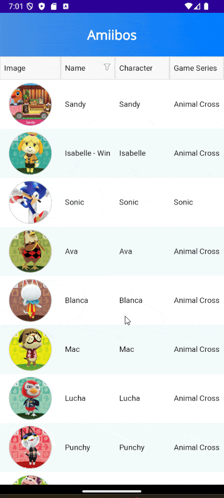
The application looks fantastic. However, it has the issue of loading too much information in the list control, making it a perfect use case for implementing the DataPager control.
The DataPager Control
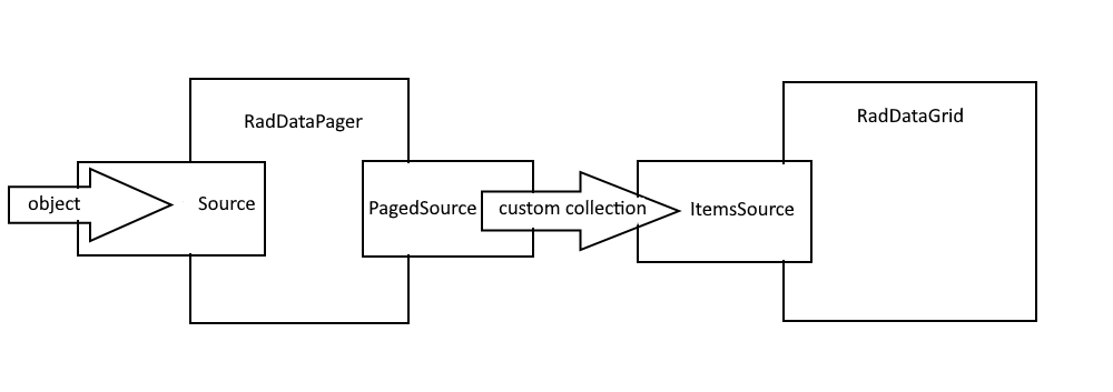
First, you should know that, when you want to use the RadDataPager control, you need to reassign the data source to the Source property of the RadDataPager.
Internally, the control encapsulates the list stored in Source within a custom collection, exposing the paginated data through a property called PagedSource. Then, you can rebind your collection-type control to the PagedSource property, which will automatically display the paginated items in the collection-type control. You can see a diagram of how it works in the following image, taken from the Telerik documentation:
Implementing a DataPager Control
It is important to highlight that you can easily add pagination to list-type controls, such as Telerik’s RadDataGrid or a .NET MAUI CollectionView. In our example, we will add a new RowDefinition to the main Grid and then add the DataPager control as follows:
<ContentPage
    ...
    xmlns:telerik="http://schemas.telerik.com/2022/xaml/maui">
    ...

    <Grid RowDefinitions="Auto,*,Auto">
        <Grid...>
            ...
        </Grid>
        <telerik:RadDataGrid>
            ...
        </telerik:RadDataGrid>
        <telerik:RadDataPager
            x:Name="dataPager"
            Grid.Row="2"
            PageSize="5"
            Source="{Binding Amiibos}" />
        </telerik:RadDataGrid>
    </Grid>

</ContentPage>
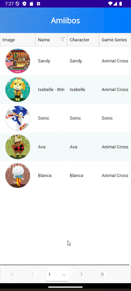
In the above code, you can see that we added a RadDataPager, where the PageSize property allows us to define the number of items per page while binding the list of Amiibos to Source.
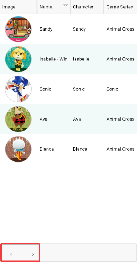
The next step is to rebind the ItemSource property of the collection-type control, in our case the RadDataGrid, so that its data source is the PagedSource property of the referenced control named dataPager, as shown in the following example:
<telerik:RadDataGrid
    x:Name="dataGrid"
    Grid.Row="1"
    AutoGenerateColumns="False"
    GridLinesVisibility="None"
    ItemsSource="{Binding PagedSource, Source={Reference dataPager}}"
    RowHeight="90"
    SelectionMode="Single">
With this modification, you will be able to see the new DataPager control in your application, allowing you to navigate through the items in an intuitive paginated format:
DataPager Control Configuration Options
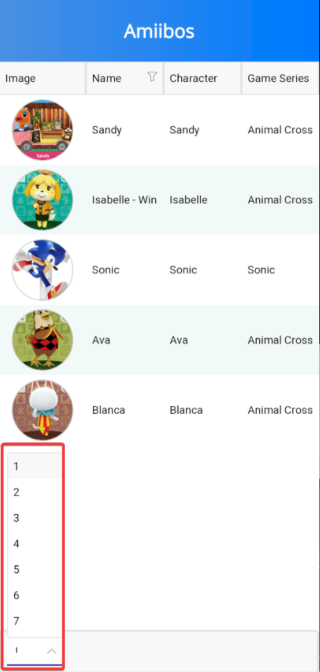
The DataPager control has many properties that allow us to customize it to our liking, for example, by changing which types of navigation controls will appear in the DataPager. If you only want to show certain controls in the DataPager to the user, you can use the DisplayMode property by assigning one of the possible values: None, FirstPageButton, PrevPageButton, NumericButtons, NavigationComboBox, NextPageButton, LastPageButton, PageSizesView or NavigationView, as in the following example:
<telerik:RadDataPager
    x:Name="dataPager"
    Grid.Row="2"
    PageSize="5"
    DisplayMode="NavigationComboBox"
    Source="{Binding Amiibos}" />
This will only display the control with the list of available pages:
If you want to use more than one value, for example, to only display the buttons for navigating forward and backward, you can do so by separating the values with commas in the DisplayMode property:
<telerik:RadDataPager
    x:Name="dataPager"
    Grid.Row="2"
    PageSize="5"
    DisplayMode="PrevPageButton,NextPageButton"
    Source="{Binding Amiibos}" />
The result of the above change is as follows:
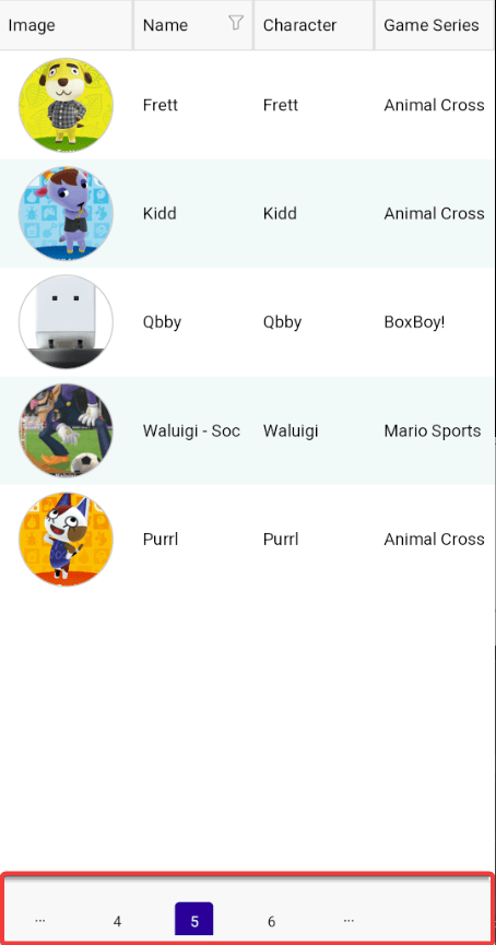
Another property we can modify is the EllipsisMode property, which allows adding ellipses when there are undisplayed pages while viewing numeric buttons. The following is an example of its usage:
<telerik:RadDataPager
    x:Name="dataPager"
    Grid.Row="2"
    PageSize="5"
    DisplayMode="NumericButtons"
    EllipsisMode="Both"
    Source="{Binding Amiibos}" />
The previous modifications of the DisplayMode and EllipsisMode properties result in the following image:
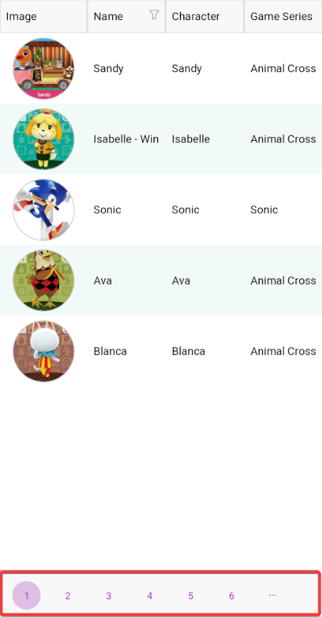
DataPager Styling Options
We can modify the visual appearance of various sections of the DataPager. For example, if you want to customize the navigation buttons, you can do so through the properties NavigateToFirstPageButtonStyle (Style), NavigateToPreviousPageButtonStyle (Style), NavigateToNextPageButtonStyle (Style), NavigateToLastPageButtonStyle (Style), NumericButtonStyle (Style) and NumericButtonsViewStyle (Style).
Here is an example with modified properties:
<ContentPage...>
    <ContentPage.Resources>
        <ResourceDictionary>
            ...
            <Color x:Key="DataPagerButtonAccentColor">#9C27B0</Color>
            <Color x:Key="DataPagerButtonNonAccentColor">#7B1FA2</Color>
            <telerik:ColorFilter
                x:Key="DataPagerButtonAccentColorAlpha16"
                Alpha="0.16"
                Color="{StaticResource DataPagerButtonAccentColor}" />
            <telerik:ColorFilter
                x:Key="DataPagerButtonAccentColorAlpha28"
                Alpha="0.28"
                Color="{StaticResource DataPagerButtonAccentColor}" />
            <telerik:ColorFilter
                x:Key="DataPagerButtonNonAccentColorAlpha16"
                Alpha="0.16"
                Color="{StaticResource DataPagerButtonNonAccentColor}" />
            <telerik:ColorFilter
                x:Key="DataPagerButtonNonAccentColorAlpha28"
                Alpha="0.28"
                Color="{StaticResource DataPagerButtonNonAccentColor}" />
            <Style x:Key="DataPagerButtonStyle" TargetType="telerik:DataPagerButton">
                <Setter Property="MinimumWidthRequest" Value="36" />
                <Setter Property="MinimumHeightRequest" Value="36" />
                <Setter Property="CornerRadius" Value="18" />
                <Setter Property="TextColor" Value="{StaticResource DataPagerButtonNonAccentColor}" />
                <Setter Property="Background" Value="Transparent" />
                <Setter Property="BorderThickness" Value="0" />
                <Setter Property="VerticalOptions" Value="Center" />
                <Setter Property="ControlTemplate">
                    <ControlTemplate>
                        <telerik:RadEffectsView
                            x:Name="PART_EffectsView"
                            Padding="{TemplateBinding Padding}"
                            Background="{TemplateBinding Background}"
                            BackgroundColor="{TemplateBinding BackgroundColor}"
                            BorderBrush="{TemplateBinding BorderBrush}"
                            BorderColor="{TemplateBinding BorderColor}"
                            BorderThickness="{TemplateBinding BorderThickness}"
                            CornerRadius="{TemplateBinding CornerRadius,
                                                           Converter={x:Static telerik:CornerRadiusToThicknessConverter.Instance}}">
                            <ContentPresenter telerik:ContentPresenterUtils.Content="{TemplateBinding ActualContent}" />
                        </telerik:RadEffectsView>
                    </ControlTemplate>
                </Setter>
                <Setter Property="VisualStateManager.VisualStateGroups">
                    <Setter.Value>
                        <VisualStateGroupList>
                            <VisualStateGroup Name="CommonStates">
                                <VisualState Name="Normal" />
                                <VisualState Name="PointerOver">
                                    <VisualState.Setters>
                                        <Setter Property="telerik:DataPagerButton.Background" Value="{StaticResource DataPagerButtonNonAccentColorAlpha16}" />
                                    </VisualState.Setters>
                                </VisualState>
                                <VisualState Name="Pressed">
                                    <VisualState.Setters>
                                        <Setter Property="telerik:DataPagerButton.Background" Value="{StaticResource DataPagerButtonNonAccentColorAlpha28}" />
                                    </VisualState.Setters>
                                </VisualState>
                                <VisualState Name="Disabled">
                                    <VisualState.Setters>
                                        <Setter Property="Opacity" Value="0.6" />
                                    </VisualState.Setters>
                                </VisualState>
                            </VisualStateGroup>
                        </VisualStateGroupList>
                    </Setter.Value>
                </Setter>
            </Style>
            <Style
                x:Key="DataPagerNumericButtonStyle"
                BasedOn="{StaticResource DataPagerButtonStyle}"
                TargetType="telerik:DataPagerButton">
                <Setter Property="TextColor" Value="{StaticResource DataPagerButtonAccentColor}" />
                <Setter Property="VisualStateManager.VisualStateGroups">
                    <VisualStateGroupList>
                        <VisualStateGroup Name="CommonStates">
                            <VisualState Name="Normal" />
                            <VisualState Name="PointerOver">
                                <VisualState.Setters>
                                    <Setter Property="telerik:DataPagerButton.Background" Value="{StaticResource DataPagerButtonAccentColorAlpha16}" />
                                </VisualState.Setters>
                            </VisualState>
                            <VisualState Name="Pressed">
                                <VisualState.Setters>
                                    <Setter Property="telerik:DataPagerButton.Background" Value="{StaticResource DataPagerButtonAccentColorAlpha28}" />
                                </VisualState.Setters>
                            </VisualState>
                            <VisualState Name="Selected">
                                <VisualState.Setters>
                                    <Setter Property="telerik:DataPagerButton.Background" Value="{StaticResource DataPagerButtonAccentColorAlpha28}" />
                                </VisualState.Setters>
                            </VisualState>
                            <VisualState Name="SelectedDisabled">
                                <VisualState.Setters>
                                    <Setter Property="telerik:DataPagerButton.Background" Value="{StaticResource DataPagerButtonAccentColorAlpha28}" />
                                </VisualState.Setters>
                            </VisualState>
                            <VisualState Name="Disabled">
                                <VisualState.Setters>
                                    <Setter Property="Opacity" Value="0.6" />
                                </VisualState.Setters>
                            </VisualState>
                        </VisualStateGroup>
                    </VisualStateGroupList>
                </Setter>
            </Style>
        </ResourceDictionary>
    </ContentPage.Resources>

    <Grid>
        ...
        <telerik:RadDataPager
            x:Name="dataPager"
            Grid.Row="2"
            DisplayMode="NumericButtons"
            EllipsisMode="Both"
            NavigateToFirstPageButtonStyle="{StaticResource DataPagerButtonStyle}"
            NavigateToLastPageButtonStyle="{StaticResource DataPagerButtonStyle}"
            NavigateToNextPageButtonStyle="{StaticResource DataPagerButtonStyle}"
            NavigateToPreviousPageButtonStyle="{StaticResource DataPagerButtonStyle}"
            NumericButtonStyle="{StaticResource DataPagerNumericButtonStyle}"
            PageSize="5"
            Source="{Binding Amiibos}" />
    </Grid>
</ContentPage>
The previous code would result in the following change in the user interface:
The DataPager control exposes several properties that you can change to customize the control as you like, and you can find them all in the official DataPager documentation.
Reacting to Navigation Events via Commands
The DataPager control exposes the NavigateToFirstPageCommand, NavigateToPreviousPageCommand, NavigateToPageCommand, NavigateToNextPageCommand and NavigateToLastPageCommand commands, which can help you perform actions when a button in the DataPager is pressed.
For example, if we had the DataPager configured to show the button to go to the first and last page as in the following example:
<telerik:RadDataPager
    x:Name="dataPager"
    ...
    NavigateToFirstPageCommand="{Binding NavigateToFirstPageCommand}"
    NavigateToLastPageCommand="{Binding NavigateToLastPageCommand}"/>
We could add the commands in the ViewModel to respond when these buttons are pressed:
public partial class AmiiboViewModel : ObservableObject
{
    ...

    [RelayCommand]
    public async Task NavigateToFirstPage()
    {
        Debug.WriteLine("NavigateToFirstPage");
    }
    [RelayCommand]
    public async Task NavigateToLastPage()
    {
        Debug.WriteLine("NavigateToLastPage");
    }
}
With the above code, a message indicating the action performed would be printed in the Output window.
Conclusion
Throughout this article, we have explored the Telerik .NET MAUI DataPager control, a highly versatile control that easily adds pagination to list-type controls. We have seen how to add pagination to a .NET MAUI application through the use of a DataPager, as well as its configuration and styling.
Now it’s your turn to simplify navigation in your .NET MAUI applications using the DataPager control.

Héctor Pérez
Héctor Pérez is a Microsoft MVP with more than 10 years of experience in software development. He is an independent consultant, working with business and government clients to achieve their goals. Additionally, he is an author of books and an instructor at El Camino Dev and Devs School.
Related Posts
Comments
All articles
Topics
Web MobileMobile
Desktop
Design
Productivity
People
