
We believe the ability to easily customize your dashboards to present the data that matters most to you is essential. That is why we have revamped how the dashboards, widgets and data presentation work and feel. In this article we describe the changes made and new features offered.
New widgetsWe are introducing three new widget types. You will find that these are smaller than the existing ones and they can be used to show the top-most aspect(s) of a specific metric, the average or the sum. Let us take a look at the widgets one by one. With these widgets you can create dashboards that quickly displays essential metrics for your business.
Top most, Top 5 and Top 10 widgets
If you click “Add Widget” you’ll see that we have simplified the dialog used to add widgets. In the “Metric” field either select from the drop down box the metric you are interested in, or simply type the name. In the following example we have selected one of the default metrics “Operating System”, but we could have selected any other metric that have been collected including your custom Feature Use, Feature Timing and Feature Value metrics.
The field “Widget type” can be selected and one of the options is “Top X”. If this is selected then to the right of this field you can select whether we just want to show the top-most, the top 5 or the top 10 values for the given metric.
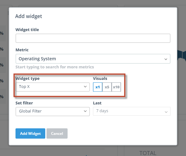
The Top most widget looks like this:
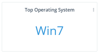
The Top 5 widget looks like this:
Here we have chosen to show the metric “Screen resolution”.
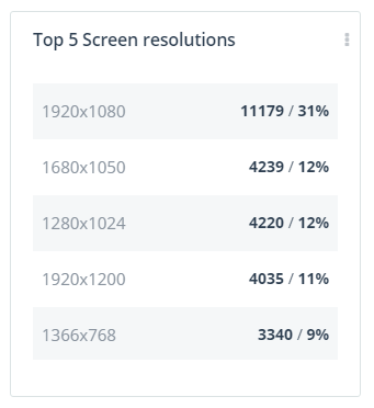
The Top 10 widget looks like this:
In this widget we have chosen to look at the Top 10 most often used menu items in a given application.
Sum widgets
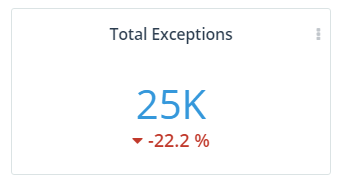
The new sum widgets are available for the metrics: users, new users, sessions and exception occurrences. It is added like this:

It looks like this:
Average widgets
The new average widgets are available for the metrics: users, new users, sessions, exception occurrences and session length. The same metrics as for the sum widgets plus session length.
The widget looks like this:

Widget types and supported metrics
Here is an overview of the different widget types we support and which metrics they can show.
| Datatype | Supported Widgets |
| Single series: users, new users, session, exception occurrences | Line, Sum, Average, Column, Trend |
| Session length | Line, Average, Column |
| TimeOfDay | Line, Column, Top X |
| GeoData | Map, Grid, Pie, Top X |
| Multi series: environment, version, FeatureUse | Line, Column, Pie, Top X |
| Multi series intervals: FeatureValue, FeatureTiming, loyalty | Area, Column, Pie, Top X |
Changes to dashboard layouts
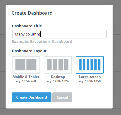
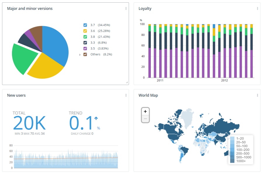
We have increased the maximum number of columns available for the dashboard layout to 6 columns and at the same time made it possible for you to choose the number of columns that you need for e.g. dashboards optimized for tablet viewing.
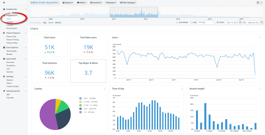
Based on this you can now create dashboards like the one we have in the new “Users” view.
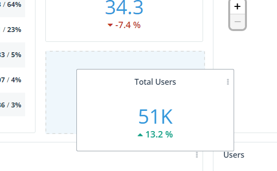
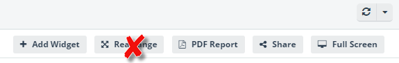
We have also made it easier for you to customize your dashboards. You can now simply drag and drop each widget and also resize them without clicking the “Rearrange” and “Save changes” buttons.
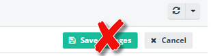
The dashboards are automatically saved, so you can simply focus on how you wish your dashboard to look and what data they should contain.
Deprecated widgets
The “Project activity” and “Project lifetime summary” widgets have been deprecated, because the information content can now be build more flexibly with the new Sums and Averages widgets.

NOTE: since these widgets have been deprecated the space they took up in your dashboards will be filled with an empty place holder after we have converted all dashboards to the new format. Further since we have introduced a new column layout your existing dashboards might require a bit of readjustments from your side.
Deprecated Versions and Installations views
The Versions view and the Installations views have been deprecated. The information they provided can now be added to any dashboard you build and you can decide which type of charts you wish to use to present the data.
Maybe you will find a dashboard like this one better, which can be build in less than one minute.
Eigil Rosager Poulsen is the Product Manager for Telerik Analytics. Having founded the application analytics company EQATEC, which was acquired by Telerik in 2013, he is passionate about helping application developers collect the data needed for better decision making.

