
Never Ask ‘How am I Going to Build That’ Again: 5 Indispensable Kendo UI for Angular Components

Check out the five components in Kendo UI for Angular users love for the development time they save. You’re never on your own again!
You know a good UI when you see it: it’s beautiful, it’s functional, and it gets users from A to B in the shortest, most intuitive way. And as a web developer, you know how to build one. But every so often, a business requirement for complex functionality will cross your desk and have you asking, “How am I going to build that?”
I know you are up to the task—I mean, who doesn’t love a challenge? But your time is better spent doing what you do best—programming your app’s logic. That’s why using a good commercial-grade UI library like Progress Kendo UI for Angular can be a true game-changer. This component library includes 120+ native components from simple controls and navigational elements to layout tools and complex data grids built to help you speed up and simplify your UI development.
Here are the five components Kendo UI for Angular users love the most for their ability to help them avoid long periods of learning and development time. Sample code is included to show you how easy implementation is. You can find hundreds more samples with code by visiting the Kendo UI for Angular documentation page.
1. Data Grid
A simple data table is easy enough, but you should ask yourself many questions when embarking on a grid project.
- Do you need advanced filtering, sorting, grouping and aggregates?
- How much data do you need to handle and is performance an issue?
- What about features such as column freezing, row and column reordering, and resizing that enable users to organize their view?
- Do you need to export the data?
- Do you need to allow users to input or edit data?
The answer to these questions might be “no” for now, but think of your product and its trajectory. Will you one day need to implement these features? Developing these features in house or even customizing a pre-existing table can take a team months, while maintaining it will take even longer. Add in attention to detail for styling and UX and you have a daunting task.
The Angular Data Grid gives you the full package of functionality, styling and maintenance out of the box with just a little code. You can choose which features to use, bind the component to various data sources and customize the view to your needs. As performance is a top priority, you can leverage data-optimization features such as virtual scrolling, paging and more.
In the screenshot below, you can see many of the essential Kendo UI for Angular Data Grid features in action, most enabled with a simple property.
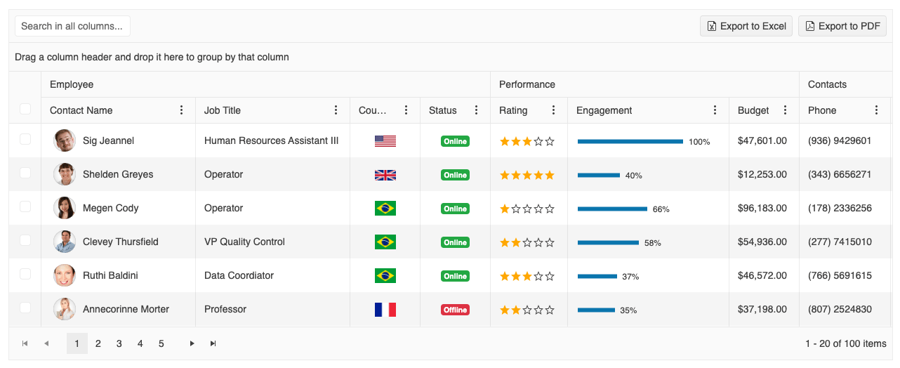
To demonstrate how easy implementation is, take this more typical implementation for example. In the screenshot, you can see a few popular features including grouping, filtering and paging.
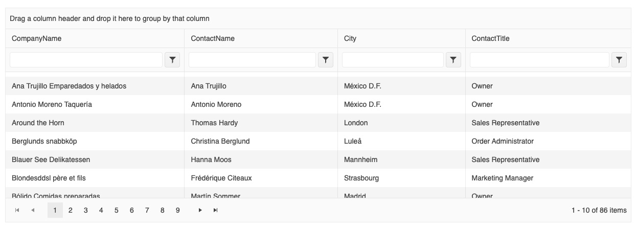
And here is the code needed to implement it.
import { Component } from "@angular/core";
import { customers } from "./customers";

@Component({
  selector: "my-app",
  template: `
    <kendo-grid
      [kendoGridBinding]="gridData"
      [pageSize]="10"
      [pageable]="true"
      [sortable]="true"
      [filterable]="true"
      [groupable]="true"
      [height]="420"
    >
      <kendo-grid-column field="CompanyName" [width]="140"></kendo-grid-column>
      <kendo-grid-column field="ContactName" [width]="120"></kendo-grid-column>
      <kendo-grid-column field="City" [width]="100"></kendo-grid-column>
      <kendo-grid-column field="ContactTitle" [width]="130"></kendo-grid-column>
    </kendo-grid>
  `,
})
export class AppComponent {
  public gridData: unknown[] = customers;
}
It’s that easy!
Want to learn more?
- Getting Started with the Kendo UI for Angular Data Grid – Official documentation starting point
- Diving into the Kendo UI Data Grid – More in-depth walkthrough with video
- Batch Editing with Kendo UI Grid for Angular – A common feature for interactive grids
- Generating Charts Based on Data in Your Kendo UI Grid – A data visualization tutorial
- How to Get a Responsive Data Grid – How to use compact mode for a more responsive data view.
Note that there is also a PivotGrid available for even more advanced scenarios.
2. Charts
Charts are the cornerstone of any data visualization scenario. The Kendo UI for Angular Charts collection includes every popular chart type from simple bar charts to more sophisticated financial and scientific charts.
Each chart is highly configurable, customizable and capable of handling large data. You get readily available features such as pan and zoom, export to file, range selection and more.
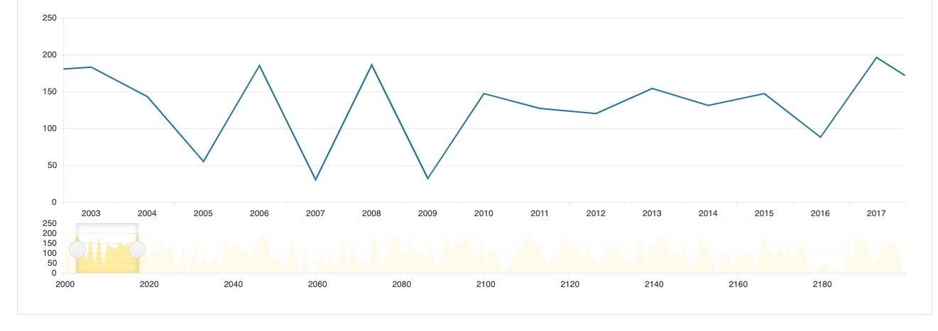
Below is an example of a financial chart with a range slider used to filter the data.
The code to render the chart follows. You can see that the component exposes an extensive list of properties to make the chart exactly what you need.
@Component({
  selector: "my-app",
  template: `
    <kendo-chart
      (selectEnd)="onSelectEnd($event)"
      [transitions]="transitions"
      [categoryAxis]="[
        {
          categories: categories,
          min: min,
          max: max,
          labels: { step: step },
          majorGridLines: { step: step },
          majorTicks: { step: step }
        },
        {
          categories: categories,
          name: 'navigatorAxis',
          labels: { step: navigatorStep },
          majorGridLines: { step: navigatorStep },
          majorTicks: { step: navigatorStep },
          pane: 'navigator',
          select: { from: min, to: max }
        }
      ]"
      [valueAxis]="[{}, { name: 'valueNavigatorAxis', pane: 'navigator' }]"
      [panes]="[{}, { name: 'navigator', height: 100 }]"
    >
      <kendo-chart-series>
        <kendo-chart-series-item
          type="line"
          style="smooth"
          [data]="data"
          [markers]="{ visible: false }"
        >
        </kendo-chart-series-item>
        <kendo-chart-series-item
          type="area"
          style="smooth"
          [data]="data"
          axis="valueNavigatorAxis"
          categoryAxis="navigatorAxis"
        >
        </kendo-chart-series-item>
      </kendo-chart-series>
    </kendo-chart>
  `,
})
And here is the code needed to implement the filter:
export class AppComponent {
  public data: number[] = [];
  categories: number[] = [];

  public transitions = false;
  public navigatorStep: number;
  public step: number;
  public min = 0;
  public max = 20;

  constructor() {
    const startYear = 2000;
    for (let i = 0; i < 200; i++) {
      this.categories.push(startYear + i);
      this.data.push(Math.floor(Math.random() * 200));
    }

    // set the navigator ticks and labels step to prevent the axis from becoming too cluttered
    this.navigatorStep = Math.floor(this.categories.length / 10);
  }

  public onSelectEnd(args: SelectEndEvent): void {
    // set the axis range displayed in the main pane to the selected range
    this.min = args.from;
    this.max = args.to;

    // stop the animations
    this.transitions = false;

    // set the main axis ticks and labels step to prevent the axis from becoming too cluttered
    this.step = Math.floor((this.max - this.min) / 10);
  }
}
Want to learn more?
- Getting Started with Kendo UI Charts – Official documentation starting point
- Angular Visualizations: Create Data Visualization with Kendo UI Charts – An overview of how to use Charts.
- Generating Charts based on Data in Your Kendo UI Grid – Using the Charts with the Data Grid
Note that Kendo UI also includes Gauges, Sparklines and a TileLayout component to serve as a dashboard container.
3. Scheduler
A surprising number of web projects require a scheduling component. This can be a planner for meetings, rooms, projects, appointments, events—or anything that requires reserving a time slot.
When you consider the need for multiple calendar views, the ability for users to add and edit appointments and managing multiple resources, you’re looking at a sizable project.
The Kendo UI for Angular Scheduler, also called an event calendar, delivers all these features in an easy-to-implement and customizable component, resembling the Microsoft Outlook calendar.
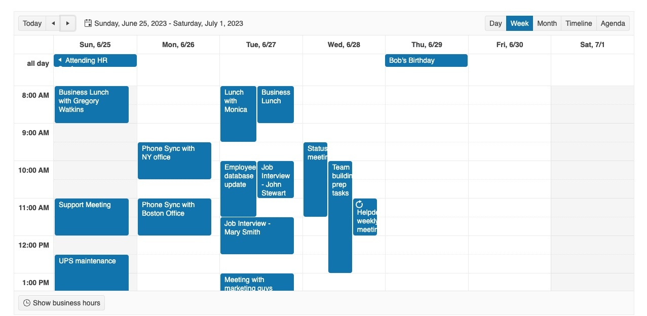
Below is a very familiar looking calendar view built with the Scheduler.
And just a handful of code is required:
import { Component } from "@angular/core";
import { SchedulerEvent } from "@progress/kendo-angular-scheduler";
import { sampleData, displayDate } from "./events-utc";

@Component({
  selector: "my-app",
  template: `
    <kendo-scheduler
      [kendoSchedulerBinding]="events"
      [selectedDate]="selectedDate"
      scrollTime="08:00"
      style="height: 600px;"
    >
      <kendo-scheduler-day-view> </kendo-scheduler-day-view>

      <kendo-scheduler-week-view> </kendo-scheduler-week-view>

      <kendo-scheduler-month-view> </kendo-scheduler-month-view>

      <kendo-scheduler-timeline-view> </kendo-scheduler-timeline-view>

      <kendo-scheduler-agenda-view> </kendo-scheduler-agenda-view>
    </kendo-scheduler>
  `,
})
export class AppComponent {
  public selectedDate: Date = displayDate;
  public events: SchedulerEvent[] = sampleData;
}
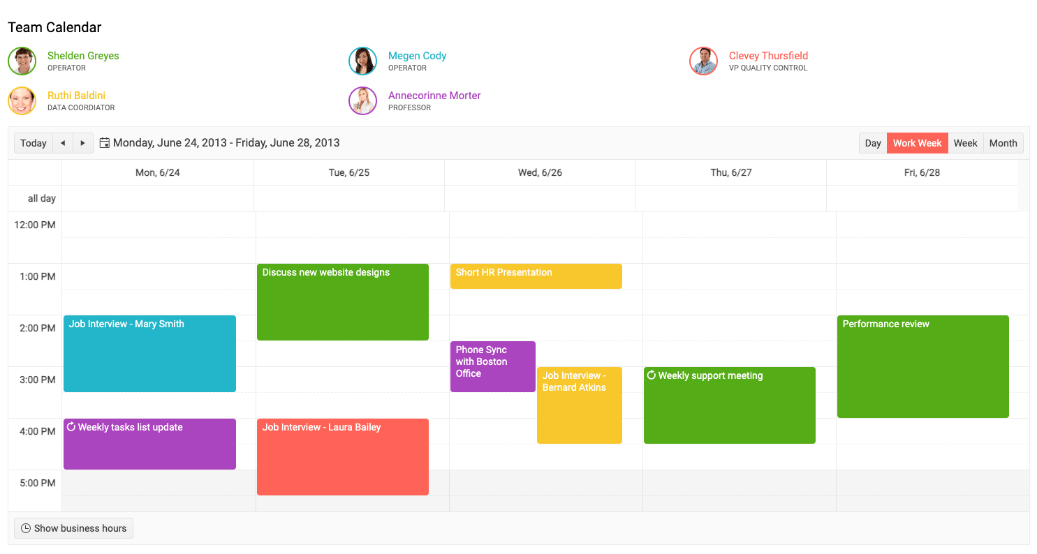
Below is a more advanced example of a team calendar. Note the color coding for resources and day, work week, week, and month view toggle buttons.
Want to learn more?
- Getting Started with the Kendo UI for Angular Scheduler – Official documentation starting point
- Building a Mini Angular Task Scheduler with Kendo UI – A practical application tutorial
Note that Kendo UI for Angular also includes a Gantt Chart for even more project management functionality.
4. Date Pickers
It may seem that date pickers are out of place in a list of such feature-heavy components, but the reality is that developers often struggle with them. Creating a nice looking and functional calendar that appears inside a dropdown or fits on a small screen is a surprisingly difficult task.
Kendo UI for Angular includes various forms of date pickers and inputs that render calendars and/or time input controls. Users can pick dates, times and ranges with ease.
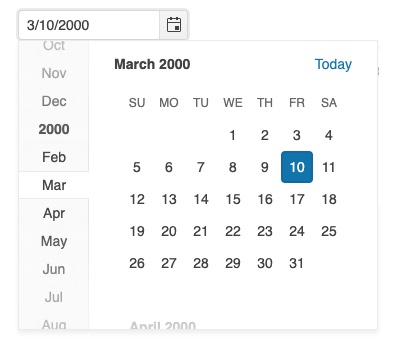
Let’s take the popular Kendo UI for Angular DatePicker for example. Embedding the calendar in the screen shot below in a form is quite easy.
It just takes a few lines of code to render and configure it.
import { Component } from "@angular/core";

@Component({
  selector: "my-app",
  template: `
    <div class="example-config">
      Selected value is: {{ value | kendoDate : "MM/dd/yyyy" }}
    </div>
    <div class="example-wrapper" style="min-height: 400px">
      <p>Select a date:</p>
      <kendo-datepicker [(value)]="value"></kendo-datepicker>
      <p>
        (use Alt+↓ to open the calendar, ← and → to navigate, ↑ to increment and
        ↓ to decrement the value)
      </p>
    </div>
  `,
  styles: [
    `
      kendo-datepicker {
        width: 170px;
      }
    `,
  ],
})
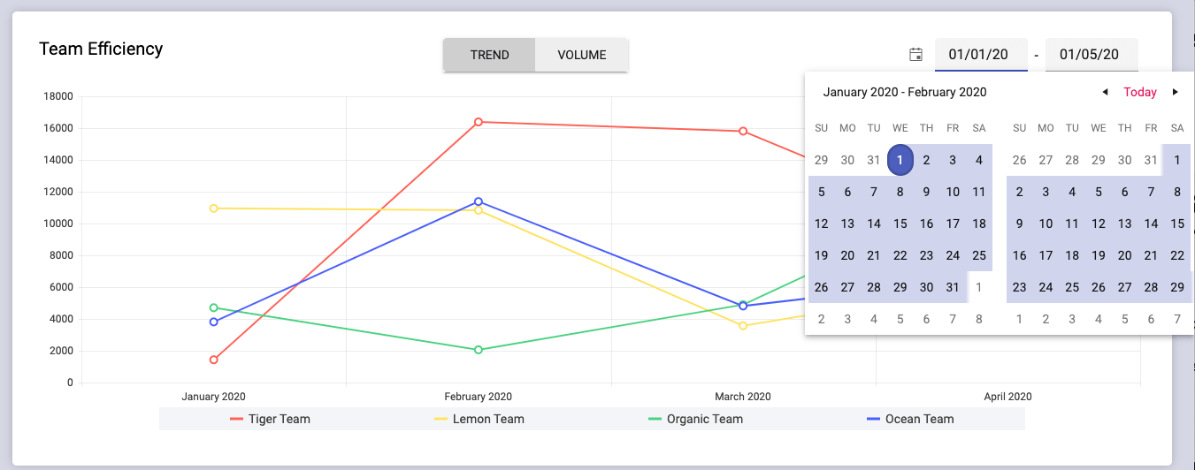
Below is a more complex example of the DatePicker being used to filter data in a dashboard.
Want to learn more?
- Getting Started with the Kendo UI for Angular Date Inputs – Official documentation starting point
- 3 Ways to Select Dates in Angular Forms Using Kendo UI Date Input Components – Practical usage of the Date Inputs package
5. Rich Content Editor
Rounding out the list is one of the most complex components: the Kendo UI for Angular Rich Content Editor. Some apps call for the ability to allow users to enter content. Some need ordinary text, while others require rich content with formatting, styling, image editing, tables and more features.
Two common examples are content management and messaging scenarios. You didn’t sign up to develop an HTML editing application, and that’s why you will find the Rich Text Editor component in Kendo UI so very time saving and useful.
The Kendo UI for Angular Editor is a seriously flexible component. It includes virtually every feature you can imagine an editor can offer, including a toolbar, code view and much more. It even has a formatting cleanup button so you can clean all the unneeded markup you get when pasting from Microsoft Word. You can choose to enable or disable features, so your users get the exact functionality they need.
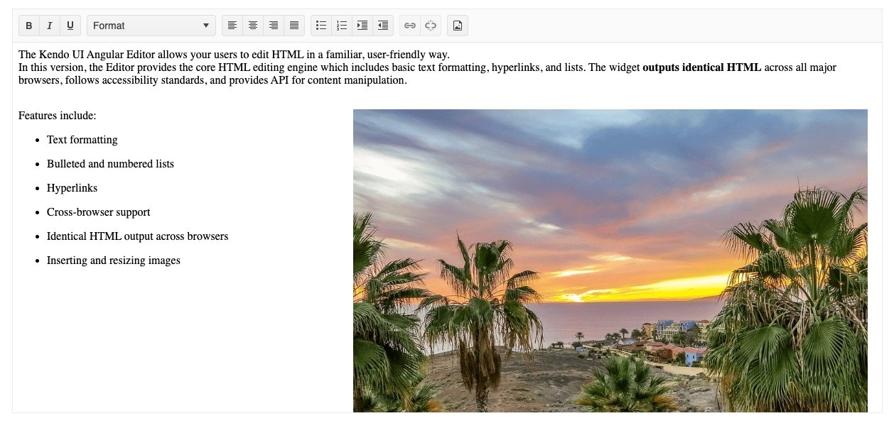
The screenshot below shows an instance of the Editor with most of its features enabled.
To embed the editor in its default state is incredibly simple:
import { Component } from "@angular/core";

@Component({
  selector: "my-app",
  template: `
    <kendo-editor [value]="value" style="height: 570px;"></kendo-editor>
  `,
})
Want to learn more?
- Getting Started with the Kendo UI Text Editor – The official documentation starting point
- Effortlessly Create Rich Text Content with Angular Kendo UI Editor – An in-depth tutorial
Debunking Third-Party Library Myths
Many developers have misconceptions about component libraries in general and Kendo UI specifically. The Kendo UI team is aware of these concerns and goes the extra mile to ensure that Kendo UI components are tools developers 100% love to use. Let me address a few:
Myth: I Can’t Customize the Components
Reality: Each component has configuration options exposed as simple properties that help you set appearance and behavior with ease. For more advanced customizations, HTML templates (ng-template) are supported. Kendo UI is built with extensibility in mind. Our developers are very conscious of how they write CSS so that your styles will easily be able to override ours, making our components living and breathing parts of your application, not the other way around.
Myth: Adding Third-Party Components Will Create UI Inconsistency
Reality: Four built-in themes (Kendo UI Default, Material, Bootstrap and Fluent) are consistently applied across all components. You can choose from many color swatches and customize them even deeper through the Progress ThemeBuilder tool to match your style.
Myth: Documentation is Never Useful
Reality: The Kendo UI components are meticulously documented, including a live example for nearly every feature. Plus, our developers often go the extra mile and create demos that show you how to extend our components or compose them with each other (as often there is a need to do).
Myth: Commercial UI Libraries are Not Worth the Price Since There are Many Free Alternatives
Reality: Open-source libraries are great for many projects but get pricey for projects that require complex functionality. If you turn developer time spent on customization and developing missing features into money, you’ll see that an open-source library can cost you more than a commercial one. The price you pay for commercial also gets you professional and guaranteed support and that’s worth the price alone.
What You Should Take Away
When you get a set of requirements, your first question to ask is always, “How am I going to build that?” You may know how (or you may not), but you are planning your path.
You have many choices: you can do it in house or turn to third-party component libraries. Some of them are open-source and others are not.
You should consider your requirements and available resources and choose carefully. Remember, you may end up doing much more work than you planned for if the library you choose doesn’t deliver complex UI or if attention hasn’t been paid to styling, accessibility and consistency.
Kendo UI fits perfectly into a project plan when functionality beyond an ordinary website is needed. Its team’s mission for the last 10+ years has been to take tedious tasks from developers and not create additional work along the way. The focus on UI styling and great documentation sets Kendo UI apart from the rest.
Trying Kendo UI for Angular is easy and free, and you get access to professional support while you’re checking it out. Get started in just a few steps by following the Getting Started tutorial.
Rather than asking, “How do I build that?” do yourself a favor and take a look at Kendo UI first.

Dan Beall
Dan Beall joined the Kendo Team in 2020 and brought with him a background in product management, marketing, and UX. Dan has over 20 years’ experience in the developer tools community bringing new solutions to market and evolving established solutions to meet the challenges of an ever-changing technical landscape. In his free time, he enjoys brewing, hiking, boating, and disc golf.
Related Posts
Comments
All articles
Topics

Latest Stories
in Your Inbox
Subscribe to be the first to get our expert-written articles and tutorials for developers!
All fields are required