
How to Use a jQuery Splitter UI Component in Your Web App - Part 2

Learn how to build the UI of your very own IDE with just three Kendo UI components: Splitter, TreeView and TabStrip.
In the first post on the Splitter component, we were introduced to the Kendo UI Splitter. Here, we will build upon what we have learned by using multiple components together.
Our goal is to build an IDE with Kendo UI. Kendo UI warriors work on very secret coding missions and have developed their own programming language to keep their work hidden. Consequently, they need their own editor that is capable of compiling this proprietary language. For this assignment, we will focus on building the UI of the IDE which will utilize the Splitter, TreeView and TabStrip components.
Getting Started
The container for the IDE will be a splitter with two horizontal panes. The left pane will contain a TreeView component to show the files and directories in the project. The right pane will be divided into a top and bottom pane. The top pane will contain a TabStrip to navigate between the files. The bottom pane will serve as the console. Before we begin, we will need a skeleton of the code. This example will use the Bootstrap theme. Let’s start by copying the following to practice in the Kendo UI Dojo:
<!DOCTYPE html>
<html>
<head>
  <link rel="stylesheet" href="https://kendo.cdn.telerik.com/2018.2.620/styles/kendo.common-bootstrap.min.css" />
  <link rel="stylesheet" href="https://kendo.cdn.telerik.com/2018.2.620/styles/kendo.bootstrap-v4.min.css" />
  <script src="https://kendo.cdn.telerik.com/2018.2.620/js/jquery.min.js"></script>
  <script src="https://kendo.cdn.telerik.com/2018.2.620/js/kendo.all.min.js"></script>
  <style>
    body { font-family: helvetica; }
  </style>
</head>
<body>
</body>
</html>
The Splitter Component
Next, let’s include the code for the Splitter component. Our app will actually use two Splitter components. One Splitter component will be used to create the left and right panes, with the other Splitter component located within the right pane to divide it into two horizontal panes.
Let’s add the following markup and JavaScript to the document’s <body>:
<div id="splitter">
  <div id="left-pane"></div>
  <div id="right-pane">
    <div id="top-pane"></div>
    <div id="bottom-pane"></div>
  </div>
</div>
<script>
  $(document).ready(function() {
    $('#splitter').kendoSplitter({
      panes: [ { size: '30%', collapsible: true }, {} ]
    });

    $('#right-pane').kendoSplitter({
      orientation: 'vertical',
      panes: [ {}, { size: '30%', collapsible: true } ]
    });
  });
</script>
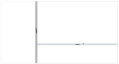
Here is what the app should look like so far:
The TreeView Component
To create the TreeView component, another element needs to be placed within the left pane. Normally, in an IDE, the files and folders vary from project-to-project. So we will use the dataSource field to build the view instead of hard-coding them in the HTML. For this exercise, we will initialize the TreeView component with a few nodes. In practice, you may want to use methods on the TreeView component to dynamically insert items.
Here is the updated markup:
<div id="left-pane">
  <div id="treeview"></div>
</div>
This code is added to the bottom of your JavaScript to initialize the TreeView component:
$('#treeview').kendoTreeView({
  dataSource: [
    { text: 'Project', items: [
      { text: 'src', items: [
        { text: 'index.html' },
        { text: 'styles.css' },
        { text: 'scripts.al' }
      ]}
    ]}
  ]
});
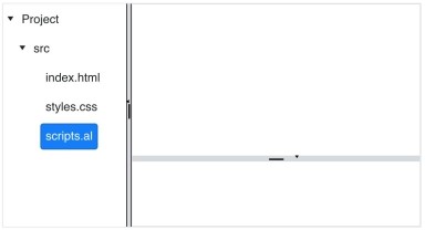
This is what our updated app looks like:
The TabStrip Component
Ideally, when we click on any item in the TreeView component, we want a tab to appear in the top right pane. This involves using the TreeView component API to get the selected item and using the TabStrip component API to append the tab. The details on how to do this are beyond the scope of this article. However, you can find instructions on how to do so in the TreeView component articles and TabStrip component post that are part of this series.
Here, we will be initializing a TabStrip with all of the tabs open. To get started, we’ll add a <div> element within the top pane <div> element:
<div id="top-pane">
  <div id="tabstrip"></div>
</div>
Next, we’ll initialize the TabStrip with three tabs which represent the files we have in our TreeView:
$('#tabstrip').kendoTabStrip({
  dataTextField: 'label',
  dataSource: [
    { label: 'index.html' },
    { label: 'styles.html' },
    { label: 'scripts.al' }
  ]
});
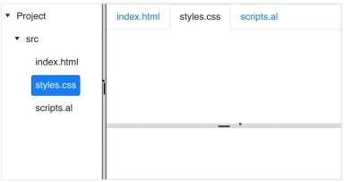
This is what the final project looks like with the TabStrip component added:
Conclusion
In this article, we used the Splitter, TreeView and TabStrip components to build an IDE. By no means should you stop here; continue experimenting with other components! You may want to wrap the Splitter component inside a Window component and add a ToolBar component. There is also much more you can do with the functionality, such as dynamically adding panes to the Splitter component to show additional views like documentation. Or, add close icons to the tabs so that they can be removed. In the upcoming articles, we’ll work on different components that are used for editing. Stay sharp because there will be more tests like these throughout your training!
Try Out the Splitter for Yourself
Want to start taking advantage of the Splitter component in Kendo UI, or any of the other 70+ ready-made Kendo UI components, like jQuery Grid or Scheduler? You can begin a free trial of Kendo UI today and start developing your apps faster.
Angular and Vue Versions
Looking for UI component to support specific frameworks? Check out the Splitter component in Kendo UI for Angular, or the Splitter component in Kendo UI for Vue.
Resources

Alberta Williams
Alberta is a software developer and writer from New Orleans. Learn more about Alberta at github.com/albertaw.
Related Posts
Comments
All articles
Topics
Latest Stories
in Your Inbox
Subscribe to be the first to get our expert-written articles and tutorials for developers!
All fields are required